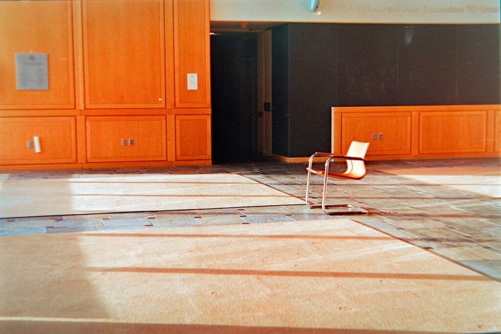
Selecting the right bedroom tiles color can completely transform the feel of your sleeping space. Tiles are no longer reserved for bathrooms and kitchens — modern porcelain and ceramic tiles now come in wood-look, marble-look, and concrete-look finishes that bring warmth and elegance to any bedroom.
- Why Choose Tiles for Your Bedroom
- Most Popular Bedroom Tile Colors
- Warm Beige & Cream
- Cool Gray
- Classic White & Off-White
- Warm Brown & Walnut
- Soft Blue & Green
- Charcoal & Black
- Color Psychology in the Bedroom
- How Tile Color Affects Room Size Perception
- Tile Colors by Design Style
- Tile & Wall Color Combinations That Work
- Bedroom Tile Trends for 2026
- Tips for Choosing the Right Bedroom Tile Color
- Frequently Asked Questions
In this guide, we explore the most popular bedroom tile colors for 2026, explain how to match tiles with your design style, and share practical tips for choosing colors that make your bedroom feel larger, cozier, or more luxurious.
Why Choose Tiles for Your Bedroom
While carpet and hardwood remain popular bedroom flooring choices, tiles offer several unique advantages:
- Durability: Porcelain tiles last 50+ years with minimal maintenance, far outlasting carpet and most hardwood.
- Hypoallergenic: Unlike carpet, tiles don’t harbor dust mites, pet dander, or allergens — ideal for allergy sufferers.
- Temperature regulation: Tiles stay cool in warm climates and pair perfectly with underfloor heating in cooler regions.
- Design versatility: Modern tiles convincingly replicate wood grain, natural stone, concrete, and terrazzo at a fraction of the cost.
- Easy maintenance: Regular mopping keeps tiles looking new with no special products needed.
Most Popular Bedroom Tile Colors
Warm Beige & Cream
Beige and cream tiles create a soft, inviting atmosphere that suits almost any bedroom style. They reflect natural light beautifully and pair well with both warm and cool wall colors. Wood-look porcelain tiles in light oak or birch tones are especially popular in this palette.
Cool Gray
Gray remains one of the most versatile tile colors for bedrooms. Light gray creates a modern, airy feel, while darker charcoal tones add drama and sophistication. Concrete-look porcelain tiles in gray are a top choice for contemporary and industrial-style bedrooms.
Classic White & Off-White
White tiles maximize the sense of space and light, making them perfect for smaller bedrooms. Marble-look porcelain tiles with subtle gray veining add visual interest without overwhelming the room. Off-white tones prevent the space from feeling too clinical.
Warm Brown & Walnut
Rich brown tones bring the warmth of natural wood to your bedroom without the maintenance requirements. Dark walnut, hickory, and teak-look tiles create a cozy, grounded atmosphere that pairs beautifully with earth-toned decor.
Soft Blue & Green
For bedrooms where relaxation is the priority, muted blues and sage greens promote calm and restfulness. These colors work best as accent tiles — perhaps on a feature wall or in a bordered pattern — combined with neutral floor tiles.
Charcoal & Black
Bold and dramatic, dark tiles make a striking statement in master bedrooms. Black terrazzo or dark slate tiles create a luxurious, hotel-inspired atmosphere. Balance dark floors with lighter walls and ample lighting to prevent the room from feeling closed in.
Color Psychology in the Bedroom
| Tile Color | Mood/Effect | Best For |
|---|---|---|
| Warm beige/cream | Cozy, welcoming, relaxed | Master bedrooms, guest rooms |
| Cool gray | Calm, modern, sophisticated | Contemporary bedrooms, teens’ rooms |
| White/off-white | Spacious, clean, serene | Small bedrooms, minimalist spaces |
| Warm brown | Grounded, natural, intimate | Traditional & rustic bedrooms |
| Soft blue/green | Tranquil, restorative, peaceful | Meditation rooms, spa-like bedrooms |
| Charcoal/black | Dramatic, luxurious, bold | Large master suites, hotel-style bedrooms |
How Tile Color Affects Room Size Perception
The color and size of your bedroom tiles can visually expand or contract the space:
- Light colors open up small rooms. White, cream, and light gray tiles reflect light and make walls feel farther apart. For the strongest effect, use large-format tiles (24″x24″ or larger) with minimal grout lines.
- Dark colors add depth to large rooms. In spacious master bedrooms, dark tiles create an intimate, cocooning effect. They also make furniture and decor pop against the floor.
- Matching tile and wall colors blur the boundary between floor and wall, making the room feel larger overall.
- Diagonal tile layout draws the eye along the longest dimension of the room, creating the illusion of more space regardless of tile color.
- Large-format tiles with rectified edges reduce the number of grout lines, creating a more seamless, expansive look.
Tile Colors by Design Style
Modern Minimalist
Stick to a monochromatic palette: white, light gray, or warm beige tiles with matching grout. Large-format rectified porcelain tiles with a matte finish create the clean, uncluttered foundation that minimalist design demands.
Mid-Century Modern
A mid-century modern bedroom pairs beautifully with warm wood-look tiles in medium tones — think teak or walnut finishes. Geometric patterned tiles as an accent can echo the era’s iconic design motifs.
Scandinavian
Light-toned wood-look tiles in pale ash, white oak, or birch tones are the foundation of Scandi bedroom design. Keep the palette muted and natural, with white or very light gray grout.
Bohemian
Patterned cement-look tiles or Moroccan-inspired encaustic tiles in earthy terracottas, blues, and greens bring boho character to the bedroom. Use patterned tiles as a feature strip or border to avoid overwhelming the space.
Industrial
Concrete-look tiles in medium to dark gray with a matte finish anchor the industrial aesthetic. Pair with exposed metal bed frames, Edison bulb lighting, and raw wood furniture for the full effect.
Traditional & Classic
Marble-look porcelain tiles in white with subtle gray or gold veining bring timeless elegance. Herringbone or chevron patterns in wood-look tiles also suit traditional bedrooms beautifully.
Tile & Wall Color Combinations That Work
| Tile Color | Wall Color | Accent Colors | Style |
|---|---|---|---|
| Light oak wood-look | White or soft ivory | Dusty blue, sage green | Scandinavian |
| Warm beige porcelain | Greige or warm white | Terracotta, burnt orange | Organic modern |
| Dark gray concrete-look | Charcoal or navy | Brass, amber, cream | Industrial luxe |
| White marble-look | Pale blue or blush pink | Gold, crystal, white | Classic glam |
| Walnut wood-look | Sage green or olive | Cream, tan, rust | Nature-inspired |
| Black terrazzo | White or light gray | Green plants, wood tones | Contemporary bold |
Bedroom Tile Trends for 2026
- Warm minimalism: The shift away from stark cool grays continues. Expect warm neutrals like sand, camel, and clay to dominate bedroom tile choices.
- Extra-large format tiles: Tiles measuring 48″x48″ or even 60″x120″ create a near-seamless floor surface that feels expansive and modern.
- Textured finishes: Matte and textured finishes are replacing high-gloss tiles in bedrooms for a more natural, tactile feel underfoot.
- Terrazzo revival: Large-chip terrazzo tiles in muted earth tones bring retro character to contemporary bedrooms.
- Sustainability focus: Recycled-content tiles and tiles manufactured with renewable energy are increasingly important to eco-conscious homeowners.
Tips for Choosing the Right Bedroom Tile Color
- Consider natural light. Rooms with large windows can handle darker tile colors. North-facing rooms with limited light benefit from lighter, warmer tones.
- Test samples in your actual room. Tile colors look dramatically different under showroom lighting versus your bedroom. Always take samples home and view them at different times of day.
- Think about grout color. Matching grout creates a seamless look; contrasting grout highlights the tile pattern. For bedrooms, matching grout usually creates the most calming effect.
- Account for furniture. Consider the color of your bed frame, nightstands, and dresser. Your tile should complement, not compete with, existing furniture.
- Plan for area rugs. If you plan to use rugs beside the bed for warmth, choose a tile color that will look good both exposed and partially covered.
- Factor in underfloor heating. If you’re installing heated floors, any tile color works. Without heating, lighter colors may feel less cold psychologically.
Frequently Asked Questions
What is the best tile color for a small bedroom?
Light colors like white, cream, beige, or light gray make small bedrooms feel larger. Use large-format tiles (24″x24″ or bigger) with matching grout to minimize visual breaks and create a seamless, spacious appearance.
Are dark tiles a good choice for bedrooms?
Dark tiles work well in larger bedrooms where you want a dramatic, cozy atmosphere. They show dust more easily than lighter tiles, so they require more frequent cleaning. Balance dark floors with lighter walls and plenty of overhead lighting.
What color tiles go with gray walls?
Warm wood-look tiles in oak or walnut tones create beautiful contrast with gray walls. White marble-look tiles also pair well, as do beige and cream porcelain tiles. The key is to introduce warmth to offset the coolness of gray.
Do bedroom tiles feel cold?
Tiles can feel cool underfoot, which is actually a benefit in warm climates. In cooler regions, underfloor radiant heating eliminates this issue entirely. Area rugs beside the bed also add warmth where you need it most. Psychologically, warm-toned tiles (beige, brown, terracotta) feel less cold than cool-toned options.
What tile finish is best for bedrooms?
Matte and textured finishes are ideal for bedrooms. They’re less slippery than polished tiles, feel more natural underfoot, and don’t show footprints or cleaning streaks. Polished tiles can look stunning but require more frequent cleaning to maintain their shine.
Can I mix different tile colors in one bedroom?
Yes, but keep it to two colors maximum and use the secondary color as an accent — such as a border, a feature strip, or a specific zone like a reading nook. Too many colors create visual chaos, which isn’t conducive to sleep.
Last updated: March 2026
Prefer to explore on your own?
See how new flooring looks in your actual room in seconds — free, no signup.
Try the free Floor Studio →