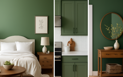
Behr Back to Nature (color code S340-4) is a soft, muted green with a noticeable yellow undertone, the kind of color that reads like new grass or dried meadow depending on the light. Behr named it its 2020 Color of the Year and described it as a restorative, meadow inspired green. Several years on, it is still one of the more approachable greens in the Behr lineup because it sits in a comfortable middle ground: not pale enough to look washed out, not dark enough to shrink a room.
The color works best in rooms with plenty of natural light, alongside warm whites, natural wood and earthy textiles. In north facing rooms, its yellow side calms down and it reads more like a gray green. In strong south or west light, it looks brighter and more yellow, so test it in your space before committing.
- Behr Back to Nature at a Glance
- Undertones and How the Color Shifts
- Best Colors to Pair With Back to Nature
- Where to Use Back to Nature
- Similar Colors From Behr and Other Brands
- How to Test Back to Nature Before Painting
- Choosing a Sheen and Product
- Troubleshooting
- Cost to Paint a Room in Back to Nature
- When to Call a Pro
- Frequently Asked Questions
One point to clear up: Back to Nature was the 2020 pick, not a later one. Behr’s 2024 Color of the Year was a soft black called Cracked Pepper, and the 2021 pick was the terracotta Canyon Dusk.
Behr Back to Nature at a Glance
| Spec | Value | What It Means |
|---|---|---|
| Color code | S340-4 | Use this code when ordering to avoid mixing the wrong green |
| Color family | Green, mid tone | Light enough for walls, deep enough to show color |
| Undertone | Yellow, slightly khaki | Looks warm and earthy, not minty or blue |
| LRV | About 47 (color databases list 46 to 48) | Reflects a moderate amount of light; a true mid tone |
| Color of the Year | Behr 2020 | Anchored Behr’s nature themed 2020 trends palette |
| Interior or exterior | Both, depending on the paint product | Available in interior and exterior Behr paint lines and sheens |
A note on LRV (light reflectance value): Behr publishes LRV on its color detail pages and sample cards, and independent color databases put this shade at about 46 to 48. Practically, it behaves like a mid tone: it will not brighten a dark room the way a pale green would.
Undertones and How the Color Shifts
The yellow undertone is what separates Back to Nature from sage greens and gray greens. Next to a cool sage, it looks noticeably warmer. Next to a pure olive, it looks lighter and softer. Many people describe it as a garden green with a khaki cast.
- North light: cooler and grayer. The yellow is muted, and the color can read as a soft gray green.
- South light: warm, bright and noticeably yellow. In very sunny rooms it can lean toward a chartreuse look.
- East light: bright and fresh in the morning, flatter in the afternoon.
- West light: mellow in the morning, golden in the evening.
- Warm LED bulbs (2700K): deepen the yellow side. Use 3000K to 3500K bulbs if you want it to look greener.
Best Colors to Pair With Back to Nature
When Behr launched the color, its own room examples paired it with clean whites on trim, including Polar Bear and Painter’s White, and used a deep charcoal (Graphic Charcoal) as a strong accent. The 2020 trends palette around it also included Secret Meadow, Light Drizzle, Bluebird and Dragonfly.
| Role | Pairing Direction | Why It Works |
|---|---|---|
| Trim and ceilings | Warm or soft white (Behr used Polar Bear and Painter’s White in launch examples) | Keeps the green fresh without harsh contrast |
| Accent door or cabinetry | Deep charcoal such as Graphic Charcoal | Grounds the soft green and adds depth |
| Adjoining rooms | Warm greige or creamy beige | Shares the warm undertone for smooth transitions |
| Bolder accent | Deep teal or navy (like the trends palette’s darker blues) | Cool contrast that balances the yellow |
| Wood tones | White oak, walnut, natural pine | Earthy wood makes the green look intentional |
| Metals | Brass, aged bronze, matte black | Warm metals echo the yellow undertone |
Avoid stark, cool whites that lean blue. They make the yellow in Back to Nature jump out and can make the walls look dingy by comparison. Bright primary reds and hot pinks also fight with it.
Where to Use Back to Nature
Living rooms and dens
The color creates a calm, outdoorsy feel that suits rooms with plants, linen and natural wood. It pairs especially well with white oak floors and cream upholstery.
Kitchens and cabinets
On lower cabinets or an island, Back to Nature looks fresh with white or marble look counters and brass hardware. On walls, it works with white cabinets and butcher block. Use a durable cabinet and trim enamel for doors and drawers.
Bedrooms and offices
Soft greens are a common choice for restful spaces. In a home office, the color is easy on the eyes on video calls and looks good behind wood shelving.
Bathrooms
Use it with white tile, natural stone and warm metal fixtures. Choose a moisture and mildew resistant bath paint in satin or semi gloss.
Front doors and exteriors
Behr’s launch examples showed it on a front door with white trim. On full exterior siding it reads lighter and more yellow in sun, so sample a large board outdoors before committing to the whole house.
Similar Colors From Behr and Other Brands
Color matching sites list several near neighbors from other paint makers. None are exact duplicates, and each leans a little differently, so treat them as starting points to sample side by side.
- Benjamin Moore Georgian Green (HC-115): often listed as a close match; compare in your light to see which reads warmer.
- Sherwin-Williams Baby Bok Choy (SW 9037): listed as a near neighbor; tends to look fresher and a little lighter.
- Benjamin Moore Grasslands (502): another listed neighbor in the yellow green family.
- Within Behr: if Back to Nature feels too bright, look at grayer greens on the same color strip or a sage family color; if it feels too pale, step one or two chips deeper on the S340 strip.
How to Test Back to Nature Before Painting
Green shifts more with light than most neutrals, so testing is not optional.
- Order large peel and stick paint sample swatches or a sample size container.
- Apply samples about 2 feet square on two or three walls, including one that gets direct sun and one in shade.
- Place them next to your trim, flooring and largest furniture pieces.
- Check the samples morning, afternoon and evening, under both daylight and your lamps.
- Live with them for 2 to 3 days before deciding.
Choosing a Sheen and Product
Behr offers its colors in several interior and exterior product lines and sheens. For walls, eggshell or satin is a good balance between hiding imperfections and wiping clean. Flat or matte works on ceilings and low traffic rooms. Semi gloss suits trim, doors and cabinets. Sheen changes how a color reads: higher gloss looks slightly darker and more saturated, so compare samples in the sheen you plan to use. Check the current product data sheet for coverage, recoat time and sheen availability, since they differ by line.
Troubleshooting
The walls look too yellow. Strong sun or warm bulbs are pushing the undertone. Switch to 3000K or 3500K bulbs, or step to a grayer green.
The color looks muddy. Usually a north facing room or cool trim color. Pair with a warmer white and add warm lighting.
Touch ups do not match. Use paint from the same batch and the same sheen, and feather touch ups across a full section of wall.
Patchy coverage over a dark color. Prime first with a tinted primer, then apply two finish coats.
Cost to Paint a Room in Back to Nature
A typical bedroom takes 2 to 3 gallons for two coats. Premium interior paint usually runs in the moderate per gallon range, so most rooms come in at well under a couple hundred dollars in paint and supplies if you do it yourself. Hiring a painter for a standard room often costs several hundred dollars or more, depending on wall height, trim and prep.
When to Call a Pro
Call a professional painter for high ceilings, stairwells, full exteriors or cabinet refinishing, where spray equipment and proper prep make the difference. A pro is also wise if your home was built before 1978 and you plan to sand existing paint, since lead safe practices are required for disturbing older coatings.
Frequently Asked Questions
What color is Behr Back to Nature?
Back to Nature (S340-4) is a soft, muted green with a yellow, slightly khaki undertone. Behr describes it as a restorative, meadow inspired green.
Was Back to Nature Behr’s Color of the Year?
Yes, for 2020. Behr’s 2021 pick was Canyon Dusk, and its 2024 pick was Cracked Pepper.
What trim color goes with Back to Nature?
Warm or soft whites work best. Behr’s own launch examples used Polar Bear and Painter’s White on trim.
What is the LRV of Behr Back to Nature?
Color databases list it at about 46 to 48, a mid range LRV. It will not brighten a dark room the way a pale green would.
Is Back to Nature a sage green?
Not quite. Sage greens usually lean gray or blue, while Back to Nature leans yellow and warm, closer to a soft garden or meadow green.