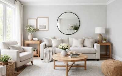
Green-gray paints have a habit of looking gray on the chip and minty on the wall, and Behr Urban Nature is a good example of a color you need to test before you commit. Sold under the code S380-3, it sits where a soft concrete gray meets a muted botanical green, which is roughly how Behr itself describes it. The result is a calm, earthy green-gray that reads more green in warm light and more gray in cool, north-facing rooms.
The color works best for people who want a hint of green without a bold statement. It suits living rooms, bedrooms, home offices and bathrooms where you want a relaxed, natural feel that still pairs easily with wood, white trim and stone. It is not a crisp neutral, though. If you want something that disappears behind your furniture, a warm gray or greige will be safer.
- Behr Urban Nature at a Glance
- Undertones: How Urban Nature Shifts in Different Light
- Rooms Where It Works and Where It Struggles
- Colors That Pair With Behr Urban Nature
- Urban Nature vs Similar Greens
- How to Test the Color Before You Commit
- Sheen and Application Tips
- Troubleshooting Common Problems
- Cost and When to Hire a Painter
- Frequently Asked Questions
Specs for this color vary a lot between online color databases, so the details here focus on how it behaves in a room. Before you buy gallons, check Behr’s own color page for the current official values and order a large sample.
Behr Urban Nature at a Glance
Use this quick reference to see where the color sits and how it tends to shift. Third-party sites disagree on its light reflectance value, so confirm that number on the manufacturer’s color detail page rather than relying on a screenshot or a hex code.
| Spec | Value | What it means |
|---|---|---|
| Color name and code | Urban Nature, S380-3 | Use the code at the paint desk to avoid name mix-ups |
| Color family | Green-gray (muted, earthy green) | Reads as a soft sage-gray rather than a true green |
| Main undertone | Green with a warm yellow lean | Turns more olive or sage beside warm woods |
| Secondary undertone | Gray | Keeps the green muted and calm |
| Lightness | Light-to-mid value | Not a near-white; visible color on every wall |
| Light reflectance value | About 50 to 51 (most color databases) | Mid-tone; reflects about half the light that hits it |
| Best rooms | Living rooms, bedrooms, offices, baths | Calm spaces that get decent daylight |
Undertones: How Urban Nature Shifts in Different Light
Every green-gray has a temperature, and Urban Nature leans gently warm. Its green carries a little yellow, which is why it can look like a soft sage or even a faint olive in rooms with afternoon sun. That yellow is also what keeps it from looking cold or clinical.
North-facing rooms
Cool, indirect northern light pulls out the gray. Here the color can look like a muted stone or a gray with a whisper of green. If you want more visible green in a north room, test it next to a slightly warmer, greener chip, because Urban Nature may look flatter than you expect.
South- and west-facing rooms
Strong warm light brings out the green and yellow. In a sunny living room it reads as a soft, natural sage, and at golden hour it can lean toward olive. This is often where homeowners love it most.
East-facing rooms
Morning light is bright and slightly cool, then the room goes flat by afternoon. Expect a fresh green-gray in the morning and a deeper, grayer tone later in the day.
Artificial light
Warm bulbs around 2700K push it toward sage, while cooler bulbs around 4000K or higher make it grayer. If you have mixed bulbs in one room, swap them to match before you judge the color.
Rooms Where It Works and Where It Struggles
Because the color is soft and earthy, it fits rooms where you want calm rather than energy. Bedrooms are a natural fit: the muted green feels restful and pairs well with linen bedding and natural wood. Living rooms with plenty of daylight and wood floors also show it off.
Bathrooms are another strong match, especially with white tile, marble-look surfaces or brushed brass and matte black fixtures. In a small powder room, it can feel like a cocoon without the drama of a dark green.
Kitchens can work if your cabinets are white, cream or natural wood. Be careful in kitchens with heavily yellow or orange-toned wood cabinets, where the yellow lean of the paint can make everything look a bit muddy. Very dark rooms with little natural light can also flatten the color into a dull gray, so check a large sample there first.
Colors That Pair With Behr Urban Nature
The easiest pairings follow the color’s warm, natural character. Think warm whites, earthy neutrals and wood tones rather than stark white and chrome.
- Trim and ceilings: A soft warm white or creamy off-white keeps the room cohesive. A bright, cool white trim gives more contrast but can make the green-gray look slightly dingy beside it.
- Adjacent rooms: Warm greige and light taupe flow well into hallways and open-plan spaces.
- Accent walls and doors: A deeper forest or olive green from the same family adds depth, while a muted terracotta or rust brings out the warmth.
- Cabinetry: White oak, walnut and painted cream cabinets all sit comfortably next to it.
- Finishes and decor: Brass, bronze, matte black, rattan, linen and stone suit the earthy feel.
For an exterior, the color can work on a cottage-style house or a garage door accent, but outdoor light is much brighter and will bleach it toward gray. Test a sample board on the house itself, in full sun and in shade.
Urban Nature vs Similar Greens
Name confusion is the first thing to watch. Benjamin Moore also sells a color called Urban Nature (AF-440), and it is a different color from Behr’s S380-3. If you see a photo labeled “Urban Nature,” check which brand and code it uses before you take it to the paint desk.
Within Behr’s own lineup, Back to Nature (the brand’s 2020 Color of the Year) is a common comparison. Back to Nature is a fresher, more yellow-green shade, while Urban Nature is more muted and gray. If you like the idea of green but want it to behave like a neutral, Urban Nature is the quieter choice. Behr’s paint strips also put lighter and darker steps of the same hue next to it, which is handy if you want a tone-on-tone scheme with a lighter ceiling or a deeper accent wall.
When comparing, paint the samples side by side on the same wall. Green-grays look very different alone than next to each other, and the comparison makes the undertone obvious.
How to Test the Color Before You Commit
A tiny chip is not enough for a muted color like this. A peel and stick paint sample or a painted sample board gives you a realistic read without marking up the wall.
- Get a large sample, ideally at least 8 x 10 inches, or paint a white poster board with two coats.
- Place it on at least two walls: one that gets direct light and one in shadow.
- Check it in the morning, mid-afternoon and at night with your normal lamps on.
- Hold it next to your trim, flooring, countertops and any large furniture.
- Live with it for two or three days before deciding.
Sheen and Application Tips
Sheen changes how a color reads. A flat or matte finish keeps the color soft and velvety and hides wall flaws, which suits bedrooms and living rooms. Eggshell is a practical middle ground for most rooms. Satin or semi-gloss works for bathrooms, trim and doors, though higher sheens reflect more light and can make the color look a touch lighter.
Good prep matters more than the paint. Patch holes, sand glossy surfaces, wipe away dust and use a primer over stains or patched areas. Two coats are standard for even coverage. Behr sells this color in several of its interior and exterior product lines, so confirm availability in the specific line and sheen you want at the paint counter.
Troubleshooting Common Problems
- It looks too gray: The room is probably cool or dim. Use warmer bulbs or consider a greener, slightly warmer neighbor on the strip.
- It looks too green or minty: Strong sun or reflections from grass and trees outside can push green. A grayer color or a flatter sheen can tone it down.
- It looks muddy next to cabinets: Yellow or orange wood fights with the paint’s yellow lean. Test against the cabinets before painting the whole room.
- Patchy finish: Usually uneven coats or skipped primer over patches. Apply a full second coat, keeping a wet edge.
Cost and When to Hire a Painter
Behr paint generally sits in the mid-price range for paint sold at home centers, and the cost depends on which product line and sheen you choose. A typical 12 x 12 ft bedroom needs about two gallons for two coats on the walls. Sample sizes are inexpensive and well worth buying first.
Most rooms are a manageable DIY job. Consider hiring a painter for tall stairwells, vaulted ceilings, exterior work above one story, or homes built before 1978, where existing paint should be tested for lead before any sanding or scraping.
Frequently Asked Questions
Is Behr Urban Nature green or gray?
It is a green-gray. It reads as a soft sage in warm light and closer to a muted gray in cool or north-facing rooms.
What is the code for Behr Urban Nature?
The code is S380-3. Use the code at the paint desk so you do not end up with a different brand’s color of the same name.
What is the LRV of Behr Urban Nature?
Most color databases list it at about 50 to 51, a mid-tone. A few sites show higher figures, so treat the number as approximate. It is clearly not a near-white.
What trim color goes with Behr Urban Nature?
A soft warm white or creamy off-white is the easiest match. Bright cool whites work too, but they make the green-gray look a little dimmer.
Is Behr Urban Nature good for a bedroom?
Yes. Its muted, earthy tone feels calm and pairs well with wood furniture, linen and warm lighting.