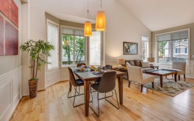
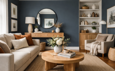
Plenty of blue paints look calm on a chip and turn cold or babyish on four walls. Behr Peaceful Blue holds up better than most because it is not a pure blue at all. Listed by Behr as color S470-3, it is a muted, dusty blue with a noticeable gray cast, the kind of color that reads as “blue” in daylight and as a soft blue-gray in the evening. That restraint is what makes it work in bedrooms, bathrooms and anywhere you want color without drama.
The gray content also explains why it is so easy to pair. Peaceful Blue sits comfortably next to crisp whites, warm creams, light wood floors and brushed metal finishes. It is a mid-light value rather than a pastel, so it has enough depth to show up on walls without darkening a room the way a navy or slate would.
- Behr Peaceful Blue at a Glance
- Undertones and How It Changes in Light
- Best Rooms for Peaceful Blue
- Coordinating Whites and Neutrals
- How It Compares With Similar Blues
- Painting Tips for a Smooth Finish
- Sampling Peaceful Blue Before You Commit
- Troubleshooting Common Problems
- Frequently Asked Questions
One caution before you buy: third-party paint databases list very different light reflectance values for this color, so do not rely on any single online number. Check the current chip or Behr’s color page, and always test a sample on your own wall.
Behr Peaceful Blue at a Glance
The quick-reference table covers what you need to know when deciding whether this color fits your room. The color code is the reliable identifier; the lightness is given as a range of practical expectations rather than an exact figure.
| Spec | Value | What it means |
|---|---|---|
| Brand and code | Behr Peaceful Blue, S470-3 | Use the code when ordering; other brands use similar names |
| Color family | Blue, blue-gray | Reads as a muted, dusty blue rather than a bright sky blue |
| Undertone | Gray, slightly cool | Calmer and more grown-up than a clean pastel blue |
| Lightness | Mid-light value (LRV commonly listed in the mid 40s; sources vary) | Visible color on walls without making rooms feel dark |
| Best rooms | Bedrooms, bathrooms, offices, laundry rooms | Spaces where a restful color helps |
| Best wall sheens | Matte or eggshell; satin in bathrooms | Soft look on walls, more moisture resistance in baths |
| Strip position | Third color on the S470 strip | Lighter and darker versions sit on the same strip |
Undertones and How It Changes in Light
Peaceful Blue gets its character from gray. Compared with a clean, saturated blue, it looks slightly smoky, and that softness is what keeps it from feeling icy. Light direction still matters a great deal.
- North-facing rooms: cool, indirect light pushes the gray forward. Expect a moody blue-gray, close to slate in late afternoon. Warm white bulbs help.
- South-facing rooms: strong warm light brings out the blue, and the color looks fresher and a touch brighter.
- East-facing rooms: bright and clear in the morning, grayer by evening.
- West-facing rooms: muted during the day, then warmer and softer in late sun.
- Artificial light: warm bulbs (around 2700K) soften the cool edge; daylight bulbs (5000K and up) can make it look stark and gray.
Because the color is mid-light rather than pale, it will look darker on a full wall than on a small chip. That surprises people who pick from a swatch under store lighting. Paint two coats of a sample patch, or use a peel-and-stick sample, and look at it at several times of day before committing.
Best Rooms for Peaceful Blue
Bedrooms
This is where the color shines. Muted blues are a long-standing bedroom favorite because they feel restful, and the gray in Peaceful Blue keeps the room from looking juvenile. Pair it with white bedding, natural linen, and light oak or walnut furniture. A matte or eggshell finish keeps the walls soft and hides minor drywall flaws.
Bathrooms
Peaceful Blue suits bathrooms with white tile, white or gray vanities, and chrome or brushed nickel fixtures. Use a satin or bathroom-specific finish for better moisture and mildew resistance, and run the exhaust fan during and after showers. In a small windowless bath, the gray side will dominate under artificial light, so test with your actual bulbs.
Home Offices and Laundry Rooms
The color is calm without being sleepy, which works in a workspace. In a laundry room it looks clean and fresh against white appliances.
Kitchens and Cabinets
On walls, it pairs well with white cabinets and butcher block. As a cabinet color it is lighter and softer than the navy and slate tones most people use on islands, so it suits cottage or coastal kitchens. Use a durable satin or semi-gloss cabinet enamel.
Exteriors
Behr lists many of its colors for both interior and exterior use. On siding, a muted blue-gray like this looks lighter in full sun than it does indoors, so test a large board outside before buying gallons.
Coordinating Whites and Neutrals
The easiest way to keep Peaceful Blue looking crisp is to frame it with the right white. Here is how the common options behave:
| Pairing | Effect | Best use |
|---|---|---|
| Clean, bright white trim | Sharp contrast, makes the blue look fresher | Modern, coastal, bathrooms |
| Soft warm white trim | Gentler contrast, cozier feel | Bedrooms, traditional homes |
| Light warm gray | Quiet, tone-on-tone look | Adjoining hallways and open plans |
| Deep navy accent | Adds depth and drama | Accent wall, island, front door |
| Natural wood and linen | Warms the cool undertone | Floors, furniture, textiles |
A useful trick is to pick a lighter color from the same S470 strip for a ceiling or adjoining room. It shares the same undertone, so the transition looks deliberate. For contrast, a darker strip mate can work on an accent wall or a set of built-ins.
How It Compares With Similar Blues
Paint matching sites point to several near-equivalents from other makers, such as Benjamin Moore Exhale and Cape Blue and Sherwin-Williams Respite. Those are useful for reference, but matches across brands are rarely exact. Each brand mixes with different colorants, and sheen changes how a color reads.
- Versus a clean pastel blue: Peaceful Blue is grayer and less sweet, better for adult bedrooms and baths.
- Versus a blue-green or aqua: it has less green, so it feels cooler and more classic, less tropical.
- Versus a true blue-gray or slate: it shows more blue and less gray, so it still reads as a color.
If you are trying to match an existing wall from another brand, bring a chip of the old paint to the store for a computer match rather than relying on a name.
Painting Tips for a Smooth Finish
- Prep the walls. Fill holes, sand patches smooth and wipe away dust. Wash bathroom and kitchen walls to remove grease and soap film.
- Prime when needed. Prime fresh drywall, patches and any dark previous color. A tinted primer helps a mid-tone blue cover evenly.
- Cut in first. Brush a band along ceilings, corners and trim before rolling.
- Roll in sections. Work in roughly 3 by 3 ft areas, keeping a wet edge to avoid lap marks.
- Apply two coats. Blues often look streaky after one coat. Respect the label’s recoat time.
- Box your paint. Mix all gallons together in a larger bucket so color is consistent across walls.
For budgeting, a typical 12 by 12 ft bedroom usually needs about 2 gallons for two coats on the walls. Interior paint generally runs from the mid-$30s to $70-plus per gallon depending on the product line, and hiring a painter for a single bedroom often lands in the low-to-mid hundreds, more with ceilings, trim and repairs.
Sampling Peaceful Blue Before You Commit
Mid-tone blues are the colors people most often repaint, usually because the wall looked darker or grayer than the chip. A careful sampling routine avoids that cost and frustration.
- Use large samples. A chip the size of a business card cannot show how a whole wall will look. Aim for at least 2 by 2 ft, or use peel-and-stick paint samples that you can move from wall to wall.
- Place samples on more than one wall. The window wall and the wall facing it can look like two different colors.
- Keep samples off the old color edge. Surround the sample with white paper or place it on a neutral board so the existing wall color does not distort your eye.
- Check at three times of day. Look in morning light, at midday and at night with the room’s lamps on.
- Compare with fixed finishes. Hold samples next to the floor, tile, countertops and bedding you plan to keep.
If the sample feels slightly too strong, step one shade lighter on the same strip rather than switching to a different blue altogether. The undertone will stay consistent, and the change in depth is often all you need.
Troubleshooting Common Problems
- It looks too gray. The room probably faces north or uses cool bulbs. Switch to warm white bulbs or consider a slightly cleaner blue.
- It looks too bright or “nursery.” Strong southern light can lift the blue. Darker trim, wood tones and textured fabrics ground it.
- Patchy or uneven color. Usually from skipping primer over patches or applying only one coat. Spot-prime and recoat.
- It looks different from a friend’s wall. Sheen, light direction and bulb temperature all change the color. Test in your own space.
Frequently Asked Questions
What color number is Behr Peaceful Blue?
Behr lists Peaceful Blue as color S470-3. Use that code when ordering so you get the right mix.
Is Behr Peaceful Blue a gray or a blue?
It is a muted blue with a gray undertone. It reads clearly as blue in good daylight and as a soft blue-gray in low or cool light.
What is the LRV of Peaceful Blue?
Most color databases list it in the mid 40s, though a few give higher figures, so treat it as a mid-light color: lighter than slate or navy, darker than a pastel.
What white goes with Peaceful Blue?
A clean, bright white gives crisp contrast for baths and coastal rooms. A soft warm white feels cozier in bedrooms and traditional spaces.
Is Peaceful Blue good for a bedroom?
Yes. Its gray undertone keeps it calm and restful, and it pairs easily with white bedding, linen and natural wood furniture.