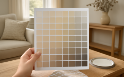
Standing in the paint aisle with 40 nearly identical beige chips is where good intentions go to die. The secret to picking from the vast range of Behr neutral paint colors is not finding the “best” beige or gray, it is understanding undertones and how the light in your specific room will pull them warm or cool. Behr, sold exclusively at The Home Depot, offers some of the most reliable neutrals in the mass market, and once you know what to look for, narrowing 40 chips down to two becomes quick work.
Part of our Paint & Walls guide — explore the full guide →
- Why Neutrals Are Harder Than They Look
- Behr’s Best Warm Neutrals
- Behr’s Best Greige and Cool Neutrals
- Soft Whites and Off-Whites
- How to Read Undertones Like a Pro
- Sampling Before You Commit
- Choosing the Right Finish
- Coordinating Neutrals Room to Room
- Common Neutral Paint Mistakes
- Putting It All Together
- Behr Paint Beige and Earthy Greige Picks
Why Neutrals Are Harder Than They Look
Neutrals seem safe, which is exactly why people get burned by them. A gray that looked perfectly balanced on the chip can turn lavender in north-facing light or greenish next to a lawn-facing window. Every off-white and greige carries a subtle undertone, and that hidden bias, not the surface color, determines whether the room feels cozy or cold once the walls are covered.
North-facing rooms receive cool, blue-tinted light that amplifies cool undertones, so warm neutrals counteract it beautifully. South-facing rooms flood with warm light that can push a beige toward yellow, making balanced greiges a smarter bet. Always test before you commit, because the room, not the store, gets the final vote.
Behr’s Best Warm Neutrals
Warm neutrals lean toward yellow, red, or brown undertones and make a space feel inviting. They shine in rooms that lack strong natural light or that face north.
- Swiss Coffee: a creamy, softly warm white that is arguably Behr’s most popular whole-home color; forgiving, cozy, and works on trim and walls alike
- Wheat Bread: a classic warm beige with a tan base, ideal for traditional living rooms and hallways
- Cornstalk: a light, buttery neutral that warms up dim spaces without going gold
- Almond Wisp: a barely-there warm white that reads clean but never stark
Warm neutrals pair naturally with wood tones, brass, and cream, making them a safe backdrop for traditional and transitional interiors.
Behr’s Best Greige and Cool Neutrals
Greige, the blend of gray and beige, has dominated interiors for a decade because it bridges warm and cool furnishings. Behr does greige exceptionally well.
- Silver Drop: a light, airy greige that leans slightly cool and works in nearly any room; a top seller for good reason
- Perfect Taupe: deeper and more grounded, excellent for accent walls or moody bedrooms
- Sculptor Clay: a mid-tone greige with subtle warmth that photographs beautifully
- Gray Cashmere: a soft, elegant gray-green that suits calm bedrooms and bathrooms
If your furnishings mix warm woods with cool metals, a balanced greige like Silver Drop or Sculptor Clay keeps the peace between them.
Soft Whites and Off-Whites
White is a neutral too, and Behr’s whites range from crisp to creamy. For trim and ceilings, a slightly cooler, cleaner white like Ultra Pure White gives a fresh, modern edge. For walls where stark white feels clinical, Swiss Coffee or Painter’s White softens the space while keeping it bright. A common designer move is painting walls in a warm off-white and trim in a cleaner white one or two steps lighter, which creates gentle contrast without harsh lines.
How to Read Undertones Like a Pro
The fastest way to spot an undertone is to compare a chip against a piece of pure white printer paper. Next to true white, the beige’s yellow, pink, or green bias jumps out immediately. Do this in the actual room, at different times of day, because the color you see at noon differs sharply from what you see under evening lamplight.
Pay attention to your fixed elements too. Flooring, countertops, and cabinets all carry undertones that either harmonize or clash with your wall color. A warm honey-oak floor fights a cool gray but sings next to a warm greige. Match the temperature of your neutrals to the temperature of your permanent finishes, and the whole room clicks into place.
Sampling Before You Commit
Never trust a two-inch chip for a whole-room decision. Behr sells eight-ounce sample jars for a few dollars, and that small investment prevents a costly mistake.
- Paint two coats on a two-by-two-foot patch, or on a white poster board you can move around the room
- Place samples on different walls, since light hits each wall differently
- Observe morning, midday, and evening under both natural and artificial light
- Live with the samples for at least two full days before deciding
Using a movable poster board is the pro trick, because you can hold it next to the sofa, the floor, and the trim without committing paint to the wall.
Choosing the Right Finish
Color is only half the decision; sheen matters just as much for how a neutral reads and wears. Flat and matte finishes hide wall imperfections and give neutrals a soft, sophisticated look, but they are harder to scrub. Eggshell is the popular all-purpose choice for living rooms and bedrooms, offering a slight glow and easier cleanup. Satin and semi-gloss belong in kitchens, bathrooms, and on trim, where moisture and scrubbing demand a tougher surface.
Behr’s Marquee and Dynasty lines carry one-coat coverage claims and strong stain resistance, which justify their higher price in high-traffic areas. For a guest room that rarely gets touched, the standard Premium Plus line covers well at a friendlier cost.
Coordinating Neutrals Room to Room
Choosing one great neutral is easy; making several rooms flow together is where people struggle. The professional approach is to build a whole-home palette around one primary neutral, then use lighter and darker versions of the same undertone in adjacent spaces. If your living room wears Silver Drop, an open kitchen might step up to a slightly lighter version and a bedroom to a slightly deeper one, keeping the same cool-greige undertone throughout. This creates a calm, cohesive feel as you move from room to room.
Trim and ceilings act as the connective tissue. Painting all the trim in one consistent white and all ceilings in the same shade ties disparate wall colors together, so even rooms with different neutrals feel like part of one home. Sight lines matter here; any two colors you can see at the same time, through a doorway or across an open floor plan, must share an undertone or they will visibly clash.
Common Neutral Paint Mistakes
The biggest mistake is skipping samples and trusting the chip, which leads to that heart-sinking moment when the “perfect” greige turns purple on the wall. A close second is ignoring undertones entirely and picking by name, assuming any “beige” or “gray” will do. Two grays with different undertones can look wildly different in the same room.
People also forget that lighting bulbs change everything. Warm 2700K bulbs push neutrals toward yellow and cozy, while cool 4000K bulbs pull them gray and crisp. Test your samples under the actual bulbs you use at night, not just daylight, because you live in these rooms after dark too. Finally, avoid choosing a wall color before your big furniture and flooring are set; the permanent finishes should lead, and the wall neutral should follow to complement them.
Putting It All Together
The right neutral disappears in the best way, letting furniture, art, and light take center stage while the walls quietly support them. Start by identifying your room’s light direction, then pick warm neutrals for cool rooms and balanced greiges for bright or mixed spaces. Sample generously, read undertones against white paper, and match your paint’s temperature to your floors and countertops. Do that, and the enormous range of Behr neutral paint colors stops being overwhelming and starts being a toolkit. Whether you land on the creamy comfort of Swiss Coffee or the modern calm of Silver Drop, testing in your own light is the single step that guarantees you love the result long after the roller dries.
Behr Paint Beige and Earthy Greige Picks
For a Behr paint beige that stays soft rather than yellow, start with a cream-based antique beige such as Varnished Ivory, then step deeper to a sandy tan or an earthy brown for accents. If you want beige with a gray edge, look for colors Behr files as gray or neutral rather than beige, since those carry the cooler undertone that reads as greige on the wall.
Beige and Earth Tones Compared
| Color | Code | How it reads | Good fit |
|---|---|---|---|
| Varnished Ivory | MQ3-40 | Light antique beige with a cream base | Whole-house walls, warm trim pairings |
| Gobi Desert | 710C-3 | Pale sandy tan; Behr groups it with its whites | Bright rooms where a white feels too stark |
| Pure Earth | PPU7-05 | Medium brown neutral | Accent walls, cabinets, exterior trim |
| French Colony | N480-4 | Listed by Behr as a gray | Cooler greige look; check the current color card |
Codes and names can change between collections, so confirm each one on Behr’s current color page or a fresh sample before buying.
Building a Beige Palette From Light to Deep
A beige scheme looks deliberate when the colors share an undertone. Varnished Ivory on walls with Gobi Desert in a hallway gives a gentle step without a visible jump. Pure Earth then works as the anchor: a kitchen island, a front door, or a bedroom wall behind the bed. Keep the trim in one consistent warm white so the beiges do not look dirty against a stark, blue-leaning white.
When Beige Needs to Lean Greige
Beige can look dated next to cool gray flooring, marble with gray veining, or black metal fixtures. In those rooms, choose a greige or a gray with a warm hint instead. French Colony is one option to sample; Behr renames colors from time to time, so search by the code N480-4 if the name does not come up.
Testing Beige Without Getting Pink or Green
- Hold the chip against your flooring and countertop, not just white paper, since those surfaces stay put.
- Compare two beiges side by side; one usually reveals a pink or green lean the other lacks.
- Check samples on the darkest wall, where beige tends to look muddy rather than warm.