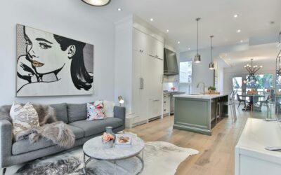
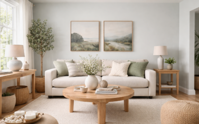
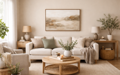
Taupe has a reputation for turning pink, purple or muddy once it hits the wall, and that fear keeps a lot of people stuck on plain beige. Behr Perfect Taupe (color number PPU18-13) is a safer bet than many taupes because it sits right in the middle: Behr files it in its neutral family and calls it a versatile greige. It reads as a warm, mid-tone neutral with a gentle rosy-beige warmth and enough gray to keep it from feeling yellow.
The short answer to the most common question: it leans warm, with a subtle pinkish-beige undertone that shows most in warm light, and it looks grayer in cool northern light. It is medium in lightness, so it adds more depth than an off-white without making a room feel dark.
- Behr Perfect Taupe Specs at a Glance
- Pink or Gray? The Undertone Breakdown
- How Behr Perfect Taupe Behaves in Different Rooms
- Best Trim and Accent Colors
- Testing Perfect Taupe at Home
- Flooring and Finishes That Suit It
- Comparing It With Nearby Neutrals
- Painting Tips and Troubleshooting
- General Cost to Paint a Room
- When to Call a Professional
- Frequently Asked Questions
Behr Perfect Taupe Specs at a Glance
Behr publishes the color as PPU18-13 with an RGB value of #B6ACA0 (182, 172, 160). Color databases agree on an LRV of about 42, which matches that RGB value.
| Spec | Value | What it means |
|---|---|---|
| Color name and number | Perfect Taupe, PPU18-13 | Order by number to get the correct formula |
| Published RGB / hex | #B6ACA0 | A mid-tone warm neutral on screen |
| Approximate LRV | About 42 | Medium: noticeably deeper than a typical off-white |
| Behr color family | Neutral (described as a greige) | Mix of beige warmth and gray restraint |
| Undertone | Warm, slightly rosy beige | Can lean pink in warm light, grayer in cool light |
| Product availability | Interior paint plus some exterior stain products | Usable inside and on some exterior wood surfaces |
| Best uses | Living rooms, bedrooms, hallways, exteriors | A whole-house neutral with more depth than white |
An LRV in the low 40s puts it squarely in mid-tone territory. Light reflectance value runs from 0 for black to 100 for pure white. A color around 42 reflects enough light to keep a well-lit room bright, but it will look noticeably deeper in a dim space and it will contrast clearly with white trim.
Pink or Gray? The Undertone Breakdown
Break apart the published color value and the red channel is a little higher than green, with blue lowest. That is the classic warm-taupe recipe. The red edge is what people perceive as a pink or rosy cast; the overall low saturation is what keeps it reading as greige instead of beige.
When it leans pink
- In warm, low afternoon sun from the west.
- Under warm incandescent-style bulbs (2700K).
- Next to red-toned woods such as cherry, or near terracotta and blush fabrics.
- Beside cool, stark white trim, which makes any warm color look warmer by contrast.
When it leans gray
- In cool, indirect north light.
- Under daylight bulbs (4000K to 5000K).
- Near gray flooring, gray tile, black metal and chrome.
- Next to soft greige or putty-colored adjacent walls.
If a pink cast is your main worry, the fix is simple: pair it with green-leaning or neutral decor (olive, sage, charcoal) and use slightly cooler bulbs. Those choices neutralize the rosy side and let the gray come forward.
How Behr Perfect Taupe Behaves in Different Rooms
Living rooms. This is where the color shines. Its medium depth gives walls a cozy, finished look, and it works with almost any upholstery. In a bright south-facing room, it can carry every wall.
Bedrooms. A warm taupe feels calm and enveloping. Pair it with crisp white bedding and natural textures. In a small, dark bedroom, keep it to an accent wall or choose a lighter step on the same color strip.
Hallways and open plans. Because it is neutral, it flows well from room to room. In windowless halls, add warm overhead lighting so it does not look flat.
Kitchens and baths. It suits white cabinets and warm wood vanities. With gray or cool marble-look counters, test carefully: the contrast can push the wall pinker.
Exteriors and stained wood. Behr offers the color in some exterior stain products as well as paint. Sun washes out exterior colors, so a mid-tone taupe often reads lighter on siding than it does on a chip.
Best Trim and Accent Colors
Behr’s color pages pair Perfect Taupe with coordinating colors, including a foggy blue-gray, and its palettes tend to combine the taupe with blues, greens and soft neutrals. Check the current coordinated palette on Behr’s site for exact picks. In general terms, these pairings work:
- Warm, soft whites on trim give a gentle, classic look and minimize the pink.
- Clean, bright whites create sharper contrast for a crisper style, though they make the warmth more noticeable.
- Foggy blue-grays on a ceiling, bedroom or adjoining room balance the warmth nicely.
- Sage and olive greens calm the rosy side and suit natural, earthy rooms.
- Charcoal or soft black on doors, window sashes and railings adds structure.
- Navy for an accent wall or furniture gives a tailored, traditional pairing.
For trim sheen, satin or semi-gloss works for doors and baseboards. Eggshell is the usual wall sheen for living areas, with satin in kitchens and baths.
Testing Perfect Taupe at Home
Taupe is the color family where sampling matters most, because flooring and light can change it so much. Peel-and-stick paint sample swatches make testing quick and clean: move them to every wall and check them through the day without painting test squares.
- Place swatches on the brightest and darkest walls, at eye level.
- Hold one directly against your trim, flooring and countertop.
- Look in morning, midday and evening light, and again at night under your bulbs.
- Compare with one lighter and one darker step on the same strip.
- Give yourself two or three days before deciding.
Flooring and Finishes That Suit It
Warm neutral walls like this one pair easily with most floors, but some combinations look better than others. Medium oak, hickory and walnut look rich against Behr Perfect Taupe. Light gray floors push the walls toward gray, which helps if you want to suppress the pink. Cream carpet and warm-toned tile keep the room cozy. For counters, white and warm marble-look surfaces work well, while very cool gray stone can bring out the rosy side.
Comparing It With Nearby Neutrals
| Option | How it differs | Choose it if |
|---|---|---|
| Behr Perfect Taupe (PPU18-13) | Mid-tone, warm rosy greige | You want depth and warmth without yellow beige |
| A lighter step on the same strip | Same undertone, more reflective | Rooms are small, dim or north-facing |
| A deeper taupe or mushroom | Darker, richer, more dramatic | You want an accent wall or a moody den |
| A green-leaning greige | Less pink, more gray-green | You want to avoid any rosy cast |
| A warm beige | More yellow, less gray | Your home has golden oak and warm stone |
Painting Tips and Troubleshooting
- Spot-prime patches so they do not flash through as dull areas.
- Apply two full coats for even color and sheen.
- Mix all your cans together before you start so every wall matches.
- Keep a wet edge and finish each wall before taking a break.
If it looks too pink: switch to slightly cooler bulbs, swap a stark white trim for a softer white and add green or gray accents. If it looks too dark: improve lighting or step one shade lighter. If it looks muddy: add contrast with clean trim and a few darker accents so the eye reads the taupe as intentional.
General Cost to Paint a Room
A gallon of interior paint usually covers about 250 to 400 sq ft per coat. A 12 by 14 foot room with 8 foot ceilings typically needs about 2 gallons for two coats on the walls, plus a quart or so of trim paint. Paint costs fall in moderate per-gallon ranges that rise for premium lines. Professional painting for a room of that size commonly runs a few hundred dollars up to more than a thousand, depending on prep, ceiling height, trim and your region.
When to Call a Professional
Hire a painter for two-story stairwells, high ceilings and any exterior work beyond a single story. In homes built before 1978, test existing paint for lead before sanding or scraping and follow lead-safe practices. A pro also makes sense for whole-house repaints where consistent cut lines and sheen across many rooms matter.
Frequently Asked Questions
Does Behr Perfect Taupe look pink?
It has a warm, slightly rosy beige undertone that can show as pink in warm light or next to red-toned wood. In cool light and with gray or green decor it reads more like a neutral greige.
Is Perfect Taupe gray or beige?
It is a greige, a mix of both. Behr places it in its neutral family and describes it as a versatile greige, with more warmth than a true gray.
What is the LRV of Behr Perfect Taupe?
About 42, a medium value consistent with its published RGB code.
What color number is Behr Perfect Taupe?
It is PPU18-13. Use the number at the paint counter to make sure the right formula is mixed.
What trim color goes with Perfect Taupe?
Soft warm whites keep the look gentle and limit the pink cast. Crisp whites give more contrast. Charcoal works well on doors and window sashes.
Is Perfect Taupe too dark for a small room?
It is a medium tone, so in a small or dim room it can feel enclosing. Use it on one wall, improve lighting, or choose a lighter step on the same color strip.