Warm neutrals are easy to love on a chip and surprisingly easy to get wrong on a wall, where a soft beige can turn peach, pink or yellow depending on the light. Behr Natural Almond is a light, creamy tan with the code PPU4-12, and the maker files it in the yellow color family. Its RGB value is #DED2BB, which puts it squarely between a warm off-white and a classic beige.
That placement is the whole appeal. It is light enough to brighten a room, warm enough to feel cozy and muted enough to sit quietly behind furniture, wood floors and art. The maker describes it as a creamy tan that brings a relaxed, comfortable feel to a space.
Behr Natural Almond Spec Table
The color name, code, family and RGB value come from the manufacturer’s color listing. The light reflectance value of about 65 is the figure most color databases agree on.
| Spec | Value | What it means |
|---|---|---|
| Color name | Natural Almond | Name printed on the chip and can label |
| Color code | PPU4-12 | Give this code at the tint counter to avoid similar beiges |
| Color family | Yellow | Warm base; reads as tan or beige rather than gray |
| RGB / hex | #DED2BB | Red highest, blue lowest, which signals a warm color |
| Light reflectance (LRV) | About 65 | Light to mid-light; bounces back plenty of light |
| Maker’s description | Creamy tan | Soft, relaxed warm neutral |
| Typical role | Whole-room wall color | Works as a main neutral rather than an accent |
Like most of the brand’s colors, it can be tinted into interior and exterior paint lines in a range of finishes. The finish you choose changes how it looks: flat and matte read softer and slightly darker, while satin and semi-gloss reflect more light and look a touch brighter.
Undertone Check: Yellow, Not Pink
The biggest question with any beige is which way it leans. Behr Natural Almond leans warm yellow. In the hex code, red and green are close and blue is noticeably lower, which is the signature of a yellow-beige. It does not carry the pink or peach undertone that makes some older beiges look dated, and it does not go green the way some greiges do.
How to confirm the undertone at home
- Put a large swatch on a sheet of plain white printer paper. The contrast reveals the undertone; here, the swatch should look gently golden.
- Compare it to a known gray swatch. Next to gray, the almond will look clearly warmer and creamier.
- Hold it against your trim, floor and countertop. Undertones that clash with fixed finishes are the most common reason a paint color feels off.
How it shifts by light
- North light: cool daylight tones down the yellow, and it reads as a soft, muted beige.
- South light: warm sun brings out the cream and gold; it can look close to a warm off-white at midday.
- East and west light: changes through the day, glowing in direct sun and looking deeper in shade.
- Warm LED bulbs (2700K to 3000K): cozier and more golden in the evening.
- Daylight bulbs (5000K): cleaner, closer to a neutral tan.
Best Rooms for Behr Natural Almond
Because it is a soft, warm neutral, Behr Natural Almond works in most rooms. It is especially effective where you want warmth without committing to a stronger color.
Living rooms and family rooms
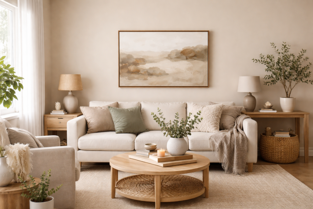
It creates a relaxed backdrop for upholstered furniture, wood tones and layered textiles. In north-facing rooms that feel chilly with cool whites or grays, it adds welcome warmth.
Bedrooms
The creamy tone feels calm and restful. Pair it with linen bedding, oak or walnut furniture and woven textures.
Dining rooms
It holds up well next to a deep navy, a good sign that it can stand beside a saturated dark. Use the navy on a lower wall or built-in and the almond on the upper wall, or reverse them for a dramatic look.
Kitchens and baths
It suits kitchens with cream, white or wood cabinets and warm stone or butcher block counters. In bathrooms, it pairs well with travertine-look tile, warm white fixtures and brass or bronze finishes. Use a satin or semi-gloss finish in wet areas for easier cleaning.
Exteriors
On siding it reads as a soft, sandy tan, especially in full sun. It suits traditional, coastal and Mediterranean-style homes. Sample it outside, since daylight washes light colors out considerably.
Trim and Accent Pairings
Behr Natural Almond is easiest to pair with colors that share its warmth. Very cool, blue-white trim can make it look yellower than you expect, so most people prefer a soft or warm white.
| Pairing | Effect | Where it works |
|---|---|---|
| Soft warm white trim | Gentle contrast, cohesive | Whole-house trim and doors |
| Bright neutral white | Crisper definition | Modern rooms, cabinets |
| Deep navy | Rich, classic contrast | Dining rooms, islands, front doors |
| Sage or olive green | Earthy, natural | Kitchens, bedrooms, exterior shutters |
| Terracotta or rust | Warm and sunny | Accents, textiles, pottery |
| Warm charcoal or brown | Grounding | Exterior trim, accent walls, doors |
For the ceiling, a warm white or a ceiling tinted to a fraction of the wall strength keeps the room cohesive. Peel-and-stick paint sample swatches make it easy to test two or three trim whites against the wall color before you buy gallons.
Flooring that suits it
Medium oak, honey-toned hardwood, warm wood-look vinyl plank and travertine or beige tile all sit comfortably with this color. Very gray or ash-washed floors can clash with its yellow base; if you have them, test carefully and lean toward a slightly more neutral trim white to bridge the two.
Natural Almond Compared With Other Warm Neutrals
It helps to know where this color sits among the warm neutrals you might be weighing. Compared with a warm off-white, it has noticeably more body and will read as a color on the wall, not as a white. Compared with a mid-tone beige or tan, it is lighter and airier, so it keeps a room feeling open. Compared with a greige, it is clearly warmer, with none of the gray that cools greige down in north light.
That middle position makes it a good choice for whole-house color in homes with mixed light. A shade that looks right in a sunny south room and a shaded north hallway is rare, and creamy tans with a gentle yellow base tend to stay pleasant in both. If you find it slightly too strong, ask the paint counter about mixing it at a reduced strength, which lightens the color while keeping the same undertone.
How to Test and Paint It
- Sample on more than one wall. Light neutrals change the most from wall to wall as the light shifts.
- Look at it for two days. Check morning, afternoon and evening with your normal bulbs on.
- Prep the surface. Clean, patch and sand glossy areas lightly so the new paint bonds.
- Prime when needed. Over dark or strong colors, use a white primer to get true color in two coats.
- Cut in and roll. Cut in corners and edges first, then roll in sections, keeping a wet edge.
- Apply two coats. Even light colors look richer and more uniform with a second coat.
Troubleshooting
- It looks too yellow: often caused by warm bulbs or orange-toned floors reflecting onto walls. Try a slightly cooler bulb or a more neutral trim white.
- It looks flat or dull: step up from flat to eggshell for a little more light bounce.
- Patchy finish: usually from uneven coverage or skipped primer over spackle. Spot-prime patches and add a full coat.
- It clashes with existing beige tile: compare undertones; a pink-based tile next to a yellow-based paint is a common mismatch.
Costs and When to Call a Painter
One gallon covers roughly 250 to 400 square feet per coat, depending on the surface. A typical bedroom often takes two gallons for two coats on the walls. Interior painting by a professional usually runs a few hundred dollars to a few thousand per room depending on size, prep and trim work.
Call a painter for high ceilings, stairwells, full exteriors or homes built before 1978, where old paint may contain lead and any sanding or scraping should follow lead-safe practices. For a single room, Behr Natural Almond is a forgiving DIY color: light enough to cover well, warm enough to make a space feel finished.
Frequently Asked Questions
What is the color code for Behr Natural Almond?
Its code is PPU4-12. Use the code when ordering, since several similar warm beiges have close names.
Does Behr Natural Almond have pink undertones?
No. It leans warm yellow, and the maker places it in the yellow color family. It reads as a creamy tan rather than a pinkish beige.
Is Natural Almond a white or a beige?
It is a light beige or tan, not a white. In bright south light it can look close to a warm off-white, but next to true white trim it clearly reads as a color.
What white trim goes with Behr Natural Almond?
A soft warm white is the most cohesive choice. A bright neutral white works for a crisper look, while very cool blue-whites can make the walls look more yellow.
What is the LRV of Behr Natural Almond?
Most color databases list it at about 65, a light color that still has visible body on the wall.