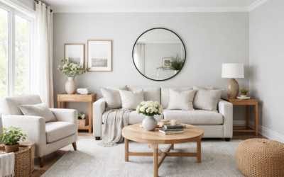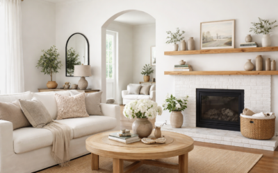
Plenty of homeowners pick a “warm white” and are surprised when it looks yellow once two coats are on the wall. Behr Cottage White is a warm white by design, so it pays to know exactly how warm before you buy gallons. Behr lists it as color number 13 in its white color family and describes it as a white with unmistakable honey-gold notes, like a picket fence in a country setting catching the sun. The hex value Behr publishes for its digital swatch is #F3E9D6, a soft, creamy off-white.
In a room, that translates to a cozy, creamy white that never feels sterile. It flatters warm wood, brick, and vintage-style finishes and makes a room feel lived-in. It is not the right pick if you want a crisp gallery white or a cool, modern look.
- Behr Cottage White at a Glance
- Understanding the Honey-Gold Undertone
- Rooms Where Cottage White Works Best
- Pairings: Trim, Accents and Coordinating Colors
- Cottage White Compared With Near Colors
- How to Test Before You Commit
- Sheen, Coverage and Application
- Troubleshooting Common Complaints
- When to Call a Pro
- Frequently Asked Questions
Behr Cottage White at a Glance
These details come from Behr’s own color listing where available. Where Behr’s published number could not be confirmed, the spec is described qualitatively, so check the current color card or Behr’s site before you rely on an exact figure.
| Spec | Value | What it means |
|---|---|---|
| Color number | 13 | The code to give the paint counter for the exact formula |
| Color family | White | Reads white overall, but noticeably warm |
| Undertone | Honey-gold (warm) | Leans yellow-cream; glows in warm light |
| Digital hex | #F3E9D6 | Useful for mood boards only; screens do not match paint exactly |
| Light reflectance | Very light; color databases list an LRV of roughly 81 to 86 | Reflects most light; good for brightening rooms |
| Suggested use | Interior and exterior | Works on walls, trim, cabinets and siding |
| Name confusion | A separate Behr color, 1813, is also named Cottage White | Always order by number, not name |
That last row matters. Behr has used the Cottage White name on more than one color number over the years, and third-party paint databases list both 13 and 1813. They are not the same formula. If you are matching an existing wall, look for the number on the old can lid or ask the store to scan a chip.
Understanding the Honey-Gold Undertone
Every white has an undertone. Cool whites lean blue or gray; neutral whites lean almost nowhere; warm whites lean yellow, cream, pink or beige. Behr Cottage White leans yellow-gold, which is why Behr’s own undertone guidance places it among warm whites.
North-facing rooms
Cool northern light tones down the gold, so the color reads as a soft cream rather than yellow. This is actually one of the best placements for it, because warm whites keep north rooms from feeling gray and flat.
South-facing rooms
Strong, warm southern light amplifies yellow. Expect Cottage White to look buttery in afternoon sun. If you love that glow, great; if not, a more neutral white may suit a sunny room better.
East and west light
East rooms will look warmest in the morning and more neutral later. West rooms shift the other way. Check samples at the hours you use the room most.
Artificial light
Under 2700K bulbs, the honey tone deepens. Under 3000K to 3500K it reads as a balanced cream. Very cool 5000K bulbs can make warm whites look slightly dingy, so pair this color with warm or soft white bulbs.
Rooms Where Cottage White Works Best
- Living rooms and family rooms: Warm whites make large spaces feel welcoming, especially with wood floors and textured fabrics.
- Bedrooms: The creamy tone is restful and pairs well with linen and natural wood.
- Kitchens: On cabinets it gives a farmhouse or vintage look, particularly with butcher block counters, brass hardware or warm stone.
- Exteriors: Behr rates it for interior and exterior use, and its soft warmth gives both traditional and modern homes an inviting look. It suits cottages, bungalows, and farmhouse siding with dark trim or natural wood accents.
- Trim in warm rooms: If your walls are a warm beige, greige or earthy color, Cottage White can serve as a softer trim than a bright white.
It is less successful next to cool gray tile, blue-gray stone, or crisp white quartz, where the gold undertone can make it look yellowed by comparison. Test it beside any fixed white surfaces first.
Pairings: Trim, Accents and Coordinating Colors
Cottage White is easiest to live with alongside soft greige, muted blue and warm brown tones; check Behr’s color detail page for its current coordinating colors. A few practical pairing ideas:
- Walls in Cottage White, trim in the same color at a higher sheen: A low-contrast, cohesive look that suits traditional homes.
- Warm greige walls with Cottage White trim: The trim reads clean without the stark contrast of a pure white.
- Muted blue or sage accents: Cool-leaning muted colors balance the warmth so the room does not feel too yellow.
- Deep charcoal, black or dark green doors and shutters: Strong contrast against a cream exterior looks classic.
- Natural wood: White oak, pine and walnut all look rich against the creamy base.
Avoid pairing it with a very bright, cool white on adjacent trim. Side by side, the cool white makes Cottage White look darker and more yellow than it is.
Cottage White Compared With Near Colors
Plenty of whites are in the same neighborhood. Comparing Behr Cottage White with a few common alternatives helps clarify where it sits. Descriptions are general; always compare physical samples.
| Option | How it compares | Choose it if |
|---|---|---|
| Cottage White (13) | Warm cream with honey-gold notes | You want a cozy, traditional white |
| A warmer antique-style white | Typically deeper and more beige-cream | You want more color and a vintage look |
| A soft neutral white | Less yellow, more balanced | Your room gets strong southern light |
| A crisp, cool white | Clean with a slight blue or gray cast | You prefer modern, high-contrast spaces |
| Cottage White (1813) | A different Behr formula sharing the name | You are matching an existing 1813 wall |
How to Test Before You Commit
- Use large samples. A paint sample swatch kit or peel-and-stick sheets give you realistic, movable samples.
- Place samples against white references. Hold them next to a sheet of plain printer paper and your existing trim to see the undertone clearly.
- Test on multiple walls. Window wall and darkest wall.
- Check morning, afternoon and evening. Include your normal lamps at night.
- Compare against fixed finishes. Counters, tile, floors and cabinet colors will not change, so the paint has to work with them.
- Wait a day or two. Whites often look different after your eyes adjust to the room.
Sheen, Coverage and Application
Sheen changes how a warm white reads. Matte and flat finishes soften the color and hide imperfections. Eggshell is a common choice for walls, offering more washability. Satin and semi-gloss reflect more light, making the color look a touch brighter, and they are better for trim, doors and cabinets.
Whites generally need two coats for even coverage. Over a dark color, prime first with a white or lightly tinted primer. On bare wood, knotty pine or stained surfaces, use a stain-blocking primer, otherwise tannins can bleed through a light cream and leave yellow-brown spots. For exteriors, use an exterior-rated paint and follow the label on temperature and humidity.
Interior paint typically ranges from the mid-$20s to $70 or more per gallon depending on product line and sheen. A 12 by 14 foot room usually takes about two gallons for two wall coats. Prices vary by store and change over time.
Troubleshooting Common Complaints
- “It looks yellow.” Strong southern light or very warm bulbs. Try 3000K bulbs, or choose a more neutral white for that room.
- “It looks dingy.” Usually a cool white nearby or cool-toned bulbs. Remove the competing white or warm up your lighting.
- “There are yellow spots on my trim.” Tannin bleed or water stains. Spot-prime with a stain-blocking primer and repaint.
- “The touch-ups do not match.” Different sheen or a different color number. Confirm you have number 13 and the same sheen, then repaint wall to wall.
When to Call a Pro
Consider a professional painter for exteriors, multi-story work, high ceilings, stairwells and cabinets, where spray finishes look noticeably better. For ladder work, keep three points of contact and set the ladder on firm, level ground; hire out anything two stories or higher. In homes built before 1978, test existing paint for lead before sanding or scraping and follow lead-safe practices or hire a certified contractor.
Used in the right light and with the right partners, Behr Cottage White gives a home a warm, welcoming base that feels classic rather than trendy.
Frequently Asked Questions
What undertone does Behr Cottage White have?
It has a warm, honey-gold undertone. Behr describes it as a white with unmistakable honey gold notes.
Is Behr Cottage White yellow?
It is a cream-leaning warm white, so it can look yellow in strong southern light or under very warm bulbs. In north light it reads as a soft cream.
What is the color number for Cottage White?
The color covered here is Behr number 13. Behr also has a separate color numbered 1813 with the same name, so always order by number.
Can I use Cottage White on exterior siding?
Yes. Behr presents it as suitable for exterior use, and it looks classic on cottage, farmhouse and traditional homes with darker trim or shutters.
What colors go with Behr Cottage White?
Warm greige, muted blue, sage, warm browns and deep charcoal or black accents all pair well. Behr’s color detail page lists its current coordinating colors.
Is Cottage White good for kitchen cabinets?
Yes, especially in farmhouse or traditional kitchens. Use a satin or semi-gloss cabinet-grade finish, and prime bare wood with a stain-blocking primer.