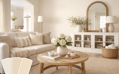
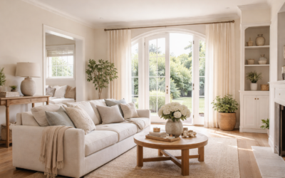
Plenty of people pick a white from a tiny chip, paint a whole room, and then wonder why the walls look like pale oatmeal by dinner. Behr Crisp Linen (color code MQ3-13) is one of those colors that rewards a little homework. It sits right on the line between a warm off-white and a very light beige, and Behr itself describes it as a true beige and a perfect neutral, so the light in your room decides which side of that line you see.
In bright, south-facing rooms it reads as a soft, creamy white with no obvious color. In dim or north-facing rooms the beige comes forward and it looks more like a pale linen fabric, which is exactly where the name comes from. If you want a warm, quiet wall color that won’t feel stark or clinical, it is a strong candidate. If you want a crisp, gallery-style white, it will likely look too warm.
- Behr Crisp Linen at a Glance
- Undertones: Why It Looks White in One Room and Beige in Another
- How Behr Crisp Linen Reads in North vs South Light
- Trim, Cabinet and Accent Pairings
- How to Test the Color Before You Paint
- Sheen and Product Choices
- Troubleshooting: When Crisp Linen Looks Wrong
- When to Call a Pro
- Frequently Asked Questions
Here you will find the confirmed specs, how the color behaves in different light, which trim and cabinet colors work with it, and how to test it before you commit.
Behr Crisp Linen at a Glance
| Spec | Value | What it means |
|---|---|---|
| Color code | MQ3-13 | Use this code at the paint desk to avoid mix-ups with similarly named colors |
| Hex (screen approximation) | #E7E1D3 | A warm, slightly yellow-beige off-white on screen |
| Color family | Off-white / light beige | Behr describes it as a true beige and a perfect neutral |
| Undertone | Warm (beige, slight yellow) | Pairs best with warm woods, brass and creamy trim |
| LRV | About 75 | Light; keeps rooms bright but is clearly deeper than a bright white |
| Best rooms | Living rooms, bedrooms, hallways | Warm, restful spaces where a stark white would feel cold |
| Similar color from another maker | Sherwin-Williams Nacre (SW 6154) | Color-matching databases list it as a very close visual match |
A note on LRV: light reflectance value tells you how much light a color bounces back on a scale from 0 (black) to 100 (pure white). Crisp Linen works out to about 75 from Behr’s published color data. A few third-party sites list higher numbers, so check the paint chip if the exact figure matters for your project. What is clear from every source is that this is a light color that keeps rooms bright.
Undertones: Why It Looks White in One Room and Beige in Another
Every off-white has an undertone, and Crisp Linen’s is warm. On screen and on the chip, the red and green channels sit slightly above blue, which pushes it toward yellow-beige. That warmth is gentle, not golden, so it rarely turns peach or pink the way some cream whites do.
Put it next to a clean, bright white and the beige becomes obvious. Put it next to a cool gray or a blue-leaning white and it looks almost tan by contrast. Put it alone on four walls and your eye adjusts, so most people simply see a soft, warm white. That last point matters: judge it on a large sample on the wall, not next to a stack of other chips.
Compared with similar warm whites
Against brighter neutral whites, Crisp Linen has more body and depth. Against creamier, more yellow whites, it looks a little more restrained and slightly grayed. Color-matching tools pair it closely with Sherwin-Williams Nacre (SW 6154), so if you have a sample of that color on hand you already know roughly what to expect. Paint chemistry and sheen still shift the result, so do not treat any cross-brand match as identical.
How Behr Crisp Linen Reads in North vs South Light
| Room exposure | How it looks | Tip |
|---|---|---|
| North-facing | Deeper, more beige, a touch gray in the afternoon | Use warm-white bulbs (around 2700K to 3000K) to keep it cozy |
| South-facing | Bright, creamy off-white; beige mostly disappears | Great choice; it softens harsh midday glare |
| East-facing | Warm and glowing in the morning, flatter later | Test at 8 a.m. and 4 p.m. before deciding |
| West-facing | Neutral early, golden in late-day sun | Pair with cooler trim if evenings look too yellow |
| Low-light rooms (halls, basements) | Light beige to pale greige | Choose a satin or eggshell sheen to bounce more light |
North light is cool and indirect, so it pulls out the gray in warm colors. That is why Crisp Linen can look a shade darker and more beige in a north bedroom than on the chip. South light is warm and strong, and it tends to wash the color toward a soft white. If your main living space faces north and you want it to read clearly white, test a brighter neutral alongside it.
Bulb color matters as much as window direction. Daylight bulbs (5000K and above) make warm whites look flat and slightly gray. Warm-white bulbs flatter the color and bring back its linen softness.
Trim, Cabinet and Accent Pairings
Trim
The simplest approach is to use Crisp Linen on walls and a cleaner white on trim. A bright neutral white, such as Behr’s Ultra Pure White, gives a crisp edge that makes the wall color look intentionally warm. For a low-contrast, soft look, paint the trim in Crisp Linen too, in a semi-gloss sheen, so the difference comes from the sheen alone.
Kitchen cabinets
Crisp Linen works on cabinets when the kitchen has warm wood floors, butcher-block counters or brass hardware. It also pairs well with creamy quartz and warm marble-look surfaces. Avoid putting it next to very cool, blue-white countertops, where it can look dingy by comparison.
Accent colors
- Muted greens like sage and olive feel natural against the beige undertone.
- Warm grays and greiges create a layered neutral scheme.
- Navy and deep charcoal on an island or front door give strong contrast without clashing.
- Terracotta and clay tones echo the warmth for a relaxed, earthy look.
Floors
Mid-tone oak, hickory and warm-toned luxury vinyl plank all sit comfortably with it. Very gray or ash-washed floors can make the walls look yellow, so bring a floor sample to your paint test.
How to Test the Color Before You Paint
- Get a large sample. Peel-and-stick paint sample swatches or a painted poster board at least 12 by 12 inches give a far more accurate read than a chip.
- Place it on several walls. Put one sample on the wall with the most light and one on the darkest wall.
- Check it at three times of day. Morning, midday and evening with lamps on.
- Compare against your fixed finishes. Hold it next to flooring, countertops, tile and trim.
- Live with it for two or three days before buying gallons.
Sheen and Product Choices
Behr Crisp Linen can be tinted in Behr’s interior and exterior lines, and the sheen changes how warm it looks. Flat and matte finishes hide wall flaws and make the color look softer and slightly deeper. Eggshell and satin reflect more light and read a bit brighter, and they scrub better in hallways and kids’ rooms. Semi-gloss suits trim, doors and cabinets. Check the store’s current product list for which sheens are available in each line.
Coverage over a previous dark color usually takes a tinted primer plus two finish coats. Over an existing light neutral, two coats of a paint-and-primer product generally cover well.
Troubleshooting: When Crisp Linen Looks Wrong
- Looks too yellow: Your bulbs may be very warm, or a cool white trim is exaggerating the contrast. Try a softer trim white or slightly cooler bulbs.
- Looks gray or dingy: Common in north light or next to cool white countertops. Brighten the room’s lighting or consider a cleaner white.
- Looks patchy: Uneven sheen from touch-ups or a skipped primer coat. Repaint the full wall from corner to corner.
- Doesn’t match the chip: Confirm the code (MQ3-13) on the can label and compare in the same light.
When to Call a Pro
Most rooms are a reasonable DIY job. Consider a professional painter for stairwells and tall foyers, for cabinets where a sprayed finish makes a difference, or for whole-house repaints where a consistent sheen across rooms matters. Pros generally charge a few dollars per square foot of wall area, with cabinet refinishing priced per door or per kitchen. If the home was built before 1978, test existing paint for lead before sanding.
Frequently Asked Questions
Is Behr Crisp Linen white or beige?
It sits between the two. Behr describes it as a true beige, but in bright light most people see it as a soft, warm off-white.
What is the color code for Behr Crisp Linen?
The color code is MQ3-13. Use it when ordering to avoid confusion with other colors that have “linen” in the name.
Does Crisp Linen look yellow?
It has a gentle warm, slightly yellow undertone, but it rarely looks obviously yellow unless it sits next to a stark cool white or under very warm lighting.
What trim color goes with Behr Crisp Linen?
A clean, bright neutral white gives crisp contrast. For a softer look, use Crisp Linen itself on trim in a semi-gloss sheen.
Is Crisp Linen good for a north-facing room?
It can work, but expect it to read more beige and slightly deeper. Test a large sample and use warm-white bulbs to keep it from looking gray.