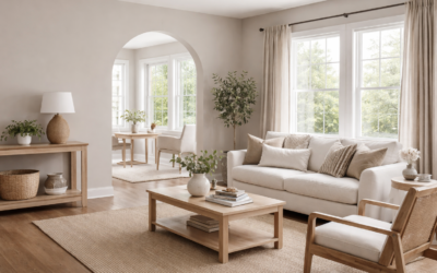
Beige has a reputation for turning yellow or pink once it hits the wall, which is why so many people now shop for “greige” instead. Valspar Warm Putty lands right on that line. It is a light neutral, color code 6006-1A, that the maker lists in its neutral family with a warm undertone and a light reflectance value (LRV) of about 64.8. On the wall it reads as a soft, slightly earthy beige with enough gray to keep it from looking dated.
That combination makes it a flexible whole-house color. It is light enough for rooms with average daylight, warm enough to feel cozy, and muted enough to sit next to white trim, wood floors and stone without fighting them. The main things to plan for are how it shifts in north light and which whites you pair with it.
- Valspar Warm Putty Specs at a Glance
- Undertones: Beige, Greige or Taupe?
- North vs South Light
- Best Rooms and Uses
- Coordinating Colors and Near-Color Comparisons
- Decorating Around Warm Putty
- How to Test Valspar Warm Putty
- Painting Tips and Finish Choices
- Troubleshooting
- General Cost Ranges
- When to Call a Pro
- Frequently Asked Questions
Valspar Warm Putty Specs at a Glance
These figures come from the manufacturer’s color page. Digital swatches vary by screen, so always test a physical sample on your own walls.
| Spec | Value | What it means |
|---|---|---|
| Color code | 6006-1A | Use this number when ordering to avoid mix-ups |
| LRV | About 64.8 (listed as 64.797) | Light, but not a white; reflects about two-thirds of light |
| Color family | Neutral | Works as a background color for most decor |
| Undertone | Warm | Leans beige and soft taupe rather than cool gray |
| RGB / HEX | 218, 210, 197 / #DAD2C5 | Useful for digital mockups only, not exact matching |
| Coordinating colors listed by the maker | Dove White 7002-7, Frappe 6003-1B, Wet Pavement 5006-2A | A white, a deeper neutral and a mid-tone gray accent |
Undertones: Beige, Greige or Taupe?
Warm Putty is best described as a warm greige that leans beige. The RGB values show red slightly higher than green and green higher than blue, which is the classic recipe for a warm neutral. The gray content keeps the color from going golden, and in most rooms it shows no strong pink, green or yellow cast.
Undertones show up more when you put the color next to something. Against a stark, cool white, Warm Putty looks clearly beige. Against a creamy white, it looks grayer and more taupe. Next to oak floors or cabinets with orange tones, it can look slightly cooler than you expect, which is often a good thing because it balances the wood.
LRV in Plain Terms
LRV runs from 0 (black) to 100 (pure white). At roughly 64.8, Warm Putty sits in the light range, so it will not make a room feel dark, but it has enough depth to give white trim visible contrast. Colors in the 60s are usually the sweet spot for whole-house neutrals: light enough for halls and bedrooms, deep enough to look intentional.
North vs South Light
Light direction changes this color more than any other factor.
| Room exposure | How Warm Putty tends to look | Tip |
|---|---|---|
| North-facing | Cooler, grayer, a bit deeper | Use warm-white bulbs (2700K to 3000K) to keep it cozy |
| South-facing | Warm, soft beige, brighter | Pair with a clean white trim so it does not look yellow |
| East-facing | Bright and warm in the morning, flatter later | Test at 8 a.m. and 5 p.m. |
| West-facing | Muted by day, glowing amber at sunset | Expect evening warmth; avoid very yellow whites |
| Low-light or windowless | Can read as a light mushroom tone | Consider a lighter neutral if the room is very dark |
Best Rooms and Uses
Living Rooms, Bedrooms and Hallways
These are the natural fit. Warm Putty creates a quiet backdrop for wood furniture, linen and leather. In open floor plans it carries well from room to room because it does not change dramatically between exposures.
Kitchen Cabinets
On cabinets, the color reads as a soft, light greige that pairs well with white quartz, brass or black hardware, and warm wood open shelves. Use a cabinet-grade enamel in satin or semi-gloss for durability, and degrease and prime properly before painting. Because the LRV is in the mid-60s, the cabinets will look a shade deeper than the same color on walls.
Exteriors
Outdoors, sunlight washes colors out, so Warm Putty will look lighter and more beige than it does inside. It works on siding with white or cream trim and a deeper accent door, such as charcoal, deep green or burgundy. Confirm the color is available in the exterior product line you plan to use and sample it on the north and south walls of the house.
Coordinating Colors and Near-Color Comparisons
The maker pairs Warm Putty with Dove White as a trim white, Frappe as a slightly deeper warm neutral, and Wet Pavement as a deeper gray accent (LRV about 35). That palette gives you a light-to-deep scheme for walls, trim and a front door or island.
Other pairings that generally work:
- Trim: a soft warm white with a touch of cream, rather than a blue-white
- Accent walls: muted sage, olive or deep green
- Doors and islands: charcoal, deep navy or espresso brown
- Bedding and textiles: oatmeal, ivory, rust and dusty blue
When comparing Warm Putty with similar greiges from other brands, such as Sherwin-Williams Agreeable Gray or Accessible Beige, the main differences are depth and warmth: Agreeable Gray tends to read grayer and a touch deeper, while Accessible Beige is deeper still and more clearly beige. Warm Putty is the lightest and airiest of the three. Put the actual chips side by side on the wall; small LRV and undertone differences are hard to judge on a screen.
Decorating Around Warm Putty
Because the color is a quiet neutral, the rest of the room sets the mood. For a warm, natural look, combine it with white oak or walnut floors, linen drapes, terracotta or rust pillows and woven baskets. For a cleaner modern feel, pair it with black window frames, matte black lighting, white quartz and a deeper gray accent such as Wet Pavement on an island or interior door.
Flooring has a large effect. Warm Putty sits well over medium oak, hickory and warm-toned luxury vinyl plank. With very orange or red wood, its gray content helps tone the floor down. With cool gray floors, it can look noticeably warmer by comparison, which some people like and others find mismatched. Tile with beige or greige veining, such as a warm marble-look porcelain, ties in easily in bathrooms and kitchens.
Rooms Where It May Not Be Ideal
- Very dark basements: the color can look flat and muddy without good lighting.
- Rooms dominated by cool gray or blue finishes: it may clash with cool countertops or tile.
- Spaces where you want a crisp gallery white: Warm Putty is a color, not a white, and reads as one.
In those cases, a lighter warm white or a cooler greige from the same color strip may suit better. Valspar Warm Putty works best where it has decent daylight and warm materials to play off.
How to Test Valspar Warm Putty
- Get large samples. Peel-and-stick paint sample swatches or a painted 12 x 12 inch board are far more accurate than small chips.
- Place them on several walls, including the one that gets the least light.
- Look at morning, midday and night under your actual light bulbs.
- Hold them next to fixed elements: floors, countertops, brick, tile and trim.
- Compare against one alternative slightly lighter and one slightly deeper, so you can see where Warm Putty falls.
Painting Tips and Finish Choices
- Walls: eggshell or satin balances washability with a soft look. Flat or matte suits ceilings and low-traffic rooms.
- Trim and doors: semi-gloss in a coordinating white.
- Over darker colors: use a tinted primer to avoid extra coats.
- Coverage: plan on two coats for even color, especially over patched drywall.
- Touch-ups: keep a labeled can with the code and sheen.
Troubleshooting
“It looks pink.” Usually caused by warm bulbs plus red-toned flooring. Try 3000K to 3500K bulbs or add cooler accents like gray-blue textiles.
“It looks too gray.” Common in north rooms. Use warmer bulbs, or pick a slightly warmer, lighter neighbor on the same color strip.
“Patchy finish.” Spot-prime patched areas and paint wall to wall in one session to keep a wet edge.
“Cabinets look darker than the walls.” Cabinet doors cast shadows and use glossier sheens; that is normal. Go one step lighter if needed.
General Cost Ranges
Mid-grade interior paint generally runs about $30 to $60 per gallon, and a gallon covers roughly 350 to 400 square feet per coat. Painting an average 12 x 14 ft bedroom yourself usually takes two gallons and costs about $80 to $160 in paint and supplies. Professional interior painting commonly runs about $2 to $6 per square foot of wall area depending on prep and region.
When to Call a Pro
Hire a professional painter for cabinet refinishing, two-story foyers, exterior siding or any home built before 1978 where existing paint may contain lead. A pro can test, prep and spray cabinets for a factory-like finish and handle ladders and scaffolding safely on tall walls.
Frequently Asked Questions
What is the LRV of Valspar Warm Putty?
The maker lists an LRV of about 64.8, which places it among light neutrals with enough depth to contrast with white trim.
Is Warm Putty beige or greige?
It is a warm greige that leans beige. It has enough gray to stay muted, but it reads warm next to cool whites.
What white trim goes with Warm Putty?
The maker suggests Dove White. In general, a soft warm white looks better than a stark blue-white.
Does Warm Putty work in a north-facing room?
Yes, though it looks cooler and grayer there. Warm-white bulbs help keep it inviting.
Can I use Warm Putty on kitchen cabinets?
Yes. Use a cabinet enamel in satin or semi-gloss, clean and prime first, and expect it to look slightly deeper than on walls.