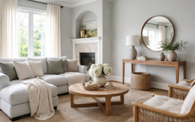
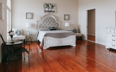
Plenty of people pick a deep gray from a tiny chip, roll it on the walls, and end up with a room that feels like a cave. Benjamin Moore Chelsea Gray avoids that trap better than most dark grays because it carries a soft hint of brown that keeps it warm instead of cold or blue. It is color number HC-168 in the Historical Colors collection, with a light reflectance value (LRV) of 23.33, which places it firmly in the medium-dark range.
In practice that means Chelsea Gray reads as a rich, grounded gray that works well on kitchen cabinets, islands, accent walls, exterior siding and front doors. On full walls it suits rooms with good natural light or spaces where you want a moody, enveloping feel. The manufacturer describes it as a handsome gray with the slightest hint of brown, and that small brown note is the main reason designers keep returning to it.
- Benjamin Moore Chelsea Gray Specs at a Glance
- Understanding the Undertones of Chelsea Gray
- Rooms and Surfaces Where Chelsea Gray Works
- Choosing a Sheen
- Coordinating Colors and Pairings
- Close Look-Alikes and How They Compare
- How to Test Chelsea Gray Before You Commit
- Troubleshooting Common Issues
- Cost and When to Call a Pro
- Frequently Asked Questions
You will often see the name spelled Chelsea Grey, especially in searches for chelsea grey paint, but the manufacturer spells it Chelsea Gray, and the number HC-168 is what the paint counter needs.
Benjamin Moore Chelsea Gray Specs at a Glance
Before you buy a gallon, it helps to see the key facts in one place. All of these values come from the manufacturer’s color page; check the current listing in case anything changes.
| Spec | Value | What it means |
|---|---|---|
| Color name and number | Chelsea Gray, HC-168 | Use the number when ordering to avoid mix-ups with similar names |
| Collection | Historical Colors | A palette rooted in traditional American architecture |
| LRV | 23.33 | Reflects roughly a quarter of the light hitting it, so it reads medium-dark |
| Color family | Neutral | A gray that leans warm rather than blue or green |
| Undertone | Slight brown | Keeps it from feeling cold, especially in warm light |
| Also offered as | Woodluxe exterior wood stain color | Can coordinate siding or fencing with painted trim |
| Best sheens | Matte or eggshell walls; satin or semi-gloss trim and cabinets | Higher sheen shows the color slightly lighter and adds wipeability |
Understanding the Undertones of Chelsea Gray
Gray paint undertones decide whether a color feels cozy or sterile. Chelsea Gray sits in the warm gray camp, but only just. The brown note is subtle enough that it does not read as taupe or greige in most rooms. Instead, it looks like a true mid-to-dark gray with a softened edge.
In North-Facing Rooms
Cool, indirect light from the north pulls out the gray and can make Chelsea Gray look deeper and a bit more charcoal. The brown undertone helps prevent it from turning blue, but expect a dramatic, moody result. Use warm-temperature bulbs (around 2700K to 3000K) to keep it inviting after dark.
In South-Facing Rooms
Strong warm light lifts the color and lets the brown undertone show a little more. Walls can read as a soft, warm gray with a hint of earthiness. This is where Chelsea Gray tends to look its best on full walls.
In East and West Light
Morning light in east rooms is bright and slightly cool, so the color shifts lighter and grayer early in the day, then deepens in the afternoon. West-facing rooms flip that pattern, glowing warmer near sunset. Watching your sample at several times of day is the only way to know which version you will live with.
Rooms and Surfaces Where Chelsea Gray Works
An LRV in the low twenties is too dark for a small, windowless room unless you deliberately want a jewel-box effect. It shines in these settings:
- Kitchen cabinets and islands: a popular choice for lower cabinets or an island paired with white uppers or open shelving.
- Accent walls: behind a bed, on a fireplace wall or in a dining room where the depth adds drama.
- Home offices and dens: rooms used in the evening that benefit from a cocooning feel.
- Bathroom vanities: a painted vanity in a satin or semi-gloss finish against white tile.
- Exteriors: siding on a traditional or farmhouse-style home, or shutters and front doors against a lighter body color.
- Interior doors and trim: a bold, tailored alternative to white trim in a room with lighter walls.
Flooring matters too. Chelsea Gray pairs well with medium-tone oak, walnut and warm white oak, and it holds its own next to darker hardwood without the two colors fighting. Very orange floors can push the brown undertone forward, so test the paint right next to your floor before you commit.
Choosing a Sheen
The same color can look different in different sheens. Flat and matte finishes absorb more light and show the deepest, most velvety version of Chelsea Gray, but they are harder to scrub. Eggshell is a solid middle ground for living rooms and bedrooms. For cabinets, trim and doors, satin or semi-gloss gives the durability and cleanability those surfaces need, and the extra reflection makes the color appear a touch lighter.
Bathrooms and kitchens with moisture and frequent cleaning call for at least eggshell or satin on walls. Exterior siding should use a high-quality exterior product in a low-luster or satin finish, applied over a properly prepared and primed surface.
Coordinating Colors and Pairings
The manufacturer suggests several coordinating colors for Chelsea Gray, including Concord Ivory (HC-12), Lemon Chiffon (OC-109), Angelica (AF-665) and Sanctuary (AF-620). These range from creamy and soft yellow-white tones to muted mid-tones, and they show how well Chelsea Gray works with warm partners.
Many homeowners also pair it with a clean or slightly warm white on trim and ceilings. A crisp white makes the gray look sharper and more modern, while a creamy white softens the contrast for a traditional look. For a tonal scheme, use a lighter warm gray on walls and save Chelsea Gray for cabinets, doors or an accent wall in the same space.
Pairing Ideas by Style
- Modern farmhouse: Chelsea Gray island, warm white walls, matte black hardware, white oak floors.
- Traditional: Chelsea Gray paneling or wainscoting with a creamy ivory above and brass accents.
- Transitional: Chelsea Gray accent wall with soft greige walls and brushed nickel fixtures.
- Exterior: Chelsea Gray siding, white trim and a natural wood or black front door.
Close Look-Alikes and How They Compare
If Chelsea Gray is not quite right, the manufacturer lists several similar colors: Dolphin (AF-715), Secret (AF-710), Eagle Rock (1469) and Squirrel Tail (1476). Each one shifts the balance of warmth and depth slightly, so sample two or three side by side rather than relying on screen images.
Within the same Historical Colors palette, people often compare Chelsea Gray with Kendall Charcoal (HC-166), which is noticeably darker, and with lighter warm grays such as Revere Pewter (HC-172) when they want a softer wall color. A common designer move is to pair a lighter warm gray on walls with Chelsea Gray on cabinetry for a layered, coordinated look. Check each color’s LRV on its own manufacturer page before you decide, since small differences in LRV feel big on a full wall.
How to Test Chelsea Gray Before You Commit
- Order peel-and-stick paint samples or buy a sample pot. Peel-and-stick swatches are handy because you can move them around without repainting boards.
- Place samples on at least two walls, including one that gets direct light and one in shadow.
- Put the sample next to fixed elements: flooring, countertops, cabinets and trim.
- Check the color in morning, midday and evening light, plus under your normal lamps.
- Live with it for two or three days before deciding. First impressions of dark colors often change.
- If you are painting cabinets, test in the actual sheen you plan to use, since gloss changes how dark it reads.
Troubleshooting Common Issues
The color looks too dark. Dark grays often look heavier on walls than on a chip. Try it on cabinets or a single wall instead, or step to a lighter look-alike. Adding brighter lighting and a light ceiling color also helps.
The color looks brown or muddy. Very warm bulbs and orange-toned wood floors can push the undertone. Switch to slightly cooler bulbs (around 3000K to 3500K) or add white and black accents to sharpen the look.
Patchy finish on cabinets or walls. Deep colors need a good primer, often a tinted gray primer, and usually two finish coats. Uneven sheen often comes from touch-ups or rolling over partially dry paint.
Shows scuffs easily. Flat finishes on dark colors can burnish when cleaned. Use eggshell or satin in busy areas.
Cost and When to Call a Pro
Chelsea Gray costs the same as any other color in a given paint product line, so your budget depends on which product you choose and the size of the job. Premium interior paint commonly runs from the mid-range to the high end per gallon, and one gallon usually covers about 350 to 400 square feet per coat. Professional interior painting generally runs a few dollars per square foot of wall, and cabinet painting is priced per door or per project with a wide range.
Consider hiring a pro for cabinet refinishing, exterior siding, two-story walls or any job where a smooth, brush-mark-free finish matters. Dark colors are less forgiving of lap marks and uneven coverage, and experienced painters have the sprayers and prep routine to get a factory-like finish.
Frequently Asked Questions
What is the LRV of Benjamin Moore Chelsea Gray?
Chelsea Gray HC-168 has an LRV of 23.33 according to the manufacturer, which makes it a medium-dark color that absorbs more light than it reflects.
Is Chelsea Gray warm or cool?
It leans warm. The manufacturer describes it as a gray with the slightest hint of brown, which keeps it from reading blue in most lighting.
Is Chelsea Gray good for kitchen cabinets?
Yes. It is a popular cabinet and island color, especially in satin or semi-gloss, paired with white counters or upper cabinets and warm wood floors.
What white goes with Chelsea Gray?
Both crisp and creamy whites work. Crisp whites give a sharper, modern contrast, while creamy whites and the manufacturer’s suggested ivory tones create a softer, traditional look.
Is Chelsea Gray too dark for a small room?
On all four walls of a small room with limited light it can feel heavy. Use it on cabinetry, a vanity or one accent wall, or choose a lighter warm gray for small spaces.
Can Chelsea Gray be used outside?
Yes. It is used on siding, shutters and front doors, and the manufacturer also lists it among its exterior wood stain colors.