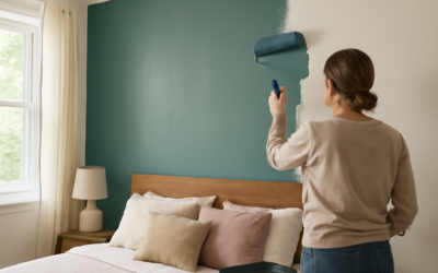
Color affects sleep more than most people realize. The best paint colors for bedroom walls are chosen not for how they photograph but for how they make you feel at the end of a long day, calm, cocooned, and ready to rest. Sleep researchers and interior designers largely agree: soft, muted, low-saturation shades outperform bright, energetic ones in the one room where winding down is the whole point. This guide covers the top-performing bedroom colors by mood, plus the undertone and sheen decisions that separate a restful retreat from a room you never quite settle into.
Part of our Paint & Walls guide — explore the full guide →
- Why Bedroom Color Is Different
- Calming Blues: The Sleep Favorite
- Soft Greens for Natural Calm
- Warm Neutrals for Timeless Comfort
- Moody and Dramatic for Deep Rest
- Colors to Approach With Caution
- Choosing the Right Sheen
- Dusty Pastels and Muted Warm Tones
- Coordinating Ceiling, Trim, and the Fifth Wall
- Test in Your Own Light Before Buying Gallons
- Matching Color to Bedroom Size and Light
- Coordinating Bedding, Furniture, and Accents
- Bringing It All Together
Why Bedroom Color Is Different
Unlike a kitchen or entryway, a bedroom’s job is to lower your heart rate, not raise it. Highly saturated colors, vivid reds, electric yellows, pure oranges, stimulate the nervous system and can make a room feel restless. Muted, desaturated versions of nearly any hue do the opposite, signaling calm.
That is why the most successful bedrooms lean on soft blues, gentle greens, warm neutrals, and dusty, grayed-down tones. You can still have color; you just want the quiet version of it. Think of the difference between a bright sky blue and a soft, foggy blue-gray, both are blue, but only one whispers.
Calming Blues: The Sleep Favorite
Blue is repeatedly cited as the most sleep-friendly color, and there is logic to it. Blue tones are associated with lowered blood pressure and a slower pulse, which is exactly what you want at bedtime.
- Benjamin Moore Quiet Moments (1563): a soft blue-green that reads serene and spa-like.
- Sherwin-Williams Sleepy Blue (SW 6225): named for the effect, a gentle dusty blue perfect for restful rooms.
- Farrow and Ball Borrowed Light: a pale, airy blue that stays light without going cold.
Pair blues with warm wood furniture and cream bedding to keep the room from feeling chilly, especially in north-facing spaces.
Soft Greens for Natural Calm
Green sits at the restful center of the color spectrum, easy on the eyes and deeply associated with nature. Sage and muted olive tones have surged in popularity for bedrooms because they feel organic and grounding.
- Sherwin-Williams Evergreen Fog (SW 9130): a gray-green that manages to feel both cozy and current.
- Benjamin Moore October Mist (1495): a soft, silvery sage that flatters almost any bedding.
- Behr Jojoba (S390-4): a muted green with a calming, earthy quality.
Warm Neutrals for Timeless Comfort
If bold color makes you nervous, warm neutrals deliver restful comfort that never dates. Greiges, soft taupes, and warm whites wrap a bedroom in quiet without demanding attention.
- Sherwin-Williams Accessible Beige (SW 7036): a warm greige that feels enveloping and forgiving.
- Benjamin Moore Pale Oak (OC-20): a soft, versatile greige that shifts gently with the light.
- Benjamin Moore Edgecomb Gray (HC-173): a warm, light greige that suits both modern and traditional rooms.
Neutrals also give you total freedom with bedding and art, since nearly any accent color works against a well-chosen greige.
Moody and Dramatic for Deep Rest
Counterintuitively, dark bedrooms can be some of the most restful. A deep, saturated wall color absorbs light and creates a cave-like sense of enclosure that many people find profoundly calming, ideal for light sleepers.
- Benjamin Moore Hale Navy (HC-154): a rich navy that feels luxurious and sleep-inducing.
- Sherwin-Williams Cyberspace (SW 7076): a deep slate blue-gray for a modern, moody retreat.
- Farrow and Ball Down Pipe: a dramatic charcoal-green with real depth.
Moody rooms need layered lighting, warm bulbs, bedside lamps, and enough light-colored textiles to keep them from feeling heavy. Done right, they feel like the inside of a luxury hotel.
Colors to Approach With Caution
A few shades work against restful sleep and deserve a second thought before you commit an entire bedroom to them.
- Bright red: the most stimulating color on the wheel, best avoided as a full wall.
- Vivid yellow: cheerful but energizing, and it can feel harsh in strong light.
- Pure white: can feel clinical and cold rather than restful; choose a warm white instead.
- Bright purple: saturated versions read juvenile and busy; dusty lavender is the calmer alternative.
Choosing the Right Sheen
Sheen matters more in bedrooms than almost anywhere else. A flat or matte finish absorbs light, hides wall imperfections, and gives colors a soft, velvety depth that suits a restful room. Eggshell adds a touch of durability for walls that get bumped by furniture, but skip satin and semi-gloss on bedroom walls, since their shine reflects light and can feel less cozy. Reserve semi-gloss for trim and doors only.
Dusty Pastels and Muted Warm Tones
Not every restful bedroom is blue or gray. Soft, grayed-down pastels bring gentle color without the energy of a saturated hue, and they suit anyone who wants a little personality in the room. The key word is muted; a chalky, dusty version of a color soothes where its bright cousin would stimulate.
- Dusty rose and blush: a soft, grayed pink that reads warm and calming rather than sweet.
- Muted lavender: a foggy purple that feels serene, far removed from a bright violet.
- Soft terracotta and warm clay: earthy, enveloping tones that add coziness in low light.
These warmer options are especially good in north-facing bedrooms that receive cool light all day, since a touch of warmth counteracts the chill and keeps the room from feeling gray and lifeless.
Coordinating Ceiling, Trim, and the Fifth Wall
Designers call the ceiling the fifth wall, and in a bedroom it deserves real thought because you stare at it from bed. A crisp white ceiling keeps the room feeling open and airy above a colored wall. But painting the ceiling a soft version of the wall color, or even the same moody shade in a dark bedroom, wraps the space in a cocoon that intensifies the restful mood.
Trim generally looks best a shade or two brighter than the walls in a satin or semi-gloss finish, framing the room cleanly. In a monochromatic bedroom, painting the trim the same color as the walls in a slightly higher sheen creates a seamless, tailored envelope that feels calm and intentional. Whatever you choose, keep the sheen decisions consistent so the room reads as one cohesive space rather than a set of mismatched surfaces.
Test in Your Own Light Before Buying Gallons
Bedroom light changes dramatically from morning to night, and that shift can transform a color. A soft blue that looks dreamy at dusk might read gray and flat in harsh morning sun. Buy sample pints, paint two-foot squares on at least two walls, and observe them at the hours you actually use the room, early morning and after dark.
Pay special attention to how the color looks under your bedside lamp with a warm bulb, since that is the light you will see most before sleep. This ten-minute habit is the single best guarantee against a repaint.
Matching Color to Bedroom Size and Light
The right shade depends heavily on your room’s dimensions and how much daylight it gets. A small bedroom generally feels more open in lighter, softer colors, pale blues, warm whites, and gentle greiges, that reflect light and push the walls outward visually. Cramming a tiny room with a dark, saturated color can work as a deliberate cocoon, but only if you commit fully and add generous lighting.
Light direction matters just as much. North-facing bedrooms receive cool, indirect light and benefit from warmer shades to counteract the chill, while south-facing rooms flood with warm light and can carry cooler blues and grays beautifully. East-facing rooms glow warm in the morning, ideal for anyone who wants a bright wake-up, and west-facing rooms turn golden at sunset, which flatters warm and neutral tones. Always weigh the room’s orientation before committing, since the same paint behaves like two different colors depending on which way the windows face.
Coordinating Bedding, Furniture, and Accents
Wall color never lives alone in a bedroom, and the most restful rooms treat the walls as a backdrop for soft layers. Before finalizing a color, consider your existing bedding, headboard, and furniture. A soft blue wall pairs beautifully with crisp white linens and natural wood, while a warm greige gives you total freedom to swap accent colors with the seasons.
If your furniture is dark, lighter walls create restful contrast; if it is light or painted, you have room to go moodier on the walls. Layer in texture through a upholstered headboard, a chunky throw, and a soft rug to make even a simple neutral feel intentional and cozy. The goal is a calm, cohesive palette where nothing jars the eye, exactly the visual quiet that helps you unwind at the end of the day.
Bringing It All Together
The best paint color for your bedroom is the one that quiets your mind, and that will differ from your neighbor’s. If you want serenity, reach for soft blues and greens. If you crave comfort that never dates, warm neutrals deliver. And if enclosure helps you sleep, a moody navy or charcoal turns the room into a retreat. Whatever direction you choose, keep the saturation low, the sheen matte, and always test in your own light. Get those three things right and your bedroom will do its most important job: helping you rest.