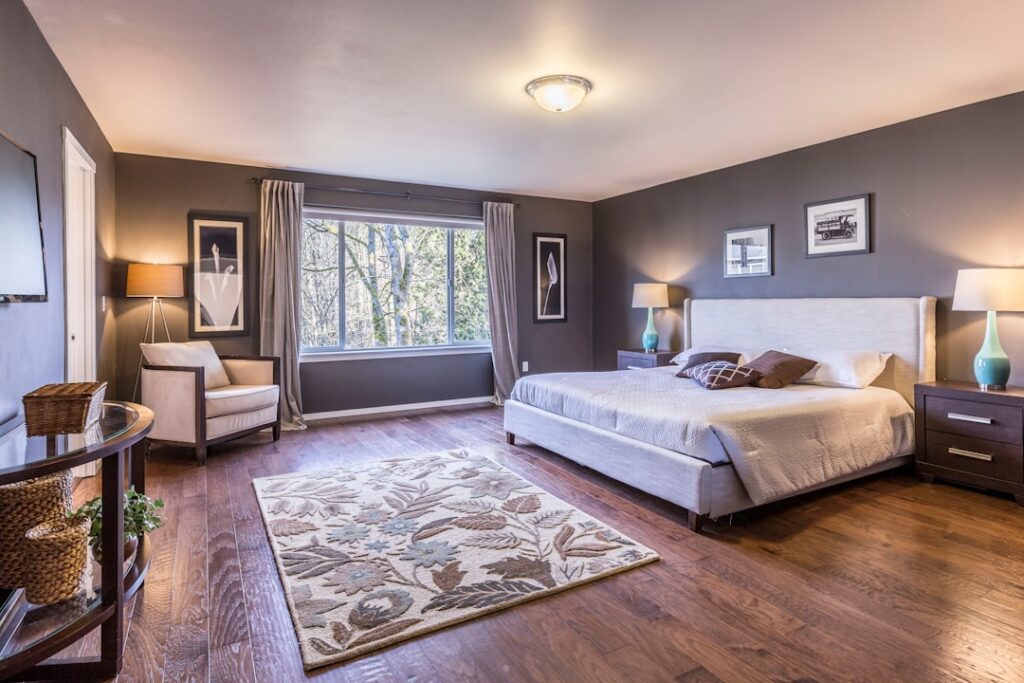
Paint is the cheapest square-foot upgrade in your entire house, yet it changes how a room feels more than new furniture ever will. The most popular bedroom paint colors right now lean soft and grounded rather than stark white, because homeowners want a space that reads as restful the moment they walk in. A gallon covers roughly 350 square feet, so most bedrooms need just two gallons plus a quart for touch-ups. Get the color right and you set the tone for every night’s sleep.
Part of our Paint & Walls guide — explore the full guide →
- Why Bedroom Colors Follow Different Rules
- Soft Neutrals That Never Go Out of Style
- Moody Blues and Deep Greens for Character
- Warm Earth Tones and Muted Blush
- Choosing the Right Sheen
- Pairing Colors With Flooring and Furniture
- How Much Paint You Actually Need
- Testing Before You Commit
- Coordinating Trim, Ceiling, and Doors
- Avoiding Common Bedroom Color Mistakes
Why Bedroom Colors Follow Different Rules
A kitchen can handle a bright, energizing hue because you spend waking hours there. Bedrooms are the opposite. You want a palette that dials your nervous system down, which is why designers steer toward desaturated, low-contrast colors with warm or muted undertones. Cool grays that looked crisp a decade ago now feel clinical to many people, and the pendulum has swung back toward greige, warm white, and soft earth tones.
Light matters as much as the swatch. A north-facing bedroom receives cool, indirect light that turns blues and grays icy, so you compensate with a warmer color than you think you need. South-facing rooms flood with warm light and can carry cooler shades beautifully. Always tape a two-foot sample square to the wall and check it at 7 a.m., at noon, and under your bedside lamp before you commit.
Soft Neutrals That Never Go Out of Style
Neutrals dominate the bedroom category for a reason: they let bedding, art, and wood tones do the talking. Warm whites like Benjamin Moore White Dove and Sherwin-Williams Alabaster have a creamy softness that avoids the sterile look of pure white. For something with a touch more depth, greige shades such as Agreeable Gray or Accessible Beige bridge gray and beige, hiding scuffs and reading differently through the day.
- White Dove (BM OC-17) — creamy warm white, forgiving in any light
- Agreeable Gray (SW 7029) — the internet’s favorite greige, mild green-gray undertone
- Accessible Beige (SW 7036) — warmer than most greiges, pairs with oak floors
- Pale Oak (BM OC-20) — barely-there taupe that glows at night
These shades work because they carry undertones you can build around. Before you buy two gallons, hold the chip against your flooring and largest piece of furniture. A greige with a green base fights a pink-toned oak floor, and you will feel the clash even if you can’t name it.
Moody Blues and Deep Greens for Character
The biggest shift in bedroom color is the rise of saturated, enveloping shades on all four walls. Deep blues and forest greens create a cocoon effect that reads as luxurious rather than dark, especially in a room where you mostly sleep. Hague Blue, Newburyport Blue, and Salamander are go-to choices, and muted sage tones like Evergreen Fog and Pewter Green have exploded in popularity for their calm, organic feel.
If a fully dark room feels risky, paint only the wall behind the headboard and keep the other three in a coordinating light neutral. This accent-wall approach delivers the drama at a fraction of the commitment, and it costs you a single quart of paint. Pair a deep green wall with warm brass hardware and natural linen bedding, and the room instantly looks designed.
Warm Earth Tones and Muted Blush
Terracotta, clay, and dusty rose have moved from trend to staple. These colors flatter skin tones under lamplight and feel inherently cozy, which is exactly what a bedroom should be. Look at shades like Redend Point, a soft clay-pink that Sherwin-Williams named a color of the year, or a muted blush such as Farrow & Ball’s Setting Plaster. They are gender-neutral in practice despite the pink family, reading more as warm plaster than nursery pink.
Earthy neutrals also age well. Unlike a trendy teal that dates a room in five years, a muted terracotta or mushroom taupe has staying power because it echoes natural materials. That longevity matters when repainting means moving furniture and taping a whole room over a weekend.
Choosing the Right Sheen
Color gets all the attention, but sheen decides how the finish wears. Bedrooms almost always call for a matte or eggshell finish. Matte hides drywall imperfections and gives walls that soft, chalky look designers love, while eggshell adds a hint of washability for rooms that see fingerprints. Skip satin and semi-gloss on bedroom walls; the shine amplifies every roller mark and wall flaw under raking light.
- Flat/Matte — best at hiding imperfections, ideal for ceilings and low-traffic adult bedrooms
- Eggshell — slight sheen, wipeable, the safe default for most bedrooms
- Satin — reserve for trim, doors, and kids’ rooms that need scrubbing
Reserve semi-gloss for baseboards, window casings, and doors, where the durability earns its shine and the contrast frames the wall color nicely.
Pairing Colors With Flooring and Furniture
Your paint never lives in isolation. Warm wood floors like oak and hickory pair naturally with greige, warm white, and earthy greens. Cool-toned gray luxury vinyl or maple flooring handles blues and true grays without fighting. If your bedroom has wall-to-wall carpet in a beige or tan, pull a warm white or soft taupe from the carpet’s undertone so the two surfaces feel intentional rather than accidental.
Bedding is your second-largest color block after the walls. A deep navy wall with crisp white linens is a timeless combination, while a soft greige wall lets a colorful quilt become the focal point. Think of the wall color as the backdrop that makes everything else look better, not the star of the show.
How Much Paint You Actually Need
For a standard 12-by-12 bedroom with 8-foot ceilings, you have roughly 384 square feet of wall minus doors and windows. Two coats over that area takes about two gallons, and premium paints like Benjamin Moore Regal or Sherwin-Williams Emerald run $55 to $80 per gallon. Budget lines cover fine for closets and low-light spaces at half the price, but the premium paints spread further and hide better, often saving you a third coat.
Factor in a quart of primer if you are covering a dark color with a light one, plus painter’s tape, a quality 9-inch roller, and a 2.5-inch angled sash brush for cutting in. A full bedroom repaint in materials lands around $120 to $180, one of the highest-return improvements you can make in a single weekend.
Testing Before You Commit
Never choose from a chip alone. Buy sample pots of your top two or three contenders, paint large swatches on at least two walls, and live with them for a couple of days. Undertones you missed in the store show up under your specific lighting, and the color that looked perfect at the paint counter can shift dramatically at home. This $15 step saves you from repainting an entire room, which is the real cost of getting it wrong.
Coordinating Trim, Ceiling, and Doors
Wall color gets the spotlight, but the trim and ceiling frame it and quietly decide whether the room looks finished. In a bedroom, a soft warm white on the baseboards, window casings, and door is the safest, most flexible partner for nearly any wall color. If you want a more modern, seamless feel, paint the trim the same color as the walls in a slightly higher sheen, which makes a small room feel larger by erasing the visual breaks.
The ceiling is the overlooked fifth wall. A flat white ceiling keeps a room feeling open and bright, but painting it a diluted version of the wall color, roughly 50 percent strength, adds a subtle warmth that makes the whole room feel enveloping. In rooms where you want maximum coziness, some homeowners carry a deep wall color right up onto the ceiling for a true cocoon effect, which works especially well under low ceilings and sloped attic rooms where the darkness reads as intimate rather than heavy.
Avoiding Common Bedroom Color Mistakes
A few predictable missteps derail bedroom paint projects. The most frequent is choosing a color that’s too saturated or energizing for a room meant for sleep, like a bright primary or an intense jewel tone that keeps the eye active. Another is picking a cool gray in a north-facing room, where the already-cool light turns it lifeless and gloomy. And many people forget to account for their bedding, ending up with a wall that clashes with the largest textile in the room.
The fix for all three is the same: sample generously and consider the whole room, not just the wall. Look at the color against your headboard, your bedding, and your flooring, in the light you actually use at night. Restraint pays off in a bedroom; the colors people love years later are almost always the quieter, more grounded choices rather than the bold swatch that felt exciting in the store.
The most popular bedroom paint colors succeed because they balance restfulness with personality. Whether you gravitate toward a barely-there greige or a bold, enveloping green, the right choice is the one that makes you exhale when you walk in at the end of the day. Sample generously, mind your undertones, match your sheen to the room, and you will land on a color that still feels right years from now.