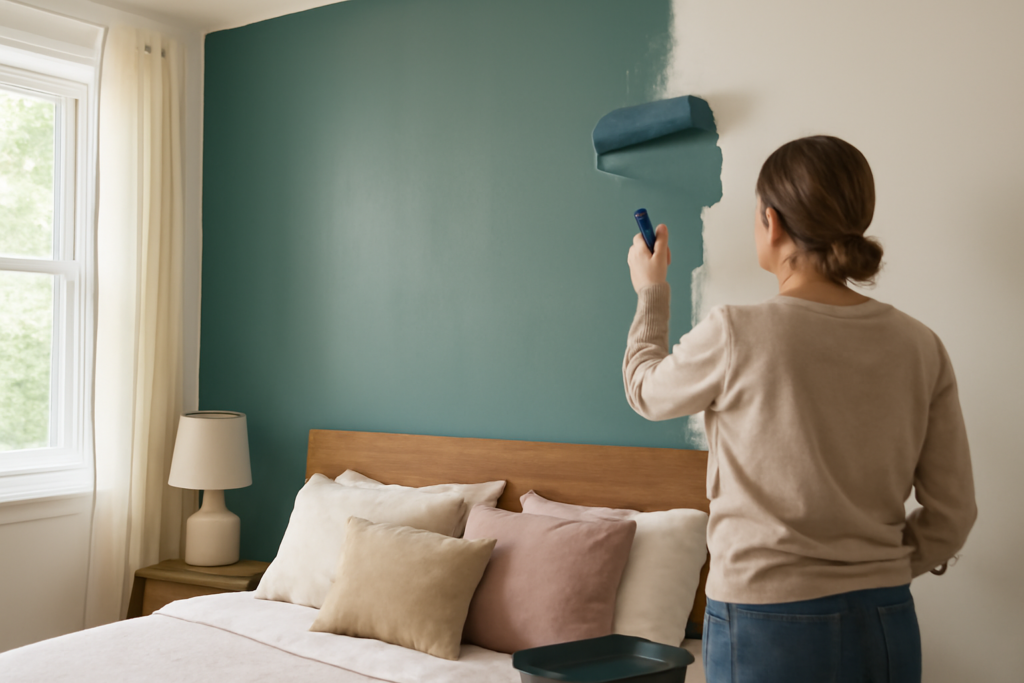
The bedroom is the one room where color should serve rest first and everything else second. Choosing paint colors for bedroom walls is less about following trends and more about matching the hue to how you want to feel when you wake up and wind down. The best bedroom colors lower visual stimulation, flatter skin in soft light, and hold up under both morning sun and warm evening lamps. This guide organizes proven picks by the mood they create, explains how lighting changes them, and shows you how to test before you commit.
Part of our Paint & Walls guide — explore the full guide →
- Start With the Mood You Want
- Calm and Serene: Blues and Greens
- Warm and Cozy: Greige, Taupe, and Muted Warm Tones
- Moody and Dramatic: Deep Blues and Charcoals
- Bright and Airy: Soft Whites and Pale Neutrals
- How Lighting Changes Bedroom Colors
- Accent Walls and Two-Tone Schemes
- Coordinating With Bedding and Furniture
- Colors to Approach With Caution
- Test Before You Commit
Start With the Mood You Want
Before you look at a single swatch, decide on the feeling. Bedrooms generally aim for one of a few moods: calm and serene, warm and cozy, moody and dramatic, or bright and airy. Each points you toward a different family of colors. A cool blue or soft green delivers calm; a warm greige or muted terracotta creates coziness; a deep navy or charcoal brings drama; a soft white or pale neutral keeps things light and open.
This mood-first approach prevents the most common mistake — choosing a color you like on a wall in a magazine that fights the feeling you actually want in your own room. Nail the mood, then pick the specific shade.
Calm and Serene: Blues and Greens
Cool colors are the go-to for restful bedrooms because they lower the visual temperature of a room and are easy on the eyes. Reliable picks:
- Sherwin-Williams Sea Salt (SW 6204): A soft green-gray-blue that reads spa-like and calm without feeling cold.
- Benjamin Moore Palladian Blue (HC-144): A gentle blue-green that’s been a designer staple for decades.
- Sherwin-Williams Rainwashed (SW 6211): A soothing aqua-tinged neutral for a coastal, restful feel.
- Benjamin Moore Quiet Moments (1563): A pale, misty blue-green ideal for winding down.
These work because muted, desaturated cool tones don’t demand attention. Keep the saturation low — a bold, bright blue energizes rather than relaxes, which is the opposite of what most bedrooms need.
Warm and Cozy: Greige, Taupe, and Muted Warm Tones
If you want your bedroom to feel like a hug, warm neutrals and soft earthy tones deliver. They’re especially good in north-facing rooms that get cool light, since the warmth balances the blue cast:
- Sherwin-Williams Accessible Beige (SW 7036): A warm greige that grounds a room and flatters warm bedding.
- Benjamin Moore Revere Pewter (HC-172): A greige with green depth, cozy but not dull.
- Sherwin-Williams Balanced Beige (SW 7037): A slightly deeper warm neutral for enveloping comfort.
- Benjamin Moore Muslin (OC-12): A soft creamy tan that’s warm and timeless.
Warm neutrals are the most forgiving choice for a bedroom because they pair with almost any furniture and bedding and never feel jarring in the morning.
Moody and Dramatic: Deep Blues and Charcoals
Dark bedroom walls have surged in popularity because they create a cocooning, luxurious feel — and darkness genuinely helps a bedroom feel sleep-ready. Consider these:
- Benjamin Moore Hale Navy (HC-154): A rich, slightly muted navy that reads elegant, not harsh.
- Sherwin-Williams Naval (SW 6244): A deep, saturated navy for a bold statement wall or whole room.
- Sherwin-Williams Iron Ore (SW 7069): A soft near-black charcoal that’s dramatic yet warm.
- Benjamin Moore Cheating Heart (1617): A deep blue-charcoal that envelops a room in moody calm.
Dark colors work best in bedrooms with decent natural light or plenty of layered lamp lighting. Balance them with lighter bedding, natural wood, and metallic accents so the room feels intentional rather than heavy.
Bright and Airy: Soft Whites and Pale Neutrals
For a clean, open feel — especially in smaller bedrooms — soft whites and barely-there neutrals maximize light. Avoid stark, cold whites, which can feel clinical; reach instead for warm or soft whites with a touch of body:
- Benjamin Moore White Dove (OC-17): A soft, warm white that’s the most popular white in the country for a reason.
- Sherwin-Williams Alabaster (SW 7008): A creamy, cozy white that never feels sterile.
- Benjamin Moore Classic Gray (OC-23): A whisper of warm gray that reads almost white but adds subtle depth.
Soft whites let you change the room’s personality with bedding, art, and accents while keeping the walls a calm, flexible backdrop.
How Lighting Changes Bedroom Colors
The direction your bedroom faces transforms any color. North-facing rooms get cool, indirect light that makes cool colors feel colder and can dull warm tones — favor warm neutrals here. South-facing rooms get abundant warm light that flatters almost anything. East-facing rooms are bright and warm in the morning, cooler by evening. West-facing rooms get cool morning light and warm, intense afternoon sun.
Your bulbs matter too. Since bedrooms are mostly used at night under lamps, choose a color that looks good under 2700K warm-white bulbs, not just in daylight. A cool gray that looks crisp at noon can turn drab and lifeless under warm evening light.
Accent Walls and Two-Tone Schemes
You don’t have to paint all four walls the same color. An accent wall — typically the one behind the headboard — lets you use a bolder or deeper color without overwhelming the room. A navy or charcoal accent behind the bed reads dramatic and cocooning while the remaining walls stay light and airy. This is a low-risk way to bring in a saturated color you love without committing the whole room to it.
Another popular approach is a two-tone scheme with a darker color on the lower portion of the wall and a lighter tone above, divided by a picture rail or chair rail. Painting the ceiling a soft color, or even a moody deep shade in a room with good height, is another way to add interest. The key is keeping the overall palette calm enough for rest, even when you introduce contrast.
Coordinating With Bedding and Furniture
Wall color never lives in isolation, so consider your bedding, headboard, and furniture before finalizing a shade. Cool wall colors like blue and green pair beautifully with white and natural linen bedding and warm wood furniture, which keeps the room from feeling cold. Warm neutrals flatter both light and dark furnishings and are the most forgiving if you like to change your textiles seasonally. Deep, moody walls call for lighter bedding and a few metallic or natural-wood accents to keep the space from feeling heavy.
If you already own bedding or a statement headboard you love, choose the wall color to complement it rather than the other way around — repainting is far cheaper than replacing furniture.
Colors to Approach With Caution
A few colors are riskier in bedrooms. Bright, saturated reds and oranges are stimulating and can make it harder to wind down. Very bright yellows can feel jarring in the morning sun and may cast an unflattering light. Stark, cold whites can read clinical and unwelcoming in a room meant for rest. None of these are off-limits, but if your goal is a restful retreat, lean toward muted, softened versions rather than pure, high-energy hues.
Test Before You Commit
Never choose a bedroom color from a chip. Buy sample pots of your top two or three, paint two-by-two-foot patches on at least two walls — one near the window, one on an interior wall — and apply two coats. Then live with them for a full day and, crucially, a full evening under your actual lamps. Check how each reads when you wake up, at midday, and at bedtime.
The right paint colors for bedroom walls are the ones that support how you want to feel in the room, hold up across your specific lighting, and still look good under the warm lamplight you’ll see them in most. Decide on the mood, pick from the proven shades above, test properly, and you’ll wake up to a color you love for years.