Color shapes how a bedroom feels more than any pillow or piece of art. The right paint schemes for bedrooms create a space that helps you wind down at night and wake up feeling good, while the wrong palette can leave a room feeling cold, busy, or claustrophobic. Because a bedroom is a place of rest, the most successful color choices lean toward calm and cohesion. This guide covers proven palettes, how to combine colors, and the practical details that make paint look right once it is on the wall.
Part of our Paint & Walls guide — explore the full guide →
- Start With the Mood You Want
- Calming Neutrals: The Safe Foundation
- Soothing Blues and Greens
- Warm and Earthy Palettes
- Popular Color Combinations
- Accent Walls and Two-Tone Schemes
- Choosing the Right Finish
- Test Before You Commit
- Color Schemes by Room Size and Light
- Coordinating With Bedding and Decor
- Bringing the Scheme Together
Start With the Mood You Want
Before picking a swatch, decide how you want the room to feel. Soft, muted colors promote calm and sleep, which is why they dominate bedroom design. Warmer tones feel cozy and intimate, cooler tones feel airy and serene, and deep saturated colors create a snug, cocooning effect. Match the palette to the mood, not just to a trend, and the rest of the choices follow naturally.
Calming Neutrals: The Safe Foundation
Neutrals remain the most popular bedroom choice because they are restful and endlessly flexible. Warm whites, soft greiges, mushroom, and gentle taupes create a serene backdrop that works with any bedding or furniture. They also make small rooms feel larger and let you change accents without repainting.
If a fully neutral room feels flat to you, vary the texture instead: layered linens, a woven headboard, or natural wood add warmth that color alone would otherwise provide.
Soothing Blues and Greens
Blue and green are widely regarded as the most relaxing bedroom colors, and for good reason. Soft sky blue, dusty slate, sage, and eucalyptus evoke water and nature, which the mind reads as restful. These shades work beautifully as wall colors and pair easily with white trim and natural wood.
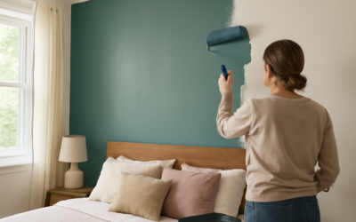
For a deeper, more enveloping feel, navy or forest green on the walls creates a luxurious, hotel-like retreat, especially in a bedroom with good natural light. Balance the depth with light bedding and metallic or wood accents so the room does not feel heavy.
Warm and Earthy Palettes
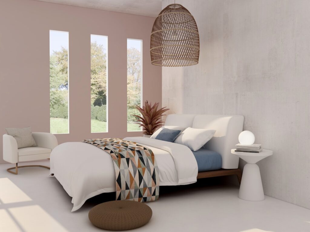
Earth tones have surged in popularity for bedrooms because they feel grounded and cozy. Think terracotta, clay, warm beige, soft caramel, and muted ochre. These colors flatter warm light, pair well with rattan and wood furniture, and create an inviting, lived-in feel.
For a subtle approach, keep the walls a warm neutral and bring the earthy tones in through bedding, curtains, and a rug. For a bolder look, paint the walls a clay or muted rust and keep furnishings simple.
Popular Color Combinations
A scheme is more than one color; it is how the wall, trim, ceiling, and accents work together. Reliable combinations include:
- Greige walls with crisp white trim and soft blue or green accents
- Sage green walls with natural wood and warm brass hardware
- Navy accent wall behind the bed with light gray remaining walls
- Warm white walls with a terracotta or clay accent and linen textiles
- Soft charcoal walls with white bedding for a calm, contemporary contrast
Accent Walls and Two-Tone Schemes
An accent wall lets you use a bolder color without overwhelming the room. The wall behind the headboard is the classic choice because it anchors the bed and faces away from you while you sleep. Color-drenching, painting walls, trim, and sometimes the ceiling the same hue, is another current approach that makes a room feel cohesive and enveloping.
A two-tone scheme that paints the lower third in a deeper shade and the upper portion in a lighter one adds architectural interest to a plain box of a room.
Choosing the Right Finish
Sheen matters as much as color in a bedroom. Use these as a guide:
- Flat or matte: Best for bedroom walls; it hides imperfections and gives a soft, modern look.
- Eggshell: A slight sheen that is a bit easier to clean, good for higher-traffic bedrooms.
- Satin or semi-gloss: Reserve for trim, doors, and baseboards where durability matters.
A flat wall paired with semi-gloss trim is a classic, foolproof combination.
Test Before You Commit
Paint always looks different on the wall than on a chip. Buy sample pots, paint large swatches on at least two walls, and observe them across the day. Bedrooms are often used at night under warm artificial light, which can shift a cool gray toward beige or wash out a soft color entirely, so check your samples after dark as well.
Pick colors that calm you, keep the overall scheme cohesive, and match the finish to the surface. Do that, and your bedroom becomes the restful retreat it is meant to be.
Color Schemes by Room Size and Light
The same color behaves differently depending on the space. Small bedrooms benefit from light, soft hues that bounce light and expand the sense of space, though a deep, color-drenched small room can feel cozy and intentional rather than cramped. Large bedrooms can carry richer, darker colors without feeling closed in.
Light direction matters too. North-facing rooms receive cooler light, so warm whites and soft warm tones counteract the chill. South-facing rooms get warm, abundant light all day and can handle cooler blues and greens beautifully. East-facing rooms are bright in the morning, while west-facing rooms glow warm in the evening, worth considering since bedrooms are often used at the start and end of the day.
Coordinating With Bedding and Decor
Walls are the backdrop, not the whole picture. Choose your paint with your bedding, curtains, and major furniture in mind so they work as a set. A common strategy is to keep the walls calm and neutral, then layer in color through textiles you can swap seasonally, which keeps the room flexible and refreshes the look without repainting.
If you start with a patterned duvet or a favorite rug, pull a quiet, secondary color from it for the walls rather than matching the boldest shade. That keeps the room balanced and lets the patterned pieces shine.
Bringing the Scheme Together
A cohesive bedroom usually relies on a simple color framework: one dominant wall color, a complementary trim, and one or two accent tones repeated across textiles and decor. Limiting the palette this way prevents the busy, restless feeling that works against sleep. Repeat each accent color at least twice in the room so it reads as deliberate.
Finish the scheme with attention to the ceiling, often painted a soft white or a lighter tint of the wall color to keep the room feeling open. With a calm palette, the right finish, and accents that tie the space together, your bedroom will feel like the relaxing sanctuary it is meant to be.