The paint chip that looks perfect under the fluorescent lights at the store can look like a completely different color on your living room wall at 6 p.m. That gap between sample and reality trips up more homeowners than any other part of a repaint. Choosing paint colors for living room spaces well means thinking about how the room is lit, which direction it faces, and what furniture and flooring you already own—long before you commit to a gallon. This guide walks through the colors that consistently work and the practical rules that keep you from repainting twice.
Part of our Paint & Walls guide — explore the full guide →
- Start With Your Light, Not Your Color
- Warm Neutrals: The Reliable Foundation
- Greens That Bring the Room to Life
- Blues for a Calm, Spacious Feel
- Going Dark and Dramatic
- Choosing the Right Finish
- Coordinating With Your Existing Furnishings
- Small Rooms vs. Large Open Spaces
- Popular Color Trends Worth Considering
- Test Before You Commit
Start With Your Light, Not Your Color
Every color reads differently depending on the light hitting it, so the first question isn’t “what color do I like” but “which way does my room face.” North-facing rooms get cool, indirect light that can turn grays and blues chilly and flat; they come alive with warm neutrals and colors that carry a hint of yellow or red. South-facing rooms flood with warm light most of the day and can handle cooler shades that would feel gloomy elsewhere.
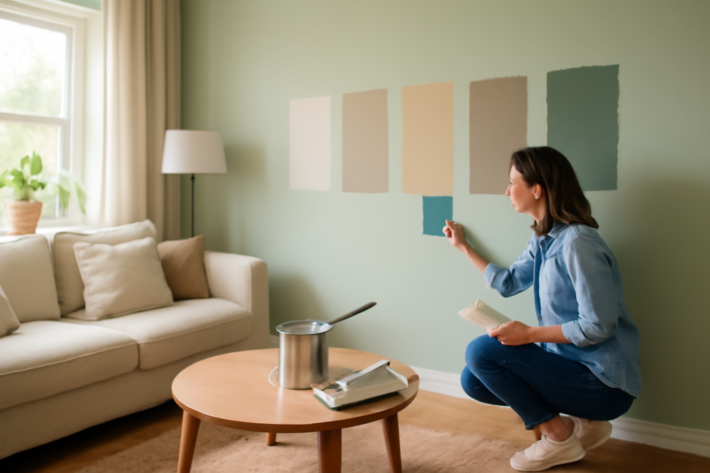
East-facing living rooms get warm morning light that goes cool by afternoon, while west-facing rooms do the reverse. Because of this, always tape a sample directly to the wall and watch it at three times of day—morning, midday, and under your evening lamps. A color you rule out at noon may be exactly right at night, when you actually use the room most.
Warm Neutrals: The Reliable Foundation
If you want a color that flatters almost any furniture and never dates itself, warm neutrals are the safest bet in the room. Greige—a blend of gray and beige—has stayed popular for good reason: it reads as a soft, sophisticated backdrop without the cold institutional feel of pure gray.
- Benjamin Moore Revere Pewter—a warm greige that shifts gracefully with the light
- Sherwin-Williams Accessible Beige—a touch warmer, great with wood floors
- Benjamin Moore Edgecomb Gray—a lighter, airy neutral for smaller rooms
- Sherwin-Williams Agreeable Gray—the most balanced gray-beige on the market
These shades work because they carry enough warmth to feel inviting under lamplight while staying neutral enough to let your art, rug, and sofa be the stars. Pair them with white trim two shades brighter for crisp definition.
Greens That Bring the Room to Life
Green has become the go-to for homeowners who want color without the risk of a trendy statement wall. Muted, earthy greens read almost as neutrals but add depth and a connection to the outdoors that beige can’t. Sage and sea-glass tones suit relaxed, bright rooms, while deeper olive and forest greens turn a formal living room genuinely cozy.
Sherwin-Williams Evergreen Fog, a soft gray-green, has been a runaway favorite for good reason—it’s calm, versatile, and photographs beautifully. For a bolder move, Benjamin Moore’s Hunter Green or Sherwin-Williams’ Pewter Green on a fireplace wall gives you a rich anchor without darkening the whole space. Green plays especially well with natural wood, brass fixtures, and cream upholstery.
Blues for a Calm, Spacious Feel
Blue is the color people reach for when they want a living room that feels serene and a little larger than it is. Soft, grayed blues recede visually, which can make a modest room breathe. The trick is avoiding blues that lean too cool or bright, since those can feel like a nursery rather than a grown-up space.
Look at slate and denim tones—Benjamin Moore Van Deusen Blue or Sherwin-Williams Naval for a dramatic dark wall, or a gentler Sherwin-Williams Krypton for an all-over calm. Blue is also forgiving in rooms with lots of natural light, where it stays crisp rather than washing out. Warm it up with wood tones, woven textures, and brass so the room doesn’t drift cold.
Going Dark and Dramatic
Dark walls intimidate people, but a deep color can make a living room feel intimate and expensive rather than small. The key is committing fully: a single dark accent wall often looks unfinished, while wrapping the whole room in charcoal, deep navy, or near-black green reads as intentional and cocooning. Dark rooms are especially effective in spaces you use mostly at night.
Choose a sheen carefully here—flat or matte hides wall imperfections that darker colors otherwise exaggerate. Balance the depth with plenty of light sources at different heights and keep your trim and ceiling lighter to prevent the space from closing in. Tricorn Black, Hale Navy, and Iron Ore are proven performers for this look.
Choosing the Right Finish
Color gets all the attention, but sheen determines how the paint wears and how the wall looks. For living room walls, the sweet spot is eggshell or matte. Both hide minor drywall flaws and give a soft, non-glaring surface, while eggshell adds a slight wipeability that helps in homes with kids or pets.
- Flat/matte—best at hiding imperfections, ideal for dark colors and ceilings
- Eggshell—the most popular living room choice, easy to clean, low glare
- Satin—slightly shinier, more durable, but shows wall flaws
- Semi-gloss—reserve for trim, doors, and baseboards
Coordinating With Your Existing Furnishings
The color on the wall never lives alone—it has to answer to your floor, your largest piece of furniture, and any element you can’t easily change. Start with the fixed things. If you have warm oak or hickory floors, a cool gray wall can feel like it’s fighting the room, while a greige or soft green harmonizes. Cool gray or dark walnut floors, on the other hand, welcome cooler wall colors.
Your sofa is usually the second anchor. A neutral wall lets a bold sofa shine, while a colorful wall demands a more restrained upholstery so the room doesn’t overload. Pull a subtle cue from a rug or a piece of art to guide the wall choice—echoing one color already in the room ties everything together and makes the paint feel deliberate. When the wall, floor, and furniture share an undertone family, the space reads as designed rather than assembled.
Small Rooms vs. Large Open Spaces
Room size changes the calculus. In a small living room, lighter colors with a higher light-reflectance value bounce daylight around and make walls feel like they’re receding, which visually enlarges the space. That doesn’t mean you’re stuck with white—soft greiges, pale blues, and light greens all keep a small room feeling open while adding personality.
Large open-concept spaces face the opposite challenge: too much of a single pale color can feel cavernous and cold. Here you can afford a deeper, enveloping shade that adds warmth and intimacy, and you can use color to visually define zones within the open plan. If your living room flows into a kitchen or dining area, choose a wall color that transitions gracefully with the adjacent rooms rather than stopping abruptly at a corner. A common trick is carrying one neutral throughout and using accent colors on features to distinguish each zone.
Popular Color Trends Worth Considering
While timelessness should guide your main choice, it helps to know where design is heading so your room feels current. Warm, earthy palettes have firmly displaced the cool gray era—terracotta-adjacent neutrals, warm whites, and muted earth tones are everywhere. Nature-inspired greens continue to dominate as the color of choice for adding personality without risk.
Moody, saturated rooms—deep greens, warm charcoals, and rich blues wrapping an entire space—remain popular for cozy, characterful living rooms, especially in homes that lean traditional or eclectic. Two-tone treatments, where a deeper color runs up two-thirds of the wall beneath a lighter top and ceiling, add architectural interest to plain rooms. You don’t have to chase any trend, but leaning toward warm, nature-derived colors is a safe way to keep a room feeling fresh for years rather than dated within one.
Test Before You Commit
No matter how confident you feel, buy sample pots and paint at least a two-foot square on more than one wall—ideally one near a window and one in a darker corner. Better yet, paint a scrap of poster board you can move around the room and stand next to your sofa and rug. Colors bounce off each other, so a green that looks perfect on bare drywall may clash once it sits beside a warm-toned floor.
When you finalize your paint colors for living room walls, buy a little extra of your chosen shade for touch-ups and note the exact name, brand, and finish somewhere you’ll find it later. A repaint two years from now is a lot easier when you’re not guessing at the formula. With the right color, the right sheen, and a proper test, your living room will feel finished the day the last coat dries.