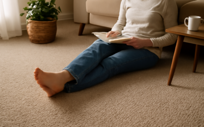
Picking carpet color feels low-stakes in the showroom and high-stakes the day you vacuum it for the first time. Carpet shades do more than set a mood — they determine how much dirt shows, how big a room feels, and how well the color holds up under your home’s particular lighting. The wrong shade reveals every crumb and footprint; the right one practically hides a week of family life. This guide walks through neutrals versus bold colors, which shades disguise dirt, and how lighting changes everything before you commit.
Neutrals: The Safe, Versatile Choice
Neutral carpet shades — beige, tan, greige, taupe, soft grey, and warm cream — are popular for good reason. They go with almost any wall color and furniture, they’re easy to live with for years, and mid-tone neutrals are excellent at hiding everyday dirt and lint. They also appeal to buyers, so they’re the smart pick if resale is on your mind.
The key is choosing a mid-tone neutral rather than an extreme. Very pale neutrals show dark dirt and stains; very dark ones show dust and lint. A medium beige or greige sits in the forgiving middle where most messes simply disappear.
Bold Shades: Personality With a Catch
Deep blues, forest greens, warm rusts, and rich charcoals can make a room feel intentional and luxurious, especially in a den, bedroom, or formal space. Bold shades hide stains well because there’s so much color to camouflage spills, and a saturated tone adds character a neutral never will.
The catch is commitment and lint. Bold colors are harder to coordinate with future furniture and decor, and dark or vivid shades show dust, lint, and pet hair more than mid-tones. They also date faster as color trends shift. Use bold shades where you want drama and won’t repaint around them every couple of years.
Which Shades Hide Dirt Best
If low maintenance is your priority, the shade and pattern both matter. The most forgiving carpets share a few traits:
- Mid-tone colors — medium beige, greige, and mid grey hide both light and dark debris
- Multi-tonal and flecked carpets — subtle color variation (berber-style flecks, heathered yarns) disguises crumbs and stains far better than a flat solid
- Warm tones over cool — warmer beiges hide common household dirt, which tends to be brownish
- Avoid extremes — pure white shows everything dark; solid black shows everything light
A flecked or tweedy mid-tone carpet is the gold standard for busy households with kids and pets — it can go longer between deep cleans while still looking presentable.
How Lighting Changes the Shade
Carpet rarely looks the same at home as it did under the showroom’s bright lights. Natural light direction and your bulbs both shift the color, sometimes dramatically.
- North-facing rooms get cool, indirect light that can make grey carpet look bluish or cold — lean warmer
- South-facing rooms get warm, abundant light that intensifies warm shades — cooler tones balance it
- Artificial light matters too: warm bulbs push beige toward yellow, cool LEDs flatten warm tones
Always take a large sample home and look at it on the floor in morning, midday, and evening light before deciding. A shade that looked perfect in the store can turn yellow, pink, or grey-cold in your actual room.
Coordinating the Shade With Your Room
Carpet is a large surface, so it sets the tone for everything else. For flexibility, keep the carpet neutral and bring color through walls, furniture, and accents you can change cheaply later. If you go bold with the carpet, keep walls and large furniture neutral so the room doesn’t feel chaotic.
Match undertones for a cohesive look: warm carpet with warm whites and woods, cool carpet with cooler greys and crisp whites. Mixing warm and cool undertones is what makes a room feel subtly “off” even when each piece looks fine on its own.
Popular Shades by Room
Different rooms reward different shade strategies. In a busy family living room, a mid-tone flecked neutral hides the constant traffic and crumbs while still feeling warm and inviting. Bedrooms, with their lower traffic, can carry softer, plusher shades or a richer accent color you’ll enjoy waking up to. Home offices and dens are good candidates for deeper, moodier tones that feel focused and cozy.
Stairs and hallways funnel the most foot traffic and dirt, so lean toward forgiving mid-tones and multi-tonal patterns there. Basements often benefit from warmer shades that counteract the cooler, dimmer light those spaces tend to have. Matching the shade to how each room is used and lit beats picking one color for the whole house.
Testing a Shade Before You Commit
Carpet is a big, lasting purchase, so test before you buy. Bring home the largest sample the dealer offers and live with it for a few days. Lay it on the floor — not held up at eye level — and view it in morning, midday, and evening light, since the color can shift dramatically across the day and under different bulbs.
Set the sample next to your wall color, furniture, and any fixed elements like cabinetry to check the undertones work together. Walk on it, drop a few crumbs, and see how forgiving it really is. A shade that passes the at-home test is far more likely to make you happy than one chosen under bright showroom lights, where almost everything looks good.
Choosing the Right Shade for You
Start with how the room is used. High-traffic family spaces want a forgiving mid-tone or flecked neutral that hides dirt and survives kids and pets. A low-traffic adult bedroom or formal room can carry a richer, bolder shade you’ll enjoy looking at. Resale-minded? Stick with broadly appealing neutrals.
Then test the shade in your own light, choose a multi-tonal version if low maintenance matters, and coordinate undertones with the rest of the room. Get the shade right and your carpet will look clean longer, feel cohesive with your decor, and stay in style well past the next color trend.