
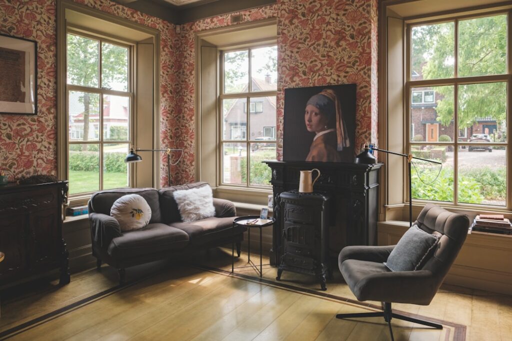
The dining room is one of the few rooms where you can actually go bold without regret. Dining room paint ideas tend to skew dramatic because the room sees mostly evening use under warm lighting, which softens deep colors and makes saturated walls feel intimate rather than overwhelming. After painting hundreds of dining rooms, the patterns are clear: dark blues, forest greens, and warm terracottas consistently outperform safe beiges in resale photos and homeowner satisfaction surveys alike.
Part of our Paint & Walls guide — explore the full guide →
Why Dining Rooms Can Handle Bold Color
You eat dinner here, not breakfast. Most meals happen between 5 and 9 PM under chandelier light, which is warm, low-lumen, and forgiving. A wall color that would feel oppressive at 9 AM in a kitchen reads as cocoon-like and elegant at 7 PM over candles. That is why designers consistently pick saturated colors for dining spaces while sticking to whites and grays for brighter rooms.
The other factor is square footage. Dining rooms in most US homes are 150 to 250 square feet — small enough that bold color creates a “moment” without dominating the entire floor plan.
Top Color Families for Dining Rooms
Deep Navy and Inky Blue
Sherwin-Williams Naval (SW 6244) and Benjamin Moore Hale Navy (HC-154) are the two most-specified navies for dining rooms in the past five years. Both have enough black in them to read sophisticated rather than nautical. Pair with brass fixtures and white wainscoting for a classic look that ages well.
Forest and Hunter Green
Farrow and Ball Studio Green (No. 93) and Benjamin Moore Forest Green (2047-10) lead this category. Green dining rooms photograph beautifully, especially when paired with natural wood tables and live plants. The color reads “garden room” without trying too hard.
Warm Terracotta and Spice
Sherwin-Williams Cavern Clay (SW 7701) was their 2019 Color of the Year and remains a dining room favorite. It works because the warm undertones flatter food and skin tones — important when guests are sitting under your light fixture.
Charcoal and Soft Black
For drama with restraint, Benjamin Moore Kendall Charcoal (HC-166) or Iron Mountain (2134-30) creates a high-contrast backdrop for art and white dishware. Black dining rooms work best with at least one large window and warm wood floors to balance the mass.
Two-Tone Treatments That Work
Wainscoting plus a deep color above is the most reliable two-tone formula. Run white painted wainscoting to 36 or 42 inches and put your bold color above. This breaks the visual mass, gives the room formal architecture, and is almost impossible to get wrong.
Picture rail with a single accent wall works in modern spaces. Pick the wall behind the buffet or the longest unbroken wall and paint it the bold color. Keep adjacent walls in a soft white like Benjamin Moore Simply White (OC-117) for contrast.
Finish Selection Matters More Than Color
- Matte or eggshell on dining room walls — hides imperfections, looks expensive, easy to touch up
- Satin or semi-gloss on trim and wainscoting — wipeable, takes scuffs from chair backs without showing wear
- Dead flat only if the walls are in great shape — gorgeous on deep colors but shows fingerprints
Skip high-gloss on dining room walls. The chandelier reflection turns into a glare disaster.
Lighting Will Change the Color Completely
Warm white LEDs (2700K) make every paint color look 10% richer and warmer. Cool white bulbs (4000K and up) flatten warm colors and exaggerate cool ones. Before you commit to any of these dining room paint ideas, swap your bulbs to 2700K and view sample swatches at the time of day you actually use the room.
Sample boards beat tiny chips every time. Buy a $7 quart of any color you are considering, paint a 2 by 2 foot poster board, and tape it to the wall for 48 hours. Move it to the wall opposite the window, the wall next to the doorway, and the wall behind where you will sit. Colors shift dramatically based on adjacent surfaces.
Ceiling and Trim Pairings
The fifth wall — your ceiling — is where most dining rooms miss an opportunity. Painting the ceiling the same color as the walls (sometimes called “color drenching”) makes a small dining room feel intentional and architectural rather than cramped. For Hale Navy walls, a Hale Navy ceiling is stunning with white crown molding to delineate.
For trim, stick with Benjamin Moore Chantilly Lace (OC-65) or Sherwin-Williams Pure White (SW 7005) in semi-gloss. These two whites work with nearly every wall color without yellowing or going too cool.
Paint Brands and Pricing
- Sherwin-Williams Emerald: $80 to $100 per gallon, premium coverage, two coats usually do it
- Benjamin Moore Aura: $90 to $110 per gallon, best for deep colors, often one-coat coverage
- Behr Marquee: $50 to $60 per gallon, solid budget option for lighter colors
- Farrow and Ball: $130 per gallon, unmatched depth for dark colors but budget-busting for whole rooms
For a 200 square foot dining room with 9 foot ceilings, plan on 2 gallons for walls plus 1 quart for trim — roughly $200 to $250 in premium paint, less than $400 with Farrow and Ball.
FAQ
What is the most popular dining room paint color in 2026?
Deep blues continue to dominate, with Hale Navy and Naval leading the requests. Warm terracottas and earthy greens are gaining ground fast.
Should the dining room match the kitchen color?
Open floor plans benefit from coordination, not matching. Pick a wall color from the kitchen palette and use it as an accent in the dining room, or use the dining room color in a small kitchen vignette.
Is it okay to paint a small dining room a dark color?
Yes. Dark colors actually make small rooms feel intentional and intimate rather than cramped, especially in a room used mostly at night.
What sheen is best for dining room walls?
Eggshell or matte. Both hide drywall imperfections and look more expensive than satin or semi-gloss on walls.
How many gallons of paint for a dining room?
Most dining rooms need 1.5 to 2 gallons for walls plus 1 quart for trim. Buy the second gallon in the same dye lot to avoid color mismatch.


