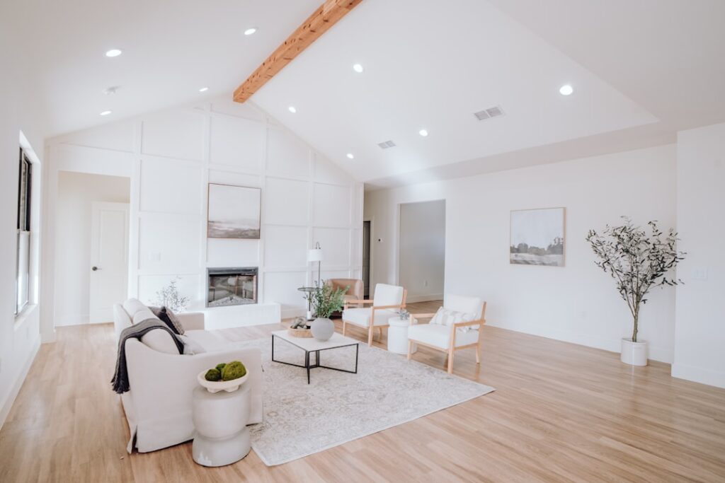
The same gray paint chip that looks sophisticated in the store can turn cold and blue on a north-facing living room wall, which is why choosing wall colors for living room spaces is more about light than the color itself. Professional designers test every color in the actual room, on multiple walls, at different times of day, before committing a single gallon. Paint is cheap and forgiving, but repainting a whole room because you skipped that step costs a weekend and a few hundred dollars. Get the undertones and lighting right and the color you pick will feel exactly as good on the wall as it did on the chip.
- Start With the Light Your Room Gets
- Warm Neutrals: The Reliable Foundation
- Whites and Off-Whites for Bright, Airy Rooms
- Bold and Moody Colors for Drama
- Using Color to Change a Room's Proportions
- Finishes and Sheen Matter Too
- Understanding Undertones Before You Commit
- Accent Walls and the 60-30-10 Rule
- Coordinating With Your Whole Space
Start With the Light Your Room Gets
Natural light dictates how a color reads more than anything else. A north-facing room gets cool, indirect light that pushes colors toward gray and blue, while a south-facing room floods with warm light that brightens and warms every shade.
- North-facing rooms: Choose warm colors to counteract the cool light. Warm whites, greige, soft yellows, and warm neutrals shine here.
- South-facing rooms: Handle almost any color; cool blues and greens stay balanced, and warm tones glow.
- East-facing rooms: Bright warm morning light, cooler afternoons. Neutrals and soft blues work well.
- West-facing rooms: Cool mornings, warm golden evenings. Test both times of day.
Always buy a sample pint, paint a two-foot square on the wall, and watch it morning, noon, and night before deciding.
Warm Neutrals: The Reliable Foundation
Warm neutrals dominate living rooms because they flatter almost any furniture and never feel sterile. Greige, the blend of gray and beige, has been the go-to for years because it pairs with both cool and warm accents.
Popular, dependable picks include Benjamin Moore Revere Pewter, Sherwin-Williams Accessible Beige, and Sherwin-Williams Agreeable Gray. These read as soft, sophisticated backdrops that let your art and furniture take the spotlight. If your room runs dark, lean toward the lighter end so the walls don’t close in.
Whites and Off-Whites for Bright, Airy Rooms
A well-chosen white makes a small living room feel larger and lets natural light bounce around. The trick is matching the white’s undertone to your room’s light and furnishings.
- Benjamin Moore White Dove: A soft warm white that’s forgiving in almost any light.
- Sherwin-Williams Alabaster: Creamy and warm, cozy without going yellow.
- Benjamin Moore Chantilly Lace: A crisp, cool, true white for modern spaces with lots of light.
Avoid stark cool whites in a north-facing room, where they can feel clinical. Warm whites are the safer default for living rooms most people want to relax in.
Bold and Moody Colors for Drama
If you want your living room to make a statement, deep saturated colors have surged in popularity. A navy, forest green, or charcoal wall creates a cozy, enveloping feel, especially in rooms used mostly in the evening.
Deep colors like Hague Blue, Benjamin Moore Hale Navy, and forest greens work beautifully on an accent wall or wrapped around the whole room with plenty of natural or layered artificial light. The key is committing fully; a timid amount of dark color looks like a mistake, while a fully dark room with warm lighting feels intentional and rich. Pair moody walls with brass fixtures and warm wood to keep them inviting rather than heavy.
Using Color to Change a Room’s Proportions
Paint is a cheap way to visually reshape a space. Light colors on the walls make a room feel larger and airier, while dark colors make a large room feel cozier and more intimate.
Painting the ceiling a shade lighter than the walls draws the eye up and makes ceilings feel taller. Conversely, a slightly darker ceiling brings a soaring room down to a warmer scale. For a small living room you want to open up, stick with light warm neutrals on every surface and let trim go just a touch brighter.
Finishes and Sheen Matter Too
The sheen changes both look and durability. For living room walls, the two most common choices are eggshell and matte.
- Matte/flat: Hides wall imperfections and gives a soft, modern look, but is harder to wipe clean.
- Eggshell: A slight sheen that resists scuffs and cleans up more easily. The most popular living room finish.
- Satin: More durable and washable, but shows wall flaws under raking light.
Reserve semi-gloss for trim and doors. On walls it magnifies every dent and roller mark.
Understanding Undertones Before You Commit
Undertone is the hidden color lurking beneath a paint’s main hue, and it’s the reason two grays that look identical on the chip can clash on the wall. Every neutral leans warm or cool: a gray might have a blue, green, purple, or greige undertone that only reveals itself once it’s up and catching light.
To spot an undertone, hold the color chip next to a pure white card. The subtle cast you see against the white is the undertone. Cool undertones (blue, green, gray) can feel crisp but risk reading cold in low light, while warm undertones (yellow, red, beige) feel cozy but can go muddy in dim rooms. Matching the undertone to your room’s light and furnishings is what separates a color that sings from one that feels off for reasons you can’t name.
Accent Walls and the 60-30-10 Rule
If you want more than a single wall color, designers lean on the 60-30-10 rule to keep a room balanced. Roughly 60 percent of the room is your dominant color (usually the walls), 30 percent is a secondary color (furniture, drapes), and 10 percent is an accent (pillows, art, a bold accent wall).
An accent wall is the cheapest way to add drama, and it works best on the wall your eye lands on first, often behind the sofa or around a fireplace. Choose a deeper shade in the same family as your main color for a subtle effect, or a bold contrast for impact. Just keep the accent to one wall in a small living room so the space doesn’t feel chopped up.
Coordinating With Your Whole Space
Your wall color should connect to your flooring, furniture, and adjacent rooms. Pull an undertone from your largest fixed element, like the floor or a big sofa, and choose a wall color that complements it. A warm oak floor pairs naturally with warm greige; a cool gray tile likes cooler neutrals.
If your living room flows into a kitchen or dining area, keep the palette in the same family so the spaces feel continuous. Test your top two or three finalists as large swatches side by side, live with them for a few days, and pick the one that still looks right in every light. That patience is the difference between a color you love and one you repaint.