
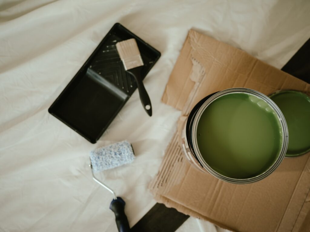
Paint is the highest-impact, lowest-cost change you can make to a home, transforming a room for the price of a few gallons and a weekend. The best interior paint ideas go beyond picking a color off a chip; they consider light, room function, and how spaces flow into one another. Whether you want soothing neutrals or a bold statement, these interior paint ideas will help you choose colors and combinations that actually work in your home rather than looking great only on a store display. Let’s walk room by room and technique by technique.
Part of our Paint & Walls guide — explore the full guide →
Start With Warm, Livable Neutrals
Neutrals dominate for good reason: they’re forgiving, timeless, and let your furniture and art take center stage. But not all whites and greiges are equal. The trend has shifted decisively toward warm neutrals that feel cozy rather than cold.
Reliable choices designers reach for again and again:
- Benjamin Moore White Dove: a soft, warm white that never reads sterile
- Sherwin-Williams Accessible Beige: a versatile greige for open-plan main floors
- Benjamin Moore Revere Pewter: the gray-beige that flatters nearly any wood tone
- Sherwin-Williams Alabaster: a creamy white for trim and full-room warmth
Paint a large sample board and move it around the room across the day before committing. North-facing rooms cool a color down; south light warms it up.
Bold Accent Walls Done Right
A single dramatic wall injects personality without overwhelming a space. The key is choosing the right wall, usually the one your eye lands on first, like the wall behind a bed or a fireplace.
Deep, saturated colors read as sophisticated when used with intention:
- A moody navy like Hale Navy behind a bed for a cocooning bedroom
- Forest green such as SW Pewter Green in a study or dining room
- Charcoal or near-black on a fireplace wall to frame the hearth
- Terracotta or clay tones to warm a reading nook
Keep the other three walls a quiet complement so the accent has room to breathe.
Color-Drenching an Entire Room
One of the strongest current trends is color-drenching: painting the walls, trim, ceiling, and even doors the same color in a single tone. It sounds risky but delivers a wrapped, enveloping effect that makes a room feel intentional and larger, not smaller.
This works beautifully in small rooms where contrasting trim would chop up the space, powder rooms being the classic example. A deep green or a soft clay drenched across every surface turns a tiny bathroom into a jewel box. Use a consistent sheen adjustment: eggshell on walls, satin on trim in the same color, so the surfaces read as one without going flat.
Ideas by Room Function
Match the color mood to how you use each space. What relaxes in a bedroom energizes poorly in a home office.
- Bedrooms: soft blues, warm greiges, and muted greens for rest
- Kitchens: crisp whites, sage green cabinets, or a warm cream for an inviting hub
- Home offices: deep greens and blues that focus the mind without feeling loud
- Living rooms: warm neutrals as a backdrop with a considered accent
- Bathrooms: spa-like blues and greens, or a drenched dramatic tone in a powder room
- Dining rooms: richer, moodier colors that feel intimate at night
Choosing the Right Finish
Color gets all the attention, but sheen determines durability and how the color reads on the wall. Higher gloss reflects more light and shows more imperfection.
- Flat/matte: hides wall flaws, ideal for ceilings and low-traffic adult bedrooms
- Eggshell: the go-to for most walls, a subtle sheen that wipes clean
- Satin: more scrubbable, good for hallways, kids’ rooms, and bathrooms
- Semi-gloss: durable and washable, standard for trim, doors, and cabinets
A common designer move is eggshell walls with semi-gloss trim in the same or a crisp white, giving definition and easy cleanup at the baseboards.
Creating Flow Between Rooms
Open floor plans and sightlines between rooms mean colors have to get along. The trick is a cohesive palette rather than one color everywhere. Choose a whole-home neutral for the main open spaces, then layer in coordinating colors for enclosed rooms.
Pull colors from the same undertone family so transitions feel natural. If your main floor is a warm greige, let adjacent rooms carry warm greens and clays rather than cool grays that would clash at the doorway. Many paint brands publish coordinating palettes that take the guesswork out of building a home-wide scheme.
Working With Undertones
The reason a paint color looks perfect in the store and disappointing on your wall almost always comes down to undertones. Every neutral leans warm or cool underneath, and that hidden bias either harmonizes with your room or fights it.
A gray with a blue undertone reads cold next to warm oak floors, while a greige with a green or taupe undertone glows next to the same floors. Hold your candidate color next to fixed elements you can’t change, like flooring, countertops, and cabinets, and watch which way it shifts. Warm undertones (yellow, red, taupe) cozy up a room; cool undertones (blue, green, gray) calm and recede. Matching the paint’s undertone to your home’s existing warm or cool palette is the single biggest predictor of whether you’ll love the result.
How Lighting Changes Everything
The same color behaves like three different paints depending on the light hitting it. Natural light shifts throughout the day, and artificial bulbs add their own cast, so testing in your actual space is non-negotiable.
- North-facing rooms: cool, indirect light that mutes color; lean warm to compensate
- South-facing rooms: bright, warm light all day that intensifies color
- East-facing rooms: warm in the morning, cooler by afternoon
- West-facing rooms: cool early, then rich golden light in the evening
Bulb choice matters too. Warm 2700K bulbs flatter neutrals and reds; cooler 3500K to 4000K bulbs can make warm colors look sallow. Paint a two-foot sample square on the wall and watch it at morning, midday, and night under your own lamps before committing to gallons.
Testing Colors the Right Way
Skipping the sample step is the most expensive mistake in painting, because repainting a room you got wrong costs far more than a few sample pots. Do it methodically and you’ll nail the color the first time.
- Buy sample pots (or peel-and-stick samples from brands like Samplize) of your top two or three choices.
- Paint large two-by-two-foot swatches, two coats, on more than one wall since light hits each differently.
- Live with the samples for at least two full days, checking them morning, noon, and night.
- View each swatch next to your furniture, trim, and flooring, not floating on a bare wall.
- Only then commit to the full gallons.
This handful of dollars and a couple of days of patience is the difference between a room you love and a repaint you resent.
Small Details With Big Impact
Beyond the walls, a few targeted paint moves punch above their weight. Painting interior doors a deep color, like black or navy, against light walls adds instant architecture. A painted ceiling in a soft blush or blue, the so-called fifth wall, surprises and delights.
Refreshing tired kitchen cabinets in a sage green or warm white transforms the whole room for a fraction of a remodel’s cost. And painting the inside of a bookshelf or a niche a contrasting color adds depth behind your objects. These small interior paint ideas cost a quart or two and turn an ordinary room into one that feels designed. Sample generously, respect your light, and start with one room; the confidence to go bolder comes fast once you see what a well-chosen color does.


