Picking a single wall color is easy; getting several colors to work together across a room or a whole home is where most people get stuck. Great interior paint color schemes aren’t random collections of colors you happen to like, they follow proven relationships from color theory that create balance, harmony, and flow. Understand a few core principles, the 60-30-10 rule, the color wheel, and undertones, and you can assemble a palette that looks professionally designed instead of accidental. Here’s the framework designers use, plus ready-to-borrow schemes that reliably work.
Part of our Paint & Walls guide — explore the full guide →
Start With the 60-30-10 Rule
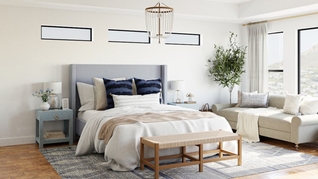
The single most useful tool for building a color scheme is the 60-30-10 rule, a designer’s formula for proportion that keeps any palette balanced. It divides a room’s color into three roles: 60% dominant, 30% secondary, and 10% accent.
- 60% dominant color: the main color, usually the walls, that sets the overall tone. This is typically your most neutral or restful choice.
- 30% secondary color: supports the dominant, often appearing in furniture, an accent wall, or large textiles. It contrasts enough to add interest.
- 10% accent color: the pop, in pillows, art, accessories, or a painted door, that gives the scheme energy.
Following these proportions prevents the two most common mistakes: a room so monochrome it feels flat, or so full of competing colors it feels chaotic. Even if you only remember one rule, make it this one.
Use the Color Wheel to Choose Relationships
The color wheel explains why certain combinations feel harmonious. Most successful schemes fall into one of a few classic relationships, and knowing them helps you build a palette on purpose:
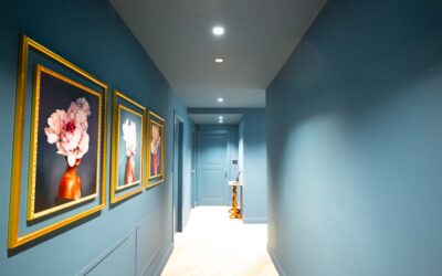
- Monochromatic: different shades and tints of a single color, calm, sophisticated, and easy to pull off (e.g., pale to deep blue-grays).
- Analogous: colors next to each other on the wheel, like blue, blue-green, and green. These feel natural and serene because they share underlying tones.
- Complementary: colors opposite each other, like blue and orange or green and terracotta. High contrast and energetic, best used with one color dominant and the other as an accent.
- Triadic: three evenly spaced colors for a lively, balanced scheme, more advanced, but striking when muted.
For most homes, monochromatic and analogous schemes are the safest and most soothing, while a touch of complementary color makes a great accent. Match the relationship to the mood you want: analogous for calm, complementary for energy.
Undertones Make or Break a Scheme
Even a technically correct color relationship falls apart if the undertones clash. Every color, especially neutrals, leans slightly warm or cool, and colors with compatible undertones blend while clashing ones fight. A greige with a green undertone next to a beige with a pink undertone will look subtly “off” even when you can’t name why.
The rule: keep every color in your scheme within the same undertone temperature. If your palette leans warm, choose warm-undertoned neutrals and accents; if it leans cool, keep everything cool. To test, tape large samples side by side and view them together in the room’s actual light, harmonious colors look like a family, clashing undertones jump out. This single check prevents most palette failures.
Warm vs. Cool Schemes
Deciding whether your scheme is fundamentally warm or cool anchors every other choice. Warm schemes, built on reds, oranges, yellows, and warm neutrals like beige and greige, feel cozy, inviting, and energetic, well suited to living rooms, dining rooms, and north-facing spaces that need warming. Cool schemes, built on blues, greens, purples, and cool grays, feel calm, spacious, and serene, ideal for bedrooms, bathrooms, and bright south-facing rooms.
You can mix warm and cool for balance, that’s often what makes a room feel layered, but let one temperature dominate so the space has a clear mood. A cool blue-gray room warmed by natural wood and a terracotta accent is a classic example of balanced mixing done right.
Proven Schemes to Borrow
If you’d rather start from something reliable, these combinations work in almost any home:
- Greige + white + black: a warm greige on the walls, crisp white trim, and black hardware or fixtures, timeless and versatile.
- Soft blue-green + cream + brass: a calming, coastal-adjacent scheme with warm metal accents.
- Sage green + warm white + natural wood: organic and current, perfect for a relaxed modern look.
- Navy + light gray + white: classic and crisp, with navy as the secondary and white as the connector.
- Warm white + terracotta + charcoal: earthy and grounded, great for open living spaces.
Each of these follows the 60-30-10 proportions and keeps undertones consistent, which is exactly why they feel cohesive.
Connecting Colors Room to Room
A scheme shouldn’t stop at one doorway. For a home that flows, repeat a consistent trim and ceiling white throughout and carry your main neutral through connecting spaces like hallways and open areas. Then let individual rooms take on their own accent colors while staying within the same undertone family. This creates variety without chaos, each room feels distinct, but the whole home reads as one considered palette.
Pay attention to sightlines: colors you can see from one room into the next should coordinate. Bold accent colors work best in rooms with a clear break, like a powder room or study, while open sightlines call for the shared neutral so the eye transitions smoothly.
Test Before You Commit
No matter how sound the theory, always test your scheme on the actual walls. Paint large samples of every color, at least two feet square, and view them together across morning and evening light. Colors read differently at scale and shift with the light, and seeing your whole palette side by side is the only way to catch undertone clashes before you buy gallons. A few dollars in samples saves the cost and heartache of repainting.
Build your interior paint color schemes on the 60-30-10 rule, choose a color-wheel relationship that matches the mood you want, keep undertones consistent, and test everything in place, and you’ll end up with a home that feels intentional, balanced, and calm from room to room, the hallmark of a palette that was planned rather than pieced together by accident.
Matching the Scheme to Each Room’s Purpose
A great color scheme also responds to how a room is used, because color genuinely affects mood. Bedrooms benefit from calming, low-saturation schemes, soft blues, greens, and muted neutrals that help you wind down, while a home office often works best with focused, slightly cooler tones that support concentration. Kitchens and dining rooms can carry warmer, more energetic colors that feel social and appetizing, and bathrooms suit fresh, clean schemes built on spa blues, greens, and crisp whites.
Living rooms and family spaces sit in the middle, they want inviting, versatile schemes that feel comfortable for both quiet evenings and entertaining. The point isn’t to give every room a wildly different palette, but to tune the same overall color family warmer or cooler, lighter or deeper, to fit each space’s function. A home where the bedroom feels restful, the office feels focused, and the kitchen feels lively, all while sharing a consistent undertone and trim color, reads as both cohesive and thoughtfully tailored.
Common Color-Scheme Mistakes to Avoid
Even with the right framework, a few predictable missteps trip people up. The most common is choosing colors in isolation, picking a favorite for each room without checking whether they work together, which produces a disjointed, patchwork home. Building a whole-home sample board and keeping a shared neutral and trim color prevents this. The second frequent error is ignoring undertones, pairing a warm-beige wall with cool-gray trim, for instance, so the combination looks subtly off even though each color is fine on its own.
Watch for these other traps as well:
- Too many accent colors: more than two or three competing accents makes a scheme feel chaotic; discipline reads as design.
- Skipping the test stage: judging color from a tiny chip instead of a large on-wall sample leads to costly surprises at full scale.
- Forgetting the room’s light: a color chosen without checking it in the room’s actual daylight and evening light can turn cold, muddy, or garish.
- Matching everything too tightly: a scheme with zero contrast falls flat; the 60-30-10 rule builds in the variation that keeps a room interesting.
Sidestep these pitfalls, lean on the proven relationships and proportions, and your interior paint color schemes will do exactly what good design should: feel effortless, balanced, and intentional in every room of the house.