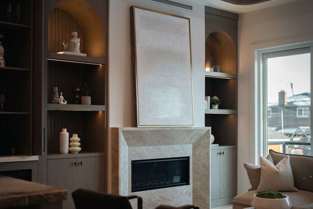
Pink has spent the last decade working its way out of the nursery and into living rooms, kitchens, and even home offices. The trick is choosing the right shade and the right partners, because a poorly executed light pink color palette reads as juvenile within minutes. The right one feels warm, modern, and quietly luxurious. After repainting two of my own rooms in shades of pink and helping clients pick palettes for a dozen more, the patterns that work consistently come down to undertone awareness, neutral selection, and disciplined accent use.
Understand Pink Undertones First
Light pink is not a single color. It splits into three undertone families, and each one demands different partners. Peachy pinks (Sherwin-Williams Cherished, Benjamin Moore Soft Pink) lean warm and pair beautifully with cream, cognac leather, and natural woods. Cool pinks (Farrow & Ball Pink Ground, Behr Mille Pink) read more neutral and work with grays, blacks, and crisp whites. Mauve pinks (Sherwin-Williams Intimate White, Benjamin Moore Wild Aster) sit between pink and lavender and pair best with deep greens and warm taupes.
Pull the paint chip into your specific room before committing. North-facing rooms shift cool pinks toward gray and can wash out warm pinks entirely. South-facing rooms amplify warmth in any pink, which can flatter peachy tones but make cool pinks look chalky.
The Best Light Pink Paint Codes
A handful of paint colors consistently deliver the elevated look most homeowners want.
- Farrow & Ball Pink Ground: The benchmark sophisticated pink, slightly dusty and complex. About $115 per gallon.
- Benjamin Moore Pink Bliss: Soft, warm, and forgiving in low light. A safe starter pink.
- Sherwin-Williams Romance: Slightly more saturated, ideal for accent walls or powder rooms.
- Behr Plumeria Petal: Budget option with similar feel to higher-end pinks.
- Backdrop Lou Lou: Trendy direct-to-consumer pink with a soft modern feel.
- Clare Pink Plate: Designer-developed pink that photographs well for resale.
Always sample these in 2 by 2 foot squares on at least two walls before committing to gallons. Paint dries darker than the swatch suggests and shifts based on adjacent finishes.
Neutral Pairings That Work
The single biggest mistake in pink palettes is pairing pink with stark white, which creates a candy-store look. Soft, warm whites and creams blend better. Try Benjamin Moore White Dove (OC-17), Sherwin-Williams Alabaster (SW 7008), or Farrow & Ball Pointing for trim. These cream-tinted whites soften the contrast and let pink read as a sophisticated neutral rather than a statement.
For grays, choose warm or greige tones. Cool blue-grays clash with most pinks. Sherwin-Williams Agreeable Gray, Benjamin Moore Revere Pewter, and Farrow & Ball Cornforth White all create cohesive backdrops that let pink shine without competing.
Accent Colors for Depth
A two-color palette feels flat. The strongest light pink color palette combinations include one accent that adds visual weight. The classic pairings are brass and pink, dark green and pink, navy and pink, and terracotta and pink.
- Pink and forest green: Hunter green, Benjamin Moore Salamander, or Farrow & Ball Studio Green deliver gravitas without overwhelming.
- Pink and burgundy: Wine and oxblood tones make pink feel like part of an heirloom palette.
- Pink and navy: Crisp, traditional, ideal for bedrooms with white trim.
- Pink and black: Modern and graphic. Use black sparingly in hardware, frames, and one large piece.
- Pink and terracotta: Bohemian and earthy. Layer in jute, leather, and warm woods.
Where to Use Pink in the Home
Pink works in any room when the saturation is right. Bedrooms are the easiest entry point because the warm tones flatter skin and the soft palette supports rest. Powder rooms are the bold choice, often painted in a slightly more saturated pink and paired with brass or matte black fixtures for drama in a small space.
Kitchens with light pink cabinetry have become a major trend. Designers like deVOL and Plain English have led this in the UK and the look has spread stateside. Pair pink lower cabinets with white upper cabinets, brass hardware, and white marble or quartz counters for a balanced, livable result.
Wood and Material Choices
Wood tones interact strongly with pink. Pale oak and white oak deliver a Scandinavian feel and pair seamlessly with cool pinks. Walnut and warm cherry add a traditional warmth to peachy or mauve pinks. Avoid red-toned woods like classic cherry or mahogany with cool pinks because the red-on-red competition feels muddy.
For furniture, velvet and bouclé fabrics in cream or oatmeal soften pink walls. Black metal frames and brass hardware add structure. Marble surfaces in warm Calacatta or honed Carrara complement pink without overwhelming it.
Lighting Considerations
Pink walls react strongly to light temperature. Warm bulbs (2700K) deepen and enrich pink. Cool bulbs (4000K and above) wash pink out and can make it look chalky or even slightly green. For rooms painted in pink, stay with 2700K to 3000K LED bulbs throughout, including in lamps and pendant fixtures.
Natural light dramatically alters how pink reads through the day. A pink that looks delicate at noon can read shockingly intense at sunset when warm golden light amplifies the warm undertones. Sample paint and observe through full daily light cycles before committing.
Avoiding the Nursery Look
The line between sophisticated and saccharine pink comes down to three rules. First, choose dustier and grayer pinks rather than candy or bubblegum tones. Second, anchor with darker accents (navy, black, deep green, burgundy) rather than only pastels. Third, layer in heavier materials (iron, marble, leather, dark wood) to balance the inherent softness of the color.
Avoid pairing pink with mint, baby blue, or yellow at the same intensity. Those combinations feel youthful at best and infantile at worst in adult spaces. Save them for actual nurseries.
Frequently Asked Questions
What colors go with light pink in a living room?
Forest green, navy, black, brass, and warm cream consistently look upscale with light pink. Add walnut or white oak wood and one or two textured neutrals like bouclé or jute to complete the palette.
Is pink a good color for a bedroom?
Yes, soft pinks promote calm and warm the room atmospherically. Choose dusty or muted shades rather than saturated bubblegum tones for a grown-up feel that ages well.
What is the most popular light pink paint color?
Farrow & Ball Pink Ground and Benjamin Moore Pink Bliss top most designer lists. Both offer warmth without veering into candy territory and pair well with a wide range of accent colors.
Can light pink work in a kitchen?
Absolutely. Light pink cabinetry paired with brass hardware, white quartz counters, and natural wood floors creates a sophisticated kitchen that feels current and timeless at once.