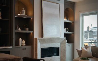
Light pink has shed its dated reputation and become one of the most versatile colors in home design, but it only shines when paired thoughtfully. Understanding what colors go well with light pink is the difference between a room that feels fresh and sophisticated and one that reads as sugary or juvenile. Blush and soft pink are essentially neutrals with warmth, which means they play beautifully off cool grays, deep greens, crisp whites, and metallic accents. This guide walks through the strongest color partners for light pink and how to use them in real rooms, from walls to decor.
Why Light Pink Is So Adaptable
Soft pink sits between a true pastel and a warm neutral. Depending on its undertone, it can lean cool and dusty, like a mauve or blush, or warm and peachy. That flexibility lets it act as a backdrop or an accent. Because it carries a hint of red’s warmth without the intensity, it softens cool palettes and adds sophistication to neutral ones. The key is choosing partners that either ground its sweetness or amplify its elegance, rather than competing with it.
The Classic Pairings
Light Pink and Gray
The most reliable, designer-approved combination. Cool gray tempers pink’s warmth and gives it a modern, grown-up edge. Charcoal grays create bold contrast, while soft dove grays keep things serene. This pairing works in bedrooms, living rooms, and bathrooms, and it is nearly impossible to get wrong. Add white trim to keep it crisp.
Light Pink and White
Clean, airy, and fresh. Pairing blush with bright or creamy white keeps a space feeling light and uncluttered, letting the pink read as a gentle wash of color rather than a statement. This is the go-to for Scandinavian and minimalist interiors and for small rooms that need to feel open.
Light Pink and Navy Blue
For drama and contrast, deep navy is a standout partner. The richness of navy grounds the softness of pink, creating a balanced, polished look that feels both classic and current. Use navy on a feature wall, cabinetry, or upholstery with pink as the softening accent.
Unexpected Combinations That Work
Light Pink and Green
Nature pairs pink and green constantly, from roses to peonies, which is why it feels so right indoors. Sage and olive greens bring an earthy, calming balance to blush, while emerald green creates a luxe, jewel-toned contrast. This botanical pairing is one of the most popular in current design, especially with plenty of houseplants and natural textures.
Light Pink and Terracotta or Rust
Warm earth tones amplify pink’s cozy side. Terracotta, clay, and rust create a warm, inviting palette that feels sun-washed and Mediterranean. Layer in natural materials like rattan and linen for a relaxed, textural room.
Light Pink and Black
A small dose of black adds instant sophistication and edge. Black picture frames, light fixtures, or window trim sharpen a pink room and keep it from feeling too soft. Use black as an accent, not a dominant color, to let the pink stay the star.
Metallic Accents for Light Pink
Metals elevate a pink palette from pretty to refined. Each brings a different mood:
- Gold and brass: Warm metallics that make blush look rich and glamorous. Ideal in light fixtures, hardware, and frames.
- Rose gold: A natural extension of pink itself, for a soft, cohesive shimmer.
- Silver and chrome: Cool metals that pair with dusty, gray-leaning pinks for a modern, sleek finish.
- Copper: Adds warmth and an artisanal feel, especially against earthy pinks.
Building a Full Palette
A well-balanced room usually follows a rough 60-30-10 rule: 60 percent a dominant color, 30 percent a secondary, and 10 percent an accent. With light pink you have two easy directions:
- Pink as the star: Use blush on walls or large furniture (60 percent), a grounding gray or green as secondary (30 percent), and a metallic or black accent (10 percent).
- Pink as the accent: Keep walls neutral white or gray (60 percent), add a deeper secondary like navy or sage (30 percent), and let pink pillows, art, or a chair provide the pop (10 percent).
Room-by-Room Ideas
Bedroom: Blush walls with gray bedding, white trim, and brass lighting create a calm, elegant retreat. Living room: A pink accent chair against sage or navy with wood tones feels sophisticated and warm. Bathroom: Pink and white with black hardware reads as fresh and modern, especially with subway tile. Kitchen: Soft pink cabinets paired with white counters, gold hardware, and wood shelving make a charming, on-trend statement. Nursery or kids room: Pink with soft green and cream stays sweet without being overwhelming.
Colors to Use Carefully
A few pairings need a lighter hand. Bright or neon colors can clash with soft pink and overwhelm its subtlety. Warm yellows can compete with pink’s warmth and muddy the palette unless carefully balanced. And too many pastels together, pink with lavender, mint, and baby blue all at once, can tip a room into looking childish. When in doubt, ground pastel pink with one strong neutral or deep tone to keep it looking intentional and mature.
Frequently Asked Questions
What is the best color to pair with light pink?
Gray is the most reliable and versatile partner. It cools pink’s warmth for a modern, sophisticated look. Green and navy are close seconds for more contrast and depth.
Does light pink go with gold or silver?
Both work depending on the pink’s undertone. Warm, peachy pinks glow with gold and brass, while cool, dusty pinks pair beautifully with silver and chrome. Rose gold complements nearly any shade of pink.
Can light pink and green be used together?
Absolutely. Pink and green is one of the most popular pairings, echoing flowers in nature. Sage and olive calm the palette, while emerald creates a luxe, jewel-toned contrast.
How do I keep a pink room from looking childish?
Ground it with a strong neutral or deep tone like gray, navy, or black, add metallic accents, and limit the number of pastels. Pairing pink with one sophisticated partner keeps it looking mature.