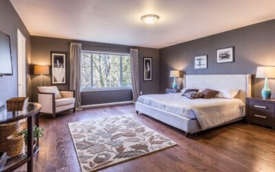
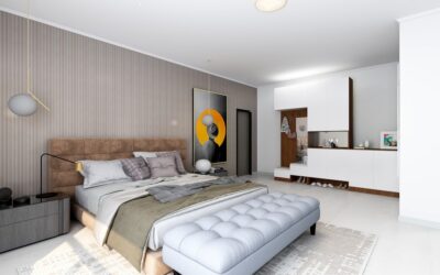
Paint is the cheapest sleep upgrade in the house — a $60 gallon changes how a room feels at 10 p.m. more than a $600 duvet. Choosing master bedroom calm bedroom paint colors is less about picking a pretty chip and more about controlling value (lightness), undertone, and saturation so the walls recede instead of buzzing. Designers reach for the same families again and again for restful primary suites: muted blues, gray-greens, warm whites, and soft earth neutrals, all in low-sheen finishes. This guide gives you the specific colors professionals actually specify, how lighting changes them, and how to build the rest of the palette around your pick.
Part of our Paint & Walls guide — explore the full guide →
What Makes a Color Read as Calm
Three properties do the work. Saturation: calm colors are desaturated — grayed-down versions of blue, green, or beige rather than clear, vivid hues; on a paint chip strip, the restful options usually sit one or two positions from the muted end. Value: light-to-mid values reflect enough light to keep the room from feeling heavy, though very dark, enveloping colors can also soothe when used deliberately in low-light “cocoon” bedrooms. Undertone: the hidden bias of a neutral (a gray can lean blue, green, or purple), and the thing that makes one greige feel serene and another feel dingy in your specific light. Test candidates on your walls before committing — a 12×12 inch painted swatch or peel-and-stick sample viewed morning, afternoon, and lamplight tells you more than an hour on Pinterest.
Room orientation should steer the shortlist before any chips come home. North-facing bedrooms receive cool, bluish light all day, which intensifies cool colors and can turn gray-blues gloomy — they usually want warmer, creamier picks. South-facing rooms bathe in warm light that flatters nearly everything but pushes yellows and beiges toward gold. East-facing rooms are warm at sunrise and cool by evening, and west-facing rooms reverse that, so judge swatches at the hour you actually use the room.
Muted Blues: The Sleep Classics
Soft blue remains the most consistently chosen bedroom family, and surveys of designers back it up. The trick is choosing blues with gray in them, which read as sky-at-dusk rather than beach house. Reliable picks include Sherwin-Williams Upward SW 6239, a light denim-gray blue; Benjamin Moore Quiet Moments 1563, a blue-green-gray chameleon that flatters almost every light exposure; and Behr Light Drizzle for a budget-friendly pale blue-gray. Pair muted blues with crisp white trim, warm oak or walnut furniture, and brass or black hardware. One caution: in north-facing rooms, already-cool light can push pale blue toward icy — warm the room back up with textiles, or shift one step toward blue-green.
Gray-Greens and Sage: The Designer Favorites
Green sits between warm and cool on the wheel, which is why muted greens are the most forgiving calm colors across changing light. Sage and gray-green tones connect the bedroom to nature without reading as color-forward. Standouts include Sherwin-Williams Evergreen Fog SW 9130, a soft gray-green with real depth; Benjamin Moore October Mist 1495, a gentle sage; Sherwin-Williams Sea Salt SW 6204, a pale green-gray that has anchored serene bedrooms for a decade; and Farrow & Ball Pigeon for a moodier European gray-green. These pair beautifully with linen bedding in white or oatmeal, rattan and light wood, and unlacquered brass. Sage also flatters skin tones in mirrors better than blue — a small thing you notice every morning.
Warm Whites and Earth Neutrals
For minimalists and bright-room lovers, the calm play is a warm white or soft greige rather than stark builder white, which can feel clinical. Dependable choices: Benjamin Moore White Dove OC-17, the designer default warm white; Sherwin-Williams Alabaster SW 7008, creamy without yellowing; Benjamin Moore Pale Oak OC-20, a barely-there greige; and Sherwin-Williams Accessible Beige SW 7036 where you want genuine warmth. Deeper earth tones — mushroom taupe, clay, and muted terracotta like Sherwin-Williams Redend Point SW 9081 — create warmth-forward calm, particularly in rooms with abundant natural light. Neutrals demand the most undertone diligence: sample at least three side by side, because the pink cast hiding in a beige only reveals itself at scale.
The Dark-and-Cozy Alternative
Calm does not always mean pale. In bedrooms used mostly at night, deep desaturated colors wrap the room and make lamplight feel golden: Benjamin Moore Hale Navy HC-154, Sherwin-Williams Outerspace SW 6251 (a soft charcoal-blue), or a deep spruce green. Rules for pulling it off: commit to all four walls (a single dark accent wall behind the bed is the safer half-step), keep bedding light for contrast, layer at least three light sources, and use the same color on trim in a slightly higher sheen for a tailored, enveloping result. Dark rooms photograph dramatically and sleep even better, but they do shrink visually — best above 12×12 feet or in rooms where coziness is the goal.
Sheen, Ceilings, and the Fifth Wall
Finish selection quietly makes or breaks the calm effect. Walls: matte or flat hides drywall imperfections and gives color a soft, velvety depth — the correct choice for low-traffic adult bedrooms; use eggshell only if you need extra scrubbability. Trim and doors: satin or semi-gloss in a coordinating white. Ceiling: flat ceiling white is standard, but the current designer move is painting the ceiling in 25 to 50 percent strength of the wall color, which eliminates the harsh white contrast line and makes the room feel finished from the bed — the view you actually have in a bedroom. Expect to need one gallon per 350 to 400 sq ft of wall per coat, and plan on two coats over any color change.
Building the Full Palette
A calm wall color succeeds or fails based on what surrounds it. Keep the whole-room formula simple: one wall color, one trim white, two or three supporting neutrals in textiles, and a single accent. With sage walls, that might be white trim, oatmeal linen, walnut nightstands, and aged brass lamps. With muted blue, try ivory bedding, a natural jute rug, and charcoal accents. Repeat the wall color once more somewhere small — a lampshade interior, throw pillow, or framed art — so the room reads intentional. Resist adding a second saturated color; the fastest way to undo a restful scheme is a bold accent wall competing with everything you just calibrated. If you crave contrast, get it from texture — a chunky knit throw, a rough-hewn wood bench, matte ceramics — rather than from another hue. Master bedroom calm bedroom paint colors work best as the quietest voice in a coordinated room, not a solo act; choose the muted chip, sample it in your own light, and let texture do the decorating.