Color choice drives more carpet returns and remorse than fiber, density, or price combined. Mohawk carpet colors span more than 600 named shades across the SmartStrand, EverStrand, and Air.O lines, and the catalog is genuinely overwhelming if you walk in without a plan. The good news: 80 percent of buyers land on roughly two dozen popular neutrals, and once you understand how Mohawk groups its color families, narrowing your choice to three samples becomes a one-hour project instead of a three-week ordeal.
How Mohawk Organizes the Catalog
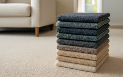
Mohawk groups colors into nine families: cool grays, warm grays, beiges, browns, taupes, blues, greens, reds, and blacks/charcoals. The grays and beiges represent about 70 percent of residential sales. Within each family, shades step from very light (10 to 20 percent reflectance) through mid-tones to deep saturation. Most homes use a light-to-mid neutral on bedroom floors and a slightly deeper or more saturated tone on stairs and hallways.
Each named color carries a four-digit code on the back of the sample. Snap a photo of the code, not just the front of the sample, because identical-looking colors can ship from different mills with subtly different dye recipes.
Top-Selling Mohawk Carpet Colors
Across showrooms nationwide, the same handful of names dominate the order books year after year:
- Gentle Rain — soft warm gray with a hint of beige, works in nearly any room
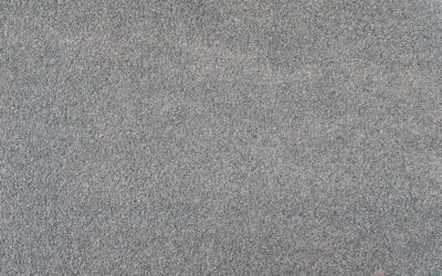
- Stoneware — true mid-gray, slightly cool, very forgiving with wood furniture
- Mushroom — taupe with a green undertone, hides traffic lanes well
- Linen — light beige with cream highlights, brightens dark north-facing rooms
- Pewter — deep charcoal with brown flecks, popular in basements and dens
- Driftwood — light gray-beige (greige), pairs with both white and warm-toned trim
- Antelope — warm tan, classic choice that hides pet hair on golden retrievers and labs
If the showroom only stocks 30 samples, those seven will almost always be on the wall.
Cool vs Warm: The Decision That Drives Everything
Before you compare specific shades, decide whether your space reads cool or warm. Hold a piece of pure white paper next to your trim, your largest piece of furniture, and any flooring already in the home. If the existing surfaces look creamy or yellowish next to the white sheet, you have a warm-toned home. If they look slightly blue or true white, you are cool. Mixing temperatures looks unsettled — a cool gray carpet under warm oak trim almost always reads “off” even when nobody can name why.
Mohawk’s warm grays — Gentle Rain, Driftwood, Antelope — pair with oak, cherry, and cream trim. Cool grays like Stoneware and Pewter belong with maple, painted white trim, or modern stained concrete adjacencies.
Lighting Changes Everything
A sample evaluated under a 5000K LED in a showroom will look noticeably different under your 2700K incandescent fixtures at home. Order three free samples per color and live with them for at least 72 hours. View them in morning light, midday, evening lamp light, and overhead light. North-facing rooms throw cool, blue light all day and shift warm carpets toward green. South-facing rooms warm everything by 5 to 10 percent on the color wheel.
If a color reads beautifully at 7 PM and harshly at 10 AM, it is the wrong color. The sample needs to look acceptable in every lighting condition you actually live in.
Choosing by Room
Different spaces tolerate different intensities of color. In a primary bedroom, lighter tones (Linen, Driftwood, Gentle Rain) feel restful and reflect lamp light to make the room feel larger. In a finished basement with limited natural light, deeper Mohawk carpet colors like Pewter or Mushroom paradoxically feel more welcoming because they create contrast against painted walls. Stairs and traffic lanes need mid-tone shades that hide soil — pure white and pure black both telegraph dirt within a week.
For kids’ rooms, consider Stoneware or Antelope. Both have enough fleck or mottling to camouflage juice spills until you can blot them. Avoid solid pastels in any room that sees food or pets.
Pattern, Fleck, and Multi-Tone Options
Beyond solid colors, Mohawk runs subtle multi-tone berbers and patterned loops where a base color gets accents of two or three secondary shades. These patterns hide soil dramatically better than solids — call it the eight-week rule: a solid Linen carpet looks soiled at week eight in a high-traffic hall, while a Linen-with-fleck reads clean at month four. The cost premium is usually $0.30 to $0.80 per square foot.
Coordinating With Existing Hardwood
If your main floor is already hardwood and carpet runs in adjacent bedrooms, the carpet should pull one tone — not match exactly, not contrast harshly. With red oak floors, target warm grays and beiges with a slight pink undertone. With white oak, the new market favorite, target cool greige (Driftwood) or true mid-gray (Stoneware). Hickory pairs surprisingly well with deeper taupes like Mushroom because the wood already carries dramatic color variation.
Common Color Mistakes
The most common error is choosing carpet color in isolation from paint color. Repaint the room first or, if not repainting, bring a wall-paint chip to the carpet store. Second mistake: picking the showroom favorite without checking how it reads against your specific furniture. A gray that pops against a black sample board can disappear against a charcoal sectional. Third: under-ordering samples. Three samples per top contender is the minimum.
Final Recommendation
Start with three Mohawk carpet colors: one warm neutral, one cool neutral, and one slightly deeper tone for contrast checking. Order free 4×6 samples from MohawkFlooring.com, live with them for a full week, and shoot photos at three different times of day. Choose the color that looks acceptable in every photo, not the one that looks stunning in only one. That single discipline eliminates 90 percent of color regret.