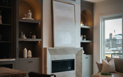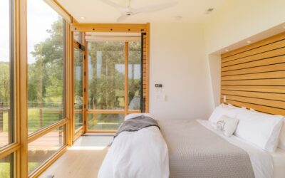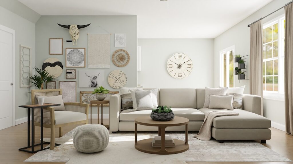
Neutrals are the backbone of a well-painted home — they let your furniture, art, and light do the talking. The best neutral interior paint colors aren’t boring; they’re the greiges, warm whites, and soft taupes that make a room feel calm and finished instead of blank. Choosing neutral interior paint colors is really about matching undertone to your light, and once you understand that, picking the right one gets a lot easier.
- Why Undertone Matters More Than the Name
- Warm Whites and Off-Whites
- Greiges — The Everyday Neutral
- Soft Gray Neutrals
- Taupes and Warm Beiges
- Building a Whole-Home Neutral Palette
- Neutrals by Room and Light
- Pairing Neutrals With Finishes
- Matching Sheen to the Room
- Cost and Coverage
- Common Neutral Mistakes
- The Bottom Line
Why Undertone Matters More Than the Name
Every neutral leans somewhere — warm toward yellow, red, or brown, or cool toward blue, green, or gray. That hidden undertone is why the same “greige” looks cozy in one house and cold in another. North-facing rooms get cool, bluish light that pushes gray neutrals toward icy, so warm them up. South-facing rooms flood with warm light that can make a beige go yellow. Sample every color on the actual wall before you commit — the swatch in the store means nothing under your light.
The one number that helps most is LRV, or Light Reflectance Value, from 0 (black) to 100 (pure white). An LRV above 60 keeps a small or dark room bright; 40–60 gives a mid-tone with more coziness.
Warm Whites and Off-Whites
A warm white is the most useful neutral in the house — it works on trim, ceilings, and whole rooms, and it never fights your furniture. These skip the sterile blue-white in favor of a soft, inviting base.
- Sherwin-Williams Alabaster (SW 7008) — LRV 82, a creamy soft white with a faint warm undertone. One of the safest, most-loved whites made.
- Benjamin Moore White Dove (OC-17) — LRV 85, warm with a touch of gray so it stays clean and never goes yellow.
- Sherwin-Williams White Duck (SW 7010) — LRV 74, a warm off-white with a subtle greige base for a cozier, aged feel.
Greiges — The Everyday Neutral
Greige is a gray-beige hybrid, and it’s the most versatile whole-house neutral there is. It reads warm enough to feel welcoming but neutral enough to work with cool or warm finishes.
- Sherwin-Williams Agreeable Gray (SW 7029) — LRV 60, the gold-standard greige. Balanced, slightly warm, and forgiving in almost any light.
- Sherwin-Williams Accessible Beige (SW 7036) — LRV 58, warmer than Agreeable Gray with a soft tan base for a cozier room.
- Benjamin Moore Revere Pewter (HC-172) — LRV 55, a green-gray greige that’s a classic for open floor plans.
- Benjamin Moore Edgecomb Gray (HC-173) — LRV 63, a lighter, airier greige for rooms that need to stay bright.
Soft Gray Neutrals
Gray isn’t dead — the trick is picking a gray with a warm or green undertone so it doesn’t go cold and blue. These read soft and modern without the sterile chill.
- Benjamin Moore Gray Owl (OC-52) — LRV 65, a light warm-gray with a faint green undertone. Bright and flexible.
- Sherwin-Williams Repose Gray (SW 7015) — LRV 58, a true mid-gray with the slightest warm base to keep it from going icy.
- Benjamin Moore Classic Gray (OC-23) — LRV 74, an almost-white warm gray for a light, quiet backdrop.
Taupes and Warm Beiges
When you want more depth than a pale neutral, taupe delivers. It’s a gray-brown that feels rich and grounding, especially in bedrooms and dining rooms with plenty of natural wood.
- Sherwin-Williams Balanced Beige (SW 7037) — LRV 44, a deeper greige-taupe with a soft gray undertone for a cozier, mid-tone wall.
- Benjamin Moore Pashmina (AF-100) — LRV 43, a smooth warm taupe that reads elegant and calm.
- Sherwin-Williams Kilim Beige (SW 6106) — LRV 57, a warm beige with a subtle pink-tan undertone that flatters warm wood tones.
Building a Whole-Home Neutral Palette
The pros don’t pick colors room by room — they build a coordinated palette so the house flows. A reliable formula: choose one warm white for trim and ceilings throughout, one main greige for the open living areas, and one deeper taupe or soft gray for bedrooms or a study. Keeping everything in the same warm or cool family means the eye moves through the house without jarring transitions.
For an even simpler approach, use one greige at full strength on the walls and the same color at 50% on the ceiling for a seamless, expensive look.
Neutrals by Room and Light
The same neutral behaves differently depending on where it lands, so let the room’s light guide the pick.
- North-facing rooms — cool, bluish light drains warmth, so lean into warm greiges like Accessible Beige or a warm white like White Duck to counteract the chill.
- South-facing rooms — flooded with warm light, these can handle a cooler gray like Repose Gray without going icy, and warm beiges may read slightly yellow here.
- Small or dark rooms — reach for a high-LRV neutral above 65, like Edgecomb Gray or Classic Gray, to bounce what light there is.
- Bedrooms — a deeper taupe like Balanced Beige or Pashmina wraps the room in warmth and reads restful.
- Open-concept main floors — a balanced greige like Agreeable Gray or Revere Pewter flows seamlessly from kitchen to living to dining.
Pairing Neutrals With Finishes
Neutrals aren’t chosen in a vacuum — they have to live with your floors, cabinets, and countertops. Warm wood floors and brass hardware pull toward warm greiges and taupes; a cool gray fights them. Cool gray-wash floors and chrome or nickel finishes sit better with a gray-leaning neutral like Repose Gray. White or marble counters give you flexibility, but check the veining — gray veining leans cool, cream veining leans warm. When in doubt, bring a large sample board next to your fixed finishes before you commit, because the wall color has to serve the things you can’t easily change.
Matching Sheen to the Room
Even the perfect neutral looks off in the wrong finish. Flat or matte hides wall imperfections and suits low-traffic bedrooms and ceilings. Eggshell is the everyday choice for living rooms and hallways — a slight glow that still wipes clean. Satin holds up in kitchens, baths, and kids’ rooms where you’ll scrub. Semi-gloss belongs on trim and doors, where its durability and slight shine define the edges of the room.
Cost and Coverage
A gallon of quality interior paint covers roughly 350–400 square feet per coat and runs $50–$90 in premium lines. Neutrals are forgiving on coats — most light greiges and warm whites cover in two coats over a similar existing color, and a tinted primer isn’t usually necessary unless you’re covering something much darker. For a standard 12-by-14 room, two gallons handles two coats on the walls with a little left for touch-ups.
Common Neutral Mistakes
Neutrals are forgiving, but a few missteps trip people up every time. The biggest is ignoring undertone — picking a gray that looks perfect on the chip and turns lavender or blue on the wall. Always look at a large sample in your own light. The second is going too light in a bright room, where a pale greige can wash out to a flat, dingy off-white in strong sun; step up to a mid-tone with more body. The third is mixing warm and cool neutrals in connected spaces, which creates a subtle clash the eye reads as “off” even if you can’t name why. Keep your palette in one temperature family and the whole house feels intentional.
The Bottom Line
The best neutral interior paint colors come down to undertone and light: warm whites like Alabaster and White Dove for trim and bright rooms, balanced greiges like Agreeable Gray and Revere Pewter for open living spaces, and deeper taupes like Pashmina when you want warmth and depth. Sample on your own walls, check the color at different times of day, build a coordinated palette across the house, and your neutrals will feel calm and intentional rather than flat and forgettable.