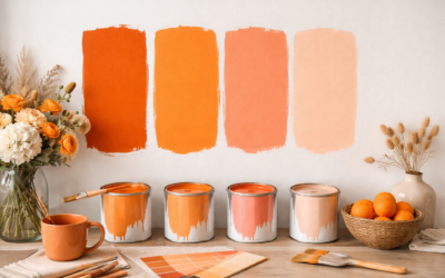
Well-chosen orange paint colors bring warmth and energy to a room like no other hue, yet orange remains one of the most misunderstood colors in the paint aisle. Most people picture a jarring, 1970s pumpkin and stop there. The truth is that orange spans a huge range, from barely-there peach and earthy terracotta to spicy cinnamon and deep rust, and the muted end of that spectrum has quietly become one of the most sophisticated choices in modern design.
Part of our Paint & Walls guide — explore the full guide →
Orange works in kitchens, dining rooms, and on front doors, and the secret is almost always to reach for the grounded, earthy versions rather than the pure, saturated ones. Here are the shades that work.
- Why Orange Is Making a Comeback
- The Best Terracotta and Earthy Oranges
- Soft Peach and Apricot Options
- Bold and Spicy Oranges
- Where Each Orange Belongs
- Colors That Pair Well With Orange
- Understanding Orange Undertones
- How Room Direction Affects Orange
- Choosing the Right Sheen and Testing
- Using Orange in Small Doses
- Warm Whites and Neutrals in the Orange Family
- Benjamin Moore Burnt Orange Shades to Sample
- Final Thoughts
Why Orange Is Making a Comeback
Orange sits between red and yellow on the color wheel, so it carries the coziness of both. It stimulates appetite and conversation, which is why designers love it in kitchens and dining rooms. After years of gray dominating interiors, warm earthy tones like terracotta and clay have surged back as people crave comfort and personality.
The modern approach is to lean into muted, dusty, or burnt oranges rather than bright citrus. These read as warm neutrals rather than loud statements.
The Best Terracotta and Earthy Oranges
Terracotta is the most versatile family of orange paint colors, evoking clay pots and Mediterranean walls. These grounded shades feel timeless:
- Sherwin-Williams Cavern Clay (SW 7701) — a dusty, warm terracotta that became a modern-southwest favorite and works beautifully on an accent wall.
- Benjamin Moore Audubon Russet (HC-51) — a rich, earthy orange-brown with real depth.
- Sherwin-Williams Baked Clay (SW 6340) — a soft, sophisticated terracotta for a warm, inviting room.
Soft Peach and Apricot Options
For a gentler take, peach and apricot deliver warmth without commitment. These lighter tones are wonderful in bedrooms, nurseries, and north-facing rooms that need a lift:
- Benjamin Moore Peach Cobbler (2175-40) — a soft, creamy peach that flatters skin tones and feels cozy.
- Sherwin-Williams Sundew (SW 6672) — a warm, muted apricot, subtle and livable.
- Benjamin Moore Blushing Apricot (2168-50) — a delicate, warm blush-orange.
Bold and Spicy Oranges
If you want a true statement, saturated oranges bring drama, especially on a front door or a single accent wall:
- Sherwin-Williams Obstinate Orange (SW 6884) — a vivid, playful orange for a bold front door or accent.
- Benjamin Moore Tangy Orange (2014-30) — a lively, energetic orange with real punch.
- Sherwin-Williams Rojo Dust (SW 9006) — a deep, brick-toned burnt orange that grounds a bold look.
Use these in small, deliberate doses. A little saturated orange goes a long way.
Where Each Orange Belongs
Matching the shade to the room is everything:
- Kitchens and dining rooms — terracotta and spice tones stimulate appetite and warmth.
- Bedrooms — soft peach and apricot for a gentle, cozy feel.
- Front doors — bold burnt orange for standout curb appeal.
- Home offices — a muted clay accent wall to energize without overwhelming.
- Powder rooms — a great place to go bold in a small footprint.
Colors That Pair Well With Orange
Orange plays beautifully with the right companions. For a warm, earthy scheme, pair terracotta with creamy whites, warm woods, and rattan. For contrast and sophistication, orange looks striking against deep navy, forest green, or charcoal. Its complement on the color wheel is blue, so a dusty blue accent makes an orange room pop without clashing.
Avoid pairing a bright orange with a competing bright color, which reads chaotic. Let orange be the star and keep the supporting palette calm.
Understanding Orange Undertones
The reason so many people fear orange is that they have only seen it go wrong, and the culprit is almost always an undertone mismatch. Orange paint colors carry undertones that pull toward red, yellow, brown, or pink, and those hidden leanings determine whether a shade feels warm and grounded or loud and dated. A red-leaning burnt orange like Rojo Dust reads rich and cozy, while a yellow-leaning orange can veer toward that harsh 1970s look people dread.
Brown-based oranges, the terracottas and clays, are the most forgiving because the earthiness tempers the intensity. Pink-leaning oranges drift into coral and peach territory, softer and more romantic. When you shop, hold a swatch against a plain white card to see which direction it truly pulls, then imagine that undertone amplified across a whole wall. Getting the undertone right is what separates a sophisticated, modern orange from one that overwhelms a room.
How Room Direction Affects Orange
The way light enters a room dramatically changes how orange paint colors appear, so the same can of paint can look wonderful in one room and wrong in another. North-facing rooms get cool, indirect light that mutes warm colors, which actually flatters orange by toning down its intensity, making these spaces ideal for a soft terracotta or clay. South-facing rooms flood with warm light all day, which amplifies orange and can push a bold shade toward glaring, so lean toward muted, dusty versions there.
East-facing rooms get warm morning light that gradually cools, while west-facing rooms turn golden and intense in the late afternoon, deepening any orange on the walls. Because of this, always paint a large sample and observe it at several times of day before committing. An earthy orange that looks perfectly balanced at noon might glow almost neon at 5 p.m. in a west-facing room, and you want to know that before the whole wall is done.
Choosing the Right Sheen and Testing
For walls, a matte or eggshell finish keeps orange looking rich and modern rather than plasticky. On a front door, a satin or semi-gloss adds durability and a subtle sheen that suits the bold color.
Always test orange paint colors with sample pots before committing, because warm tones shift dramatically with light. An earthy terracotta can turn muddy in low light or glow almost neon in strong afternoon sun. Paint a large swatch and watch it across the day.
Using Orange in Small Doses
If a whole orange wall feels like too much commitment, some of the best uses of orange paint colors are small and strategic. A painted front door in a bold burnt orange delivers standout curb appeal for the cost of a quart, and it is easy to repaint if you tire of it. Inside a neutral room, orange shows up beautifully on the back of a bookcase, the inside of a cabinet, or a single piece of furniture refreshed with paint, adding a jolt of warmth without overwhelming the space.
Trim and accents are another low-risk way in. A terracotta-painted interior door, a stair riser detail, or a laundry room ceiling in a warm clay tone injects personality where a full room might feel like too much. These smaller applications let you enjoy the energy orange brings while keeping the overall palette calm, and they are the easiest way for a hesitant homeowner to test whether they love living with the color before going bigger.
Warm Whites and Neutrals in the Orange Family
Some of the most useful members of the orange family barely register as orange at all. Warm whites and creamy neutrals that carry an orange or peach undertone bring subtle warmth to a whole house without any of the boldness. Shades like Benjamin Moore White Sand or a soft almond read as inviting neutrals, but their hidden orange undertone is what makes them feel cozy rather than cold.
These are the workhorses for anyone who wants the warmth orange provides applied across main living areas. Pair them with genuine terracotta or burnt-orange accents in pillows, art, and rugs, and you get a cohesive, sun-warmed palette that feels current without committing an entire wall to saturated color. It is the quiet way to bring the orange family into a home, and it flatters wood tones and natural materials beautifully.
Benjamin Moore Burnt Orange Shades to Sample
Benjamin Moore does not sell a single color called burnt orange, but several shades in its range describe themselves that way or sit right next to it. Fall Harvest 2168-10 is the closest classic burnt orange, and Corlsbud Canyon 076 is a richer, more saturated take. For a browner or redder lean, Burnt Caramel, Burnt Cinnamon and Audubon Russet fill out the family.
The Short List
| Color | Code | Character |
|---|---|---|
| Fall Harvest | 2168-10 | Deep, earthy burnt orange with an autumn feel |
| Corlsbud Canyon | 076 | Rich, sunbaked burnt orange with a Southwest mood |
| Burnt Caramel | 2167-10 | Browned orange, softer and sweeter in tone |
| Burnt Cinnamon | 2094-10 | Deep orange-brown, the most grounded of the group |
| Audubon Russet | HC-51 | Earthy terracotta with a red-brown lean |
How to Choose Between Them
Start with the undertone you want. If you like the look of clay pots and rust, sample Fall Harvest and Audubon Russet side by side. If you want more energy and less brown, Corlsbud Canyon pushes further toward true orange. If the room already has strong wood tones or brown leather, Burnt Cinnamon or Burnt Caramel will blend rather than compete.
Where Burnt Orange Works Best
- Front doors: a deep burnt orange pairs well with cream, gray or brick siding and hides scuffs better than bright orange.
- Dining rooms and dens: a full wall in a muted burnt orange reads warm and cozy, especially with low, warm lighting.
- Cabinetry and built-ins: a lower cabinet run or a bookcase interior gives the color a supporting role.
- Accent walls: one wall behind a sofa or bed is the lowest-risk way to try a dark shade.
Pairings That Flatter Burnt Orange
Burnt orange looks its best next to warm whites, natural oak or walnut, olive and sage greens, and deep navy for contrast. Brass and matte black hardware both suit it. Avoid placing it beside cool, blue-white trim, which can make the orange look muddy.
Dark, saturated colors like these often need a tinted primer and two full coats for even coverage. Not every shade is offered in every product line or for exterior use, so confirm availability with the maker’s current color page before buying a gallon, and always paint a large sample first.
Final Thoughts
Orange has shed its dated reputation, and the earthy, muted shades leading its revival are as livable as any neutral. Whether you want the timeless warmth of Cavern Clay on an accent wall, a soft peach bedroom, or a bold burnt-orange front door, there is an orange that fits. Choose the grounded versions for everyday rooms, save the vivid tones for accents, and pair thoughtfully, and you will have a space that feels warm, current, and full of personality.