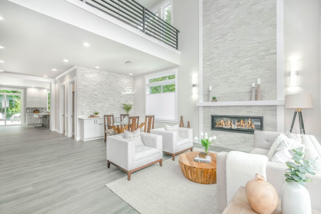
The conventional advice to “just paint a dark room white” misses the point. A north-facing room with one small window will absorb the wrong white and look colder, not brighter. The right approach to paint colors for dark rooms starts with light reflectance value (LRV), the orientation of the windows, and the existing finishes in the space. A carefully picked color with an LRV in the right zone can make a basement playroom feel like a sunroom; the wrong color of “bright white” can make the same room feel like a hospital corridor.
Part of our Paint & Walls guide — explore the full guide →
- Understanding LRV Before You Pick a Color
- 1. Benjamin Moore White Dove OC-17 (LRV 85.38)
- 2. Sherwin-Williams Alabaster SW 7008 (LRV 82)
- 3. Benjamin Moore Classic Gray OC-23 (LRV 74.78)
- 4. Sherwin-Williams Agreeable Gray SW 7029 (LRV 60)
- 5. Farrow and Ball Wimborne White No. 239 (LRV 78)
- 6. Behr Swiss Coffee 12 (LRV 84)
- 7. Benjamin Moore Pale Oak OC-20 (LRV 70.66)
- 8. Sherwin-Williams Pure White SW 7005 (LRV 84)
- 9. Benjamin Moore Simply White OC-117 (LRV 89.52)
- 10. Pale Blue: Sherwin-Williams Sea Salt SW 6204 (LRV 63)
- 11. Benjamin Moore Quiet Moments 1563 (LRV 67)
- 12. Farrow and Ball Pointing No. 2003 (LRV 79)
- North-Facing Versus South-Facing Considerations
- Sheen Matters as Much as Color
- What Else Matters Besides Wall Color
Understanding LRV Before You Pick a Color
Light reflectance value is a 0 to 100 scale where 0 is pure black and 100 is pure white. The number printed on the back of every Sherwin-Williams, Benjamin Moore, and Behr fan deck tells you exactly how much light a color bounces back.
For dark rooms, target LRV ranges:
- LRV 70 to 85 — bright, opens up the space, still has some character
- LRV 60 to 70 — warm and inviting, works in most low-light rooms
- LRV under 60 — adds drama but reads dark
- LRV over 85 — risks looking sterile or flat in low light
The pure-white trap is real. Pure white (LRV 90+) reflects every nuance of available light, including the gray-blue of north-facing daylight, which makes a room feel colder than it is.
1. Benjamin Moore White Dove OC-17 (LRV 85.38)
The most-recommended near-white in the design industry for a reason. Slightly warm, neutral enough to work with any trim, never reads pink or yellow. Works in north, south, east, and west exposures. The safest pick if you are unsure.
2. Sherwin-Williams Alabaster SW 7008 (LRV 82)
HGTV’s most-used neutral. A creamy warm white that reads bright without going stark. Pairs with white trim or with a slightly darker trim like SW Accessible Beige. Works especially well in older homes with traditional details.
3. Benjamin Moore Classic Gray OC-23 (LRV 74.78)
A warm light gray that handles low light better than cooler grays. Looks like a soft pearl in north-facing rooms and adds gentle warmth in basements. Avoid in rooms with green or olive undertones; pull the trim warmer to match.
4. Sherwin-Williams Agreeable Gray SW 7029 (LRV 60)
The boundary between light and mid-tone. Works in dark rooms when you want something with more presence than near-white but still reflects enough light to brighten. A neutral greige that almost any color will work alongside.
5. Farrow and Ball Wimborne White No. 239 (LRV 78)
Slightly warmer than White Dove with a barely-there cream undertone. Premium pricing at $115 a gallon but the finish is extraordinary in person. Used by designers in historic homes and high-end remodels.
6. Behr Swiss Coffee 12 (LRV 84)
The budget pick. At $48 a gallon for Behr Marquee, this is a workhorse warm white that competes with Benjamin Moore at half the price. Reads slightly more yellow under incandescent lighting, which can be a feature or a bug depending on the room.
7. Benjamin Moore Pale Oak OC-20 (LRV 70.66)
A barely-tinted greige that adds dimension without darkening the room. Works beautifully in bedrooms and home offices that need a touch of warmth. Pairs with white trim and dark wood furniture.
8. Sherwin-Williams Pure White SW 7005 (LRV 84)
A clean white that is not stark or cold. The pick for modern interiors where you want crisp without sterile. Less warm than Alabaster, less yellow than Swiss Coffee.
9. Benjamin Moore Simply White OC-117 (LRV 89.52)
Color of the Year 2016 and still going strong. The brightest white on this list, with just enough warmth to avoid reading cold. Best in rooms with at least some natural light; can read flat in fully artificial lighting.
10. Pale Blue: Sherwin-Williams Sea Salt SW 6204 (LRV 63)
Not every dark room needs a neutral. A pale soft blue or green can make a north-facing room feel like it has light pouring in even when it does not. Sea Salt reads as a calm blue-green that flatters morning light especially well.
11. Benjamin Moore Quiet Moments 1563 (LRV 67)
A soft blue-green that opens up dark rooms with a coastal feel. Works in bathrooms and bedrooms where you want serenity without going stark white.
12. Farrow and Ball Pointing No. 2003 (LRV 79)
A historic English near-white with a slight pink-cream undertone. Looks dreamy in candlelight and lamp-lit rooms. Premium price but a signature color that turns up in design magazines for a reason.
North-Facing Versus South-Facing Considerations
Window direction changes everything:
- North-facing — cool daylight, pulls warmer pigments out of paint; go warmer than you think
- South-facing — abundant warm daylight, almost any color works
- East-facing — bright morning, dim afternoon; pick a color that handles both
- West-facing — golden afternoon light, can handle cooler tones
- No exterior windows (interior bathrooms, basements) — go warm; cool tones read clinical
Always test paint colors at the actual location before committing. Sample boards by Samplize ($6 each) let you move colors around the room and view them in morning, afternoon, and evening light without rolling sample paint onto your walls.
Sheen Matters as Much as Color
In dark rooms, sheen choice multiplies the effect of the color:
- Flat — absorbs light, makes the room feel darker (avoid)
- Matte — modern look, hides imperfections, still absorbs some light
- Eggshell — slight reflection, the most popular choice for dark rooms
- Satin — more reflection, makes walls feel slightly brighter
- Semi-gloss/gloss — reserved for trim, doors, and high-moisture areas
For walls in a dark room, eggshell sheen with a high-LRV warm white is the formula most pros recommend. The slight reflection bounces lamp and overhead light around the room.
What Else Matters Besides Wall Color
Paint colors for dark rooms only do part of the work. Three other moves multiply the effect:
- Replace overhead bulbs with 3000K LED at 2,200 lumens minimum
- Add a floor lamp and a table lamp; one ceiling light is never enough
- Use mirrors strategically across from windows or light sources
- Pick a light flooring or a light rug to bounce reflected light upward
A dark room with the right paint and proper layered lighting reads almost as bright as a naturally well-lit room. The combination matters more than any single decision.