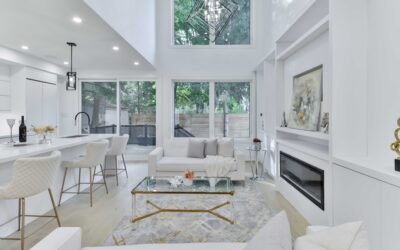
Sherwin-Williams sells well over a hundred whites, and the store chip rack does almost nothing to tell them apart. Yet the working shortlist of Sherwin Williams white paint colors — the ones designers actually specify, over and over — is about eight colors, each with a distinct undertone and a distinct job. Pick from that shortlist by matching undertone to your room’s light and fixed finishes, and the “which white” decision collapses from overwhelming to almost easy. Here is the shortlist, the numbers behind each color, and the pairings that keep trim, walls, and cabinets from fighting.
Part of our Paint & Walls guide — explore the full guide →
- How to Read a White: Undertone and LRV
- The Crisp Whites: Extra White and High Reflective White
- The Universal Whites: Pure White and Snowbound
- The Warm Whites: Alabaster, Greek Villa, Shoji White, White Duck
- Matching Whites to Jobs
- Whites With Cabinets, Counters, and Tile
- Mistakes That Sink White Paint Jobs
- Sampling: The Non-Negotiable Step
How to Read a White: Undertone and LRV
Two data points separate every white. Light Reflectance Value (LRV) measures brightness on a 0-to-100 scale; whites live roughly from 73 to 93, and a few points matter — an LRV-93 white glows, an LRV-75 white reads as “off-white” next to it. Undertone is the hidden color in the tint: yellow and red make warm whites, blue and gray make cool ones, green and beige make the in-betweeners. You cannot judge undertone from a lone chip; hold candidates against a plain sheet of printer paper or against each other, and the hidden color jumps out. Then check the room — north light cools every white, south light warms it, and your countertop or tile has an undertone of its own that the paint must not argue with.
The Crisp Whites: Extra White and High Reflective White
Extra White SW 7006 (LRV 86) is SW’s cool workhorse — a barely-blue bright white that is the factory standard on millwork in much of the country and the natural trim partner for gray and blue wall colors. High Reflective White SW 7757 (LRV 93) is the brightest white in the deck, essentially undertone-free, and reads stark almost anywhere except galleries, ceilings that must disappear, and ultra-modern spaces with abundant light. Use these two when you want clean and cold-blooded; skip them in warm-toned rooms, where they make creams and wood look dingy by comparison.
The Universal Whites: Pure White and Snowbound
Pure White SW 7005 (LRV 84) is the single safest white Sherwin-Williams makes — technically warm, but only just, with a soft neutrality that works on trim, cabinets, walls, and full exteriors without going yellow or icy. If you refuse to sample anything, this is the default. Snowbound SW 7004 (LRV 83) sits nearby with a whisper of gray (and, in some light, the faintest pink cast); it is a favorite for cabinetry that should read white but not bright-white. Both pair comfortably with nearly any wall color, which is why painters keep five-gallon buckets of Pure White semi-gloss on the truck year-round. When clients cannot decide, Pure White trim under Alabaster or Agreeable Gray walls is the combination pros default to, because it has essentially never produced a callback.
The Warm Whites: Alabaster, Greek Villa, Shoji White, White Duck
Warm whites are the coziness lane, and SW owns some of the most-specified colors in it. Alabaster SW 7008 (LRV 82) is the star — a softly creamy white without obvious yellow, famous on modern farmhouse exteriors and serene interiors alike. Greek Villa SW 7551 (LRV 84) runs slightly brighter and creamier, a beautiful whole-house white where windows are generous. Shoji White SW 7042 (LRV 74) dips toward greige, reading as a warm off-white that flatters linen, rattan, and limewash-look rooms. White Duck SW 7010 (LRV 74) carries a soft beige body that behaves almost like a pale neutral. Eider White SW 7014 rounds out the group with a gray-violet cast — lovely, but sample it, because that violet appears unannounced in north light. Warm whites are their own science across brands; the site’s warm white paint colors guide compares these SW picks against Benjamin Moore and Behr rivals head-to-head.
Matching Whites to Jobs
A quick assignment sheet for the shortlist:
- Trim and doors: Pure White (universal), Extra White (with cool wall colors)
- Kitchen cabinets: Pure White, Snowbound, or Alabaster for a warmer kitchen; avoid High Reflective White, which turns clinical under LED strips
- Whole-house walls: Alabaster or Greek Villa (warm), Pure White (neutral)
- Ceilings: SW Ceiling Bright White or the wall color cut to flat sheen
- Exteriors: Alabaster for farmhouse warmth, Pure White for crisp trim; whites above LRV 85 can glare on full-sun stucco
- Bedrooms and low-light rooms: Shoji White or White Duck, which keep shadowed walls from going gray
Undertone consistency is the rule that saves schemes: warm walls want Pure White or warmer on trim, while Extra White belongs beside grays, blues, and greens.
Whites With Cabinets, Counters, and Tile
White-on-white rooms fail at the seams, where paint meets fixed finishes. Hold your paint sample against the countertop and backsplash first: bright-white quartz and subway tile push you toward Pure White or Extra White, because Alabaster next to them looks unwashed; cream-veined marble, travertine, and warm oak floors push you toward Alabaster or Greek Villa, because blue-whites make those materials look dirty. When walls and cabinets are both white, create hierarchy with sheen and a half-step of LRV — Alabaster walls in eggshell under Pure White cabinets in satin enamel is a proven stack that reads layered rather than flat.
Mistakes That Sink White Paint Jobs
White schemes fail in predictable ways, and every one is avoidable. Mixing undertone families is the classic: Alabaster walls with Extra White trim makes the walls look dirty and the trim look icy, when either color alone was fine. Matching paint to a screen or a Pinterest photo is the second — monitor color and photo filters distort whites more than any other family, so trust only physical samples in your own light. Third is ignoring the fixed elements: the room’s countertop, tile, carpet, and flooring already have undertones, and a white chosen in isolation will pick a fight with at least one of them.
Execution mistakes matter just as much with whites because the eye catches every flaw in a light film. Skipping primer over patched drywall causes flashing — dull spots where the mud absorbed the sheen — that whites broadcast mercilessly; spot-prime every repair. Cutting in one day and rolling the next leaves visible picture-framing at edges, since the two applications age minutes apart in sheen. Cheap contractor-grade white yellows and marks up quickly, and touch-ups rarely blend on anything but flat sheen, so keep a labeled quart of the exact color, line, and sheen for future repairs and note the room it belongs to.
Finally, resist choosing the brightest white on the rack by default. LRV 90-plus whites amplify glare in sunny rooms, show shadows harshly in dim ones, and make furniture and trim look shabby by contrast. The shortlist whites all sit a few points lower for a reason — they flatter the rooms around them.
Sampling: The Non-Negotiable Step
Whites shift more between chip and wall than any other color family, so test at scale: SW sells quarts and Peel & Stick samples (about $6 each) — get your top three, place 2-foot swatches on two walls with different light, and view them morning, noon, and under evening bulbs for two days. Paint swatches on white poster board rather than over an existing dark wall, which skews perception. Then buy quality: whites show roller flashing and touch-up marks readily, so mid-tier paint or better (SuperPaint, Cashmere, Emerald, roughly $55 to $95 per gallon before SW’s frequent 30-to-40-percent sales) and a consistent 3/8-inch microfiber roller pay off visibly. Pick from the shortlist, respect the undertones, and the hardest color decision in the house becomes a one-weekend problem. Record the winner — color name, number, line, and sheen — inside a closet doorframe in pencil, the old painter’s habit that saves the next touch-up years from now.