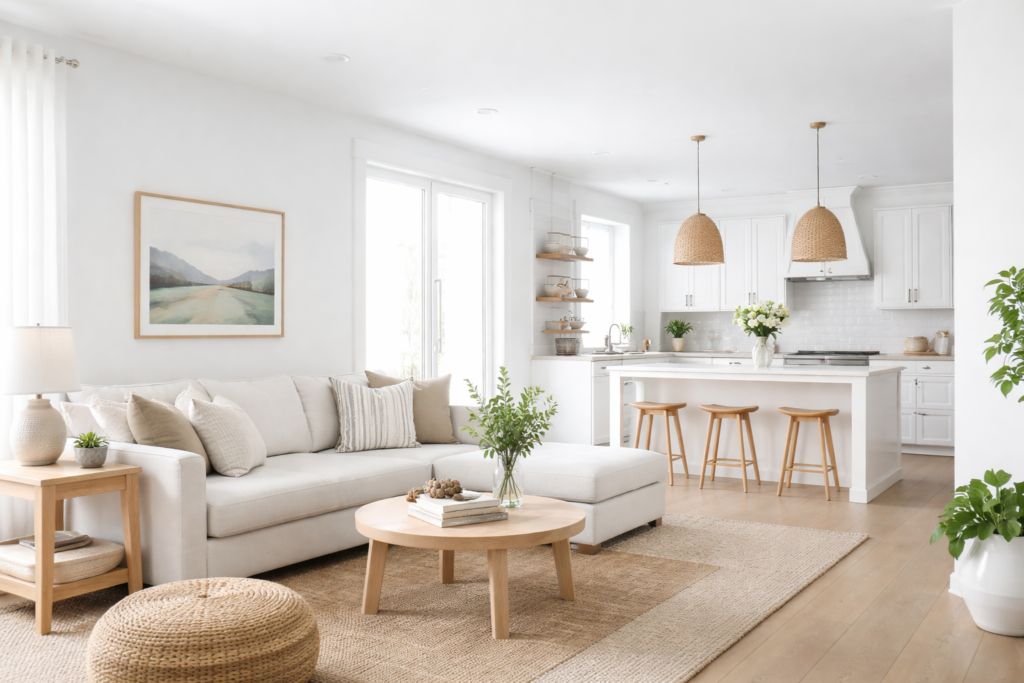
Picking a white sounds easy until you hold up five chips that all look the same in the store and completely different at home. Sherwin Williams Extra White (SW 7006) is one of the whites people land on when they want something clean and bright without the yellow cast of a creamy white. Sherwin-Williams lists its light reflectance value (LRV) at 85.861, usually rounded to 86, which places it among the brighter whites in the fan deck.
The manufacturer’s color page gives its hex code as #EEEFEA (RGB 238, 239, 234) and places it in the White color family, and the color appears in its Finest Whites & Neutrals and Top Interior Colors collections. Those numbers show a white with almost no visible tint: the red, green and blue values sit very close together, with blue just slightly lower. On the wall that translates to a crisp, near-neutral white that looks clean and slightly cool next to creamy whites, yet does not turn icy blue.
- Sherwin Williams Extra White Specs
- Undertones: How Extra White Reads in Real Rooms
- Trim vs Wall Use
- Comparison to Near Whites
- Coordinating Colors and Pairings
- Choosing a Sheen With Extra White
- Tools and Steps for Painting Trim and Walls
- Troubleshooting
- Cost Ranges and When to Hire a Painter
- Frequently Asked Questions
Extra White works especially well on trim, doors, cabinets and ceilings, and it can serve as a wall color in bright, modern rooms. In dim, north-facing spaces it can feel a little stark, so test it before painting a whole room.
Sherwin Williams Extra White Specs
The numbers here come from the manufacturer’s color page. Formulas and color data are updated from time to time, so confirm the current listing before you order.
| Spec | Value | What it means |
|---|---|---|
| Color number | SW 7006 | Use the number at the counter to avoid mix-ups |
| LRV | 85.861 (about 86) | Very light; reflects most of the light hitting it |
| Hex | #EEEFEA | Useful for digital mockups, though screens vary |
| RGB | 238, 239, 234 | Nearly balanced values: a near-neutral white |
| Color family | White | Sits with the bright whites in the fan deck |
| Collection | Finest Whites & Neutrals, Top Interior Colors | Grouped with the brand’s core whites |
| Fan deck location | Strip 257-C1 | Find nearby whites on the same strip |
| Listed coordinates | Smoky Azurite SW 9148, Charcoal Blue SW 2739 | A denim blue and a near-black navy for contrast walls, doors or cabinetry |
Undertones: How Extra White Reads in Real Rooms
On paper, Extra White has an extremely subtle undertone. Its blue value is a hair lower than its red and green, which would technically lean the faintest bit warm. In practice, most people see it as a clean, crisp white. It looks cool and bright beside creamy, yellow-leaning whites and slightly softer beside the starkest bright whites.
North-facing light
Cool indirect light brings out the coolest version of Extra White. It can look faintly gray or blue-gray in corners and on shaded walls. For trim this is often fine; for full walls in a dim north room, a warmer white may feel friendlier.
South-facing light
Warm sunlight makes it glow bright and clean. This is where Extra White looks its best on walls, giving a fresh, gallery-like feel.
East and west light
Morning light in east rooms and afternoon light in west rooms add warmth at certain hours. The white will shift slightly warmer then return to crisp as the light moves.
Lighting temperature
Under warm bulbs around 2700K, Extra White looks softer. Under daylight bulbs at 5000K, it reads very bright and cool. Pick one bulb color per space for consistent results.
Trim vs Wall Use
As a trim color. This is the most common use. Extra White gives clean, sharp lines against gray, greige, blue and green walls, and it keeps baseboards and casings looking fresh. Use a semi-gloss or satin sheen so trim wipes clean and catches a little light.
As a ceiling color. With an LRV of about 86, it reflects plenty of light downward. Use a flat ceiling finish to hide imperfections. If your walls are a warm color, a matching ceiling tint can soften the transition.
As a wall color. It suits modern, Scandinavian and minimalist rooms with good natural light. Paired with white oak floors and black hardware, it creates a crisp, high-contrast look. In rooms with little sun, it can feel flat, so sample on two walls first.
On cabinets. Extra White is popular for kitchen and bathroom cabinetry where you want a bright, clean look that does not compete with marble-look counters or white tile. Use a durable cabinet enamel and a bonding primer on previously finished surfaces.
On exteriors. Bright sun intensifies whites, so Extra White can look very bright on siding. It works well on trim, porch columns and window casings against darker siding colors.
Comparison to Near Whites
Pure White (SW 7005). Softer and warmer, with a gentle creaminess. Choose it if Extra White feels too crisp in your light.
High Reflective White (SW 7757). Even brighter and starker, with an LRV of 92.667; Sherwin-Williams calls it its brightest, cleanest white and lists it for interior use only. It reads as a very clean white and suits ceilings and modern trim, but can feel cold on walls in dim rooms.
Alabaster (SW 7008). Noticeably creamier and warmer. A good choice for traditional rooms or warm wood tones, but it will look yellow beside Extra White, so avoid pairing them on trim and walls in the same view.
The quickest test is to tape chips of all three side by side on a white sheet of printer paper. Differences that disappear in isolation become obvious in comparison.
Coordinating Colors and Pairings
The manufacturer lists two deep blues as coordinates: Smoky Azurite (SW 9148) and Charcoal Blue (SW 2739). Either makes a striking front door, island or accent wall with Extra White trim. For a darker, moodier look, Tricorn Black (SW 6258) and Urbane Bronze (SW 7048) also pair well, and Sherwin-Williams lists Extra White as a coordinating color on the Urbane Bronze page.
For whole-house schemes, Extra White trim pairs easily with mid-tone grays and greiges, soft sage greens, and navy accents. Warm wood, matte black and brushed brass all keep a crisp white from feeling clinical.
Choosing a Sheen With Extra White
Sheen changes how any white looks. A flat or matte finish absorbs more light, so Extra White looks a touch softer and hides wall flaws better. Eggshell adds a faint glow and is easier to wipe clean, which makes it a common pick for living areas and hallways. Satin and semi-gloss reflect more light and look brighter, which is one reason the same white can look slightly different on trim than on the wall next to it.
A popular approach is to use the same color on walls and trim in different sheens, such as matte walls with semi-gloss trim. The color matches, but the sheen difference still outlines doors and casings subtly. For bathrooms and kitchens, choose a finish rated for moisture and scrubbing.
Tools and Steps for Painting Trim and Walls
- Sample first. Use peel-and-stick samples or painted boards at least 12 by 12 inches, and view them for two to three days.
- Prep surfaces. Fill nail holes, caulk gaps along trim, sand glossy areas and wipe away dust.
- Prime as needed. Bare wood, patches and old oil-based trim need primer. Use a bonding primer over glossy finishes.
- Cut in. Use a quality angled brush for trim and edges.
- Roll walls. Use a 3/8 inch nap roller for smooth walls and keep a wet edge.
- Apply two coats. White paint over darker colors usually needs at least two coats for full, even coverage.
- Let trim cure. Allow enamels several days before heavy cleaning or rehanging doors tightly.
Troubleshooting
It looks gray. Usually low or cool light. Add warmer bulbs or choose a softer white for walls and keep Extra White for trim.
It looks too stark. In very bright rooms with lots of white surfaces, it can feel clinical. Add texture, wood and warm textiles, or switch walls to a softer white.
Trim looks yellow next to it. Old oil-based trim yellows with age. Repaint the trim with a waterborne enamel over a bonding primer.
Streaks or uneven coverage. White hides poorly over dark colors. Use a gray-tinted primer and two full topcoats.
Cost Ranges and When to Hire a Painter
Quality interior paint generally costs about $40 to $90 per gallon depending on the product line, and a gallon covers around 350 to 400 square feet per coat. Trim enamels often cost more per gallon. Professional interior painting commonly ranges from a few hundred dollars for a small room to several thousand for a full floor, with trim and cabinet work priced separately. Hire a pro for high stairwells, cabinet refinishing or homes built before 1978, where existing paint should be tested for lead before sanding.
Frequently Asked Questions
What is the LRV of Sherwin Williams Extra White?
Sherwin-Williams lists Extra White (SW 7006) at an LRV of 85.861, usually rounded to 86. That makes it a very light, bright white.
Is Extra White a warm or cool white?
It is close to neutral. Its RGB values are nearly balanced, so it reads crisp and slightly cool beside creamy whites, but it does not look blue in most rooms.
Is Extra White good for trim?
Yes. Sherwin-Williams itself says its high light reflectivity makes it an ideal choice for trim and ceilings, and it gives clean contrast against most wall colors. Use semi-gloss or satin for trim.
What is the difference between Extra White and Pure White?
Pure White (SW 7005) is softer and slightly warmer. Extra White looks crisper and cleaner, especially next to cream or beige.
What is the hex code for Extra White?
The manufacturer lists the hex code as #EEEFEA, with RGB values of 238, 239 and 234. Screen colors vary, so always test a physical sample.
What colors coordinate with Extra White?
Sherwin-Williams lists Smoky Azurite (SW 9148) and Charcoal Blue (SW 2739) as coordinates. Grays, greiges, sage greens and navy also pair well.