
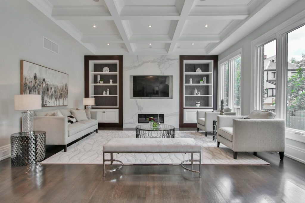
Plenty of homeowners pick a gray, roll it on, and then discover it looks beige, purple or green once the paint dries. Passive gray Sherwin Williams fans usually choose it to avoid that problem. The official name on the chip is simply Passive (SW 7064), and it is one of the cleanest light grays in the Sherwin-Williams lineup: a cool, nearly true gray with a light reflectance value (LRV) just under 60.
Quick answer: Passive is a light, cool gray that reads crisp and calm rather than warm or cozy. It reflects close to 60 percent of the light that hits it, so it keeps rooms bright while still looking clearly gray against white trim. It suits north-light rooms only if you want a cooler mood, and it shines in south- and west-facing rooms where warm sunlight balances its cool lean. Sherwin-Williams lists it for both interior and exterior use.
- Passive Gray Sherwin Williams Specs at a Glance
- Understanding the Undertone
- Best Rooms and Sheens
- Coordinating Colors and Pairings
- Passive vs Light French Gray, Repose Gray and Lazy Gray
- How to Test and Paint Passive
- Troubleshooting Common Problems
- Cost and When to Hire a Painter
- Frequently Asked Questions
Many people search for it as “Passive Gray” or “passive grey sherwin williams,” but when you order a gallon, ask for Passive SW 7064 so the counter staff tint the right formula. The sections that follow cover the confirmed specs, the undertone, sheen choices, rooms, coordinating colors and how it compares with the nearest grays on the fan deck.
Passive Gray Sherwin Williams Specs at a Glance
These figures come from the color’s page on the manufacturer’s website. Third-party paint sites usually round the LRV to 60.
| Spec | Value | What it means |
|---|---|---|
| Official name and number | Passive, SW 7064 | The name and code to give at the paint counter |
| Color family | Neutral | Filed with the neutrals; reads as a cool light gray |
| LRV | 59.885 | Light; reflects roughly 60 percent of visible light |
| Hex / RGB | #CBCCC9 / 203, 204, 201 | Channels almost equal, which is why it reads as a true gray |
| Location number | 236-C1 | Lightest chip on its color strip |
| Use | Interior and exterior | Can be tinted in interior and exterior product lines |
| Undertone | Cool, with a faint green-blue cast in shade | Looks crisp; never leans beige or pink |
| Best sheens | Matte or eggshell walls; satin or semi-gloss trim and cabinets | Flatter sheens hide flaws, higher sheens scrub clean |
An LRV near 60 is a sweet spot for a wall gray. Below about 50, grays start to darken a room noticeably. Above about 70, they drift toward off-white and can look washed out in bright sun. Passive sits right in the middle of that band, which explains why designers reach for it in open-plan spaces that need one color to work in several kinds of light.
Understanding the Undertone
The digital values tell a lot of the story. With red, green and blue channels at 203, 204 and 201, Passive has almost no color bias at all. The green channel edges ahead by a single point and blue trails slightly, so on screen it looks like a pure, slightly cool gray. On a real wall, that tiny imbalance can show up as a whisper of green or blue in shaded corners, especially in north-facing rooms or beside cool white trim.
What Passive does not do is warm up. It has no yellow or beige content to speak of, so it will not turn into greige under incandescent bulbs the way warmer grays can. That is a strength if your furniture, counters and flooring are cool: white quartz, gray tile, black metal, chrome fixtures or ash-toned wood. It can be a weakness if your floors are orange oak or your trim is a creamy white, because the contrast will make Passive look colder than the chip suggests.
How light changes it
- North-facing rooms: cool, slightly blue and a touch darker; pair it with warm lighting if the room feels flat.
- South-facing rooms: the warm sun neutralizes the cool lean, and it reads as a clean, balanced gray.
- East-facing rooms: bright and crisp in the morning, softer and grayer in the afternoon.
- West-facing rooms: cool through midday, then warmer and almost silvery at sunset.
- Bulbs: 2700K warm-white bulbs soften it; 4000K bulbs and above push it toward blue-gray.
Best Rooms and Sheens
Because it is light, neutral and cool, Passive is a natural fit for rooms where you want a calm, tidy backdrop. Kitchens with white or gray cabinets, bathrooms with marble-look tile, home offices and modern living rooms all suit it well. It also works as a whole-house color in homes with consistent cool finishes, since it will not clash from room to room.
Bedrooms are a matter of taste. Some people find cool grays restful; others find them chilly. If your bedroom faces north and you like warm, cozy rooms, test a large sample before committing. In a sunny bedroom with warm textiles, it often looks soft and airy.
For sheen, matte or flat finishes hide drywall patches and look velvety in living and dining rooms. Eggshell is the practical choice for hallways, kids’ rooms and family spaces where walls get touched and wiped. Satin works in bathrooms and kitchens where humidity and splatter are part of daily life. On trim, doors and cabinets painted in Passive, a satin or semi-gloss finish gives durability and a slight glow that makes the gray look more refined.
On exteriors, a light cool gray like Passive can look nearly white in strong sun. If you want the house to read as gray from the street, many people go a step or two darker on the same strip for siding and save Passive for porch ceilings, soffits or trim accents.
Coordinating Colors and Pairings
Sherwin-Williams lists three coordinating colors for Passive on its color page:
- Nebulous White (SW 7063): a cool, bright white (LRV 73.7) with a blue undertone; a gentle trim or ceiling color that keeps contrast low.
- Shell White (SW 8917): a brighter white (LRV 83.2) with the merest hint of peach, for trim, doors and ceilings when you want the walls to look a bit more defined.
- Green Onyx (SW 9128): a medium, muted green (LRV 31.4) that adds contrast for an accent wall, island, front door or built-ins.
Beyond the official pairings, Passive plays well with matte black hardware, brushed nickel, walnut or white oak furniture, crisp white bedding, navy textiles and natural stone. Brass and gold can work too, but they bring warmth that shifts the mood toward transitional rather than strictly modern.
Avoid pairing it with very creamy whites or yellowed trim. A white with a strong yellow base makes Passive look blue by comparison, which is the most common complaint people have after painting.
Passive vs Light French Gray, Repose Gray and Lazy Gray
The quickest way to understand any gray is to set it next to its neighbors. All four of these colors are light enough for main living areas, but each leans differently.
Passive vs Light French Gray (SW 0055)
Light French Gray has an LRV of about 52.6, so it is noticeably darker than Passive at about 59.9. Its hex value (#C2C0BB) shows a little more red and less blue, which gives it a slightly warmer, more muted look. Choose Light French Gray if you want a deeper, softer gray with more presence. Choose Passive if you want brighter walls with a cleaner, cooler finish.
Passive vs Repose Gray (SW 7015)
Repose Gray is very close in lightness, with an LRV of about 58.2. The difference is undertone. Repose Gray (#CCC9C0) carries more warmth and reads as a light warm gray that leans toward greige in some rooms. Passive stays cooler. If your home has oak floors, beige stone or cream trim, Repose Gray usually blends more easily. If your finishes are white, black and steel, Passive looks sharper.
Passive vs Lazy Gray (SW 6254)
Lazy Gray has an LRV of about 53.2 and a hex of #BEC1C3, with blue as the strongest channel. It is darker and distinctly bluer than Passive. Lazy Gray suits coastal bathrooms and bedrooms where a soft blue-gray mood is the goal. Passive is the more neutral pick when you want gray without an obvious blue reading.
How to Test and Paint Passive
Screens and small chips both mislead, so test on the actual wall before buying full gallons.
- Get a large sample. Use a peel-and-stick sample or paint a sample board at least 12 by 12 inches, ideally larger.
- Place it on several walls. Put samples on the brightest wall and the darkest corner, and near your trim, floors and counters.
- Check it at three times of day. Look in the morning, at midday and at night under your normal bulbs.
- Compare against a neighbor. Put Passive beside Repose Gray or Lazy Gray to see whether you want warmer or bluer.
- Prep the surface. Wash walls, patch holes, sand patches smooth and spot-prime repairs so the sheen stays even.
- Cut in and roll. A basic paint roller kit with a 3/8-inch nap cover handles smooth drywall; use 1/2-inch for light texture. Keep a wet edge and roll top to bottom in sections.
- Apply two coats. Light grays usually need two full coats for even color, especially over a darker or warmer previous shade.
A gallon typically covers about 350 to 400 sq ft per coat on smooth, primed walls. A 12 by 14 foot bedroom with 8-foot ceilings has roughly 400 sq ft of wall area before openings, so plan on about two gallons for two coats.
Troubleshooting Common Problems
- It looks blue: the room likely has north light, cool bulbs or a creamy trim color. Switch to 2700K or 3000K bulbs and consider a cleaner white trim.
- It looks green: nearby greenery outside the window or green-tinted tile can reflect onto the walls. A warmer gray like Repose Gray may be a better fit.
- It looks too light: in bright south light, Passive can read almost white. Move one chip darker on the same strip.
- Patchy finish: unprimed patches flash through. Spot-prime, then roll a full third coat on that wall.
- Color doesn’t match the sample: confirm the can label reads SW 7064 and the sheen matches your test sample, since sheen changes how a color reads.
Cost and When to Hire a Painter
Material cost depends mostly on the paint line you choose, not the color. Contractor-grade lines cost less per gallon than premium lines with better hide and scrub resistance. For a single bedroom, most DIYers spend a modest amount on paint and a few basic supplies. Professional interior painting generally runs from a few dollars per square foot of wall area for simple rooms to more for high ceilings, heavy patching or detailed trim.
Hiring a painter makes sense for stairwells, vaulted ceilings, exterior siding, cabinet refinishing and homes built before 1978, where existing paint should be tested for lead before any sanding. For exterior work on second stories, a pro with proper ladders or scaffolding is the safer route.
Frequently Asked Questions
Is Passive by Sherwin-Williams warm or cool?
Passive is a cool gray. Its RGB values are nearly equal, with green and red slightly ahead of blue, so it reads as a clean, cool gray and can show a faint green-blue cast in shaded rooms.
What is the LRV of Passive SW 7064?
The manufacturer lists an LRV of 59.885, usually rounded to 60. That places it in the light range, bright enough for most rooms without looking white.
Is Passive Gray the same as Passive?
Yes. People often search for it as Passive Gray, but the official color name is Passive, number SW 7064. Use the number when ordering to avoid mix-ups.
What trim color goes with Passive?
Sherwin-Williams suggests Nebulous White and Shell White as coordinating whites. Clean, neutral whites work best; very creamy whites make Passive look bluer.
Is Passive darker than Repose Gray?
They are close. Passive has an LRV of about 59.9 and Repose Gray about 58.2, so Passive is very slightly lighter. The bigger difference is that Repose Gray is warmer.
Can you use Passive on a house exterior?
Yes, it is rated for interior and exterior use. In full sun it can look close to white, so many homeowners use it for trim or porch ceilings and choose a darker gray for siding.


