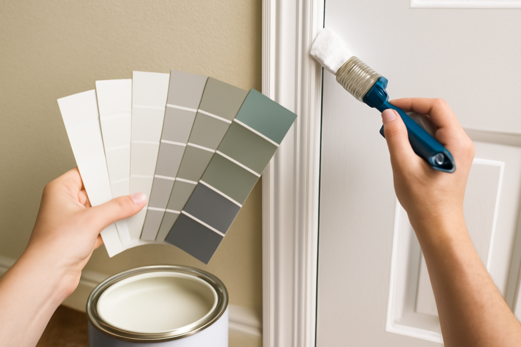
Trim is the frame around everything in your home, baseboards, door and window casings, crown molding, and it quietly shapes how polished a room looks. Most people default to “just white” and never realize there are dozens of whites, plus warm creams, moody darks, and matched-to-wall options that completely change a space. Choosing the right trim paint colors is what separates a builder-grade room from one that looks designed. The wrong white can make your walls look dingy or your trim look dirty, while the right one makes both crisp and intentional. This guide walks through how to choose, coordinate, and finish trim like a pro.
Part of our Paint & Walls guide — explore the full guide →
- Why Trim Color Matters More Than You Think
- The Best White Trim Colors
- Matching Trim to Your Walls
- When to Skip White Entirely
- Choosing the Right Sheen
- Prep Makes the Difference
- Should Trim Match Your Doors and Ceiling?
- How Much Contrast Do You Want?
- Trim Colors for Different Home Styles
- Bringing It All Together
Why Trim Color Matters More Than You Think
Trim creates contrast and definition. Crisp white trim against a colored wall frames the room, highlights architectural details, and makes ceilings feel higher. But trim also has undertones, and if your trim white clashes with your wall color, the whole room feels subtly off. A cool blue-white trim next to a warm cream wall makes the wall look dirty; a warm trim next to a cool gray wall makes the trim look yellowed.
Getting trim right is really about harmony. The trim should either crisply contrast the walls or blend with them intentionally, never fight them. That single idea guides every choice below.
The Best White Trim Colors
White is the classic choice for good reason, but the right white depends on your walls and light. A few reliable performers designers reach for again and again:
- Benjamin Moore White Dove (OC-17): a soft, warm white that flatters almost any wall color without looking stark. The most popular all-around trim white.
- Sherwin-Williams Pure White (SW 7005): a clean, versatile white with just a touch of warmth, excellent with both warm and cool walls.
- Benjamin Moore Chantilly Lace (OC-65): a crisp, bright, near-pure white for a modern, high-contrast look.
- Sherwin-Williams Extra White (SW 7006): a cooler, ultra-crisp white that pairs beautifully with gray and blue walls.
The key distinction is warm versus cool. Warm whites like White Dove suit traditional homes and warm wall colors, while cool whites like Extra White suit modern spaces and cool grays. Match the trim’s undertone to your walls.
Matching Trim to Your Walls
There is a simple rule of thumb: your trim white should share the undertone family of your wall color, or contrast it deliberately. If your walls are warm (greige, cream, warm gray), choose a warm white trim. If your walls are cool (blue-gray, cool gray, crisp blue), a cooler white keeps everything reading clean.
Another pro move is to pull your trim color from your wall color’s own strip. Many designers use a white that relates to the wall, or even paint trim a few shades lighter than the walls in the same hue for a soft, tonal look. When in doubt, White Dove and Pure White are safe bridges that work with the widest range of wall colors.
When to Skip White Entirely
White is not the only option, and skipping it can look striking. Consider these alternatives:
- Creamy off-whites for a warm, cozy, traditional feel that white can make too stark.
- Black or charcoal trim around windows and doors for a bold, modern, architectural statement, especially with white or light walls.
- Trim that matches the wall color (same color, same or slightly different sheen) for a seamless, monochromatic look that makes rooms feel larger and more serene.
- Deep, moody trim in a library or study to add richness and drama.
Matching trim to walls is a rising trend because it removes visual clutter and lets furnishings stand out. Bold dark trim, on the other hand, adds high-end contrast when you want the architecture to pop.
Choosing the Right Sheen
Sheen is where trim really earns its keep. Trim takes abuse, scuffs from shoes on baseboards, hands on door casings, so it needs a finish that cleans up and stands out from the walls. The standard choice is:
- Semi-gloss for most trim, doors, and baseboards. It is durable, wipeable, and its subtle shine catches light to define edges.
- Satin for a slightly softer look that still cleans well, popular in more casual or modern homes.
- High-gloss for a dramatic, formal, furniture-like finish on a front door or fine millwork, though it shows every imperfection.
Because walls are usually flat or eggshell, the higher sheen on trim creates a natural contrast that frames each surface even when the colors are close.
Prep Makes the Difference
Trim shows every flaw because its glossier finish reflects light, so preparation matters more than on walls. Fill nail holes and gaps with caulk and wood filler, sand smooth, and prime bare or previously stained wood before painting. Glossy old trim needs a light sanding or a bonding primer so the new paint adheres instead of peeling.
Use a quality angled sash brush for cutting in clean lines against the walls, and consider painting trim before the walls if you are doing a full room, then taping the trim and rolling the walls last. Two thin coats of trim paint look far better than one thick coat, especially in glossier sheens that reveal brush marks.
Should Trim Match Your Doors and Ceiling?
A question that stumps a lot of homeowners is whether the trim, the doors, and the ceiling should all share one color. The most common and safest approach paints the trim and interior doors the same white in the same semi-gloss sheen, which ties the millwork together and creates that crisp, cohesive frame around every room. The ceiling is usually a flat white, often a shade brighter or the same white in a flat finish, so it recedes and reflects light.
You can break from this for effect. Painting doors a bold color, black, deep green, navy, while keeping the trim white makes the doors a design feature. Or painting trim, doors, and ceiling all the same color in a small room removes visual lines and makes the space feel larger and more serene. Decide whether you want the woodwork to stand out or disappear, and let that guide how far you carry a single color.
How Much Contrast Do You Want?
The amount of contrast between trim and walls sets the entire mood of a room, and it is a deliberate choice rather than an accident. High contrast, crisp white trim against a deep or saturated wall, feels traditional, tailored, and architectural, drawing the eye to moldings and framing windows sharply. It is the classic American look and never really goes out of style.
Low contrast, trim and walls in closely related tones, feels calm, expansive, and modern. When trim only whispers against the wall, the room reads as one seamless envelope, which makes small spaces feel larger and lets furniture take center stage. Neither is right or wrong; decide whether you want the architecture to pop or recede, and choose your contrast level to match. A hallway of doors, for instance, can feel busy with high-contrast trim and serene when the trim blends in.
Trim Colors for Different Home Styles
Matching trim to your home’s architecture keeps everything feeling cohesive. A few reliable pairings:
- Traditional and colonial homes: warm whites like White Dove in semi-gloss, with high contrast against colored walls.
- Modern and contemporary: crisp cool whites or bold black trim in satin for a clean, graphic edge.
- Farmhouse and cottage: soft creamy whites that feel warm and lived-in.
- Transitional: a versatile white like Pure White that bridges warm and cool furnishings.
These are starting points, not rules. The key is that the trim color should feel like it belongs to the house rather than fighting its era and materials. When the trim, the walls, and the home’s style all agree, the result looks effortless.
Bringing It All Together
The most cohesive homes carry one trim color throughout, tying every room together even when wall colors change from space to space. A single go-to white like White Dove on all the trim, doors, and moldings creates a unified backbone, while the walls do the color-changing from room to room.
Whether you choose a soft warm white, a crisp modern one, or a bold black statement, the right trim paint colors are the finishing frame that makes your whole home look intentional. Match the undertone to your walls, choose semi-gloss for durability, prep carefully for a smooth finish, and pick one consistent color to carry throughout. Get those right, and your trim will quietly elevate every room it touches.