Painting all four bedroom walls the same color is the safe choice — and the boring one. A well-chosen two colour combination for bedroom walls adds depth, visual interest, and personality that a single flat color simply cannot achieve. The key is pairing colors that complement each other without competing, and knowing where to place each shade for maximum impact. Done right, a two-tone bedroom feels intentionally designed rather than randomly painted.
How to Choose Complementary Colors
Start with a 60/30/10 ratio adapted for two wall colors. The dominant color covers approximately 60% of the wall space (typically three walls), while the accent color covers the remaining 40% (one feature wall). This creates visual balance — enough contrast to be interesting, enough consistency to feel cohesive.
The simplest approach is using two shades from the same color family. A deep navy accent wall (like Benjamin Moore Hale Navy HC-154) paired with soft blue-gray walls (Benjamin Moore Silver Gray 2131-60) creates a sophisticated, layered look with zero risk of clashing. This tonal approach works in any style bedroom, from contemporary to traditional.
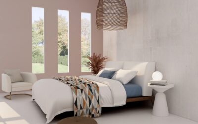
For bolder contrast, choose colors that sit opposite each other on the color wheel but at different saturation levels. A muted sage green accent wall with warm blush pink walls, for example, creates visual tension that feels modern and curated rather than jarring. The trick is keeping one color muted while the other carries more intensity.
Best Two-Color Combinations That Work
These pairings are proven performers based on interior design trends and enduring color theory. Each creates a distinct mood:
- Charcoal + warm white: Dramatic and modern. Use Sherwin-Williams Iron Ore (SW 7069) with Alabaster (SW 7008). Works in bedrooms with natural light
- Navy + cream: Classic and calming. Benjamin Moore Van Deusen Blue (HC-156) with White Dove (OC-17). Timeless combination for any style
- Sage green + off-white: Fresh and organic. Farrow and Ball Vert de Terre (No.234) with Pointing (No.2003). Perfect for nature-inspired bedrooms
- Dusty rose + light gray: Soft and romantic. Sherwin-Williams Pressed Flower (SW 6304) with Repose Gray (SW 7015). Warm without being overtly feminine
- Terracotta + warm beige: Earthy and inviting. Benjamin Moore Mexicana (AF-220) with Muslin (OC-12). Rich, grounding palette for fall-inspired rooms
- Deep teal + pale gray: Moody and sophisticated. Farrow and Ball Inchyra Blue (No.289) with Blackened (No.2011). Statement-making combination for larger bedrooms
Choosing Your Accent Wall
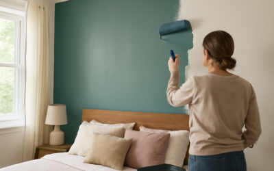
The accent wall should be the first thing you see when entering the bedroom — typically the wall behind the headboard. This placement anchors the bed visually and creates a focal point without overwhelming the room. If your bed sits on a wall with windows, the wall directly opposite the door usually works better as the accent.
Avoid using the wall with the most architectural interruptions (multiple windows, doors, closet openings) as your accent wall. Color continuity gets broken by every frame and trim piece, diluting the visual impact. Choose the most uninterrupted wall surface for the strongest effect.
For small bedrooms under 120 sq ft, a darker accent wall behind the bed can actually make the room feel deeper by creating the illusion of the wall receding. This counterintuitive trick works because our eyes perceive darker colors as being farther away than lighter ones.
Painting Techniques for Two-Tone Walls
Getting a clean, professional-looking transition between two colors requires proper technique. The most common approaches:
Hard line at the corner: The simplest method — paint the accent wall edge-to-edge, meeting the adjacent color at the room corners. Room corners naturally create a clean break between colors. Use painter’s tape on the adjoining walls for a sharp edge, press the tape firmly with a putty knife, and paint the accent color first since it is typically darker.
Horizontal split: Divide a single wall horizontally, with a darker color below and lighter above. The traditional split point is at chair rail height (32-36 inches from the floor), but a 60/40 split with the darker color covering the lower 60% of the wall creates a more modern look. Snap a chalk line to ensure your division is perfectly level, then tape along the line.
Color blocking: More contemporary, this technique uses geometric shapes — large rectangles, arches, or diagonal lines — to apply the accent color as a deliberate graphic element on one wall. This requires more planning and steady hands (or very precise taping) but creates a designer-level look that photograph beautifully.
Paint Finishes for Bedrooms
The sheen you choose affects how the color looks on your walls. For bedrooms, the standard recommendation is:
- Dominant walls (lighter color): Eggshell or matte finish. These hide imperfections in the wall surface and create a soft, warm appearance. Eggshell offers slightly better washability than flat matte
- Accent wall (darker color): Satin finish. Dark colors in flat finishes can appear chalky and uneven. Satin adds a subtle luster that makes dark colors look richer and more intentional. It also stands up better to cleaning
- Trim and molding: Semi-gloss. The contrast between matte walls and glossy trim creates visual definition and makes architectural details pop
One gallon of quality paint covers approximately 350-400 sq ft. For a standard 12×12 bedroom, you will need about one gallon of the dominant color and one gallon of the accent color, assuming 8-foot ceilings. Buy the same brand for both colors to ensure consistent sheen levels — mixing brands can result in subtly different textures even when the labeled finish is the same.
Coordinating with Furniture and Bedding
Your two wall colors set the palette, but the room only feels cohesive when bedding, furniture, and accessories tie back to those colors. Pull accent colors into throw pillows, a blanket, or curtains. If your accent wall is navy, a few navy throw pillows on a white duvet create visual connections that make the room feel designed rather than just painted.
Wood tones matter too. Warm wall colors (terracotta, dusty rose, cream) pair naturally with walnut, oak, and warm-toned woods. Cool wall colors (navy, teal, gray) look best with white, black, or cool-toned ash furniture. Mixing warm walls with cool-toned furniture creates visual tension that can feel unintentional.
When in doubt, keep bedding neutral — white, cream, or light gray — and let the walls do the talking. An overly patterned or brightly colored bedspread competing with a two-tone wall treatment makes the room feel busy rather than curated. The walls are your statement; bedding should support, not compete.
Common Mistakes to Avoid
Choosing colors only from a screen is the most expensive mistake. Paint colors look dramatically different under your specific lighting conditions than they appear on a monitor or even on a store sample chip. Always buy sample pots ($5-$8 each) and paint 2×2 foot test patches on each wall, then observe them at different times of day. Morning light, afternoon sun, and artificial evening light all shift color perception significantly.
Going too bold on the accent wall relative to the dominant color creates a jarring disconnect rather than a complementary pairing. If you have never done a two-tone room before, start with a moderate contrast level — perhaps two colors that are 3-4 shades apart on the same paint card rather than completely different hues. You can always go bolder next time once you see how the concept works in your space.