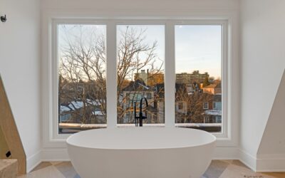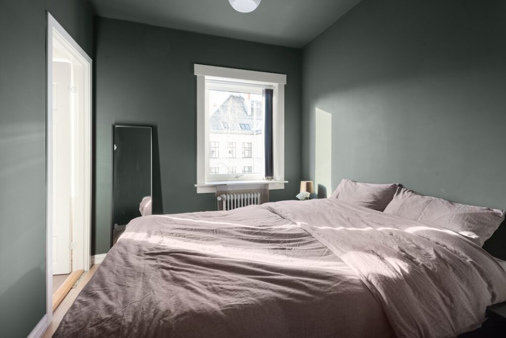
I’ve repainted more “perfect gray” walls than I care to admit, and almost every do-over happened for the same reason: the client picked a gray that turned steely blue or morgue-cold once it hit their actual walls. The fix is nearly always the same — switch to a warm gray paint, which is simply a gray built on a beige, yellow, or violet-brown base instead of a blue or green one. Warm grays keep the modern, neutral look people want from gray, but they flatter wood floors, warm lighting, and skin tones instead of fighting them. Here’s how I evaluate them on jobs, plus the specific colors I keep going back to.
Part of our Paint & Walls guide — explore the full guide →
- What Actually Makes a Gray "Warm"
- Why Warm Gray Paint Works Where Cool Gray Fails
- The Warm Grays I Actually Specify
- Matching Undertone to What's in the Room
- How to Test Warm Gray Paint Before Committing
- Sheen, Coverage, and Budget Notes
- Pairing Warm Gray With the Rest of the Palette
- Where Warm Gray Is the Wrong Call
What Actually Makes a Gray “Warm”
Every gray on the shelf is a mix of black and white plus tinting colorants, and those colorants are what create undertones. A warm gray leans on raw umber, yellow oxide, or red oxide in the formula. A cool gray leans on black with blue or green colorants. You can’t see the formula on the chip, but you can see the result if you compare grays side by side: hold any gray next to a piece of pure white printer paper and the undertone jumps out. If the gray looks slightly tan, taupe, or mushroomy against the white, it’s warm. If it looks faintly blue, icy, or seafoam, it’s cool.
The industry shorthand “greige” describes the warmest end of the gray family — grays with so much beige that they straddle both categories. We’ve covered specific greiges like Agreeable Gray and Repose Gray in their own guides, so I won’t rehash those palettes here. This piece is about the broader warm-gray landscape and how to pick within it.
Why Warm Gray Paint Works Where Cool Gray Fails
Most American homes are full of warm elements: oak, hickory, and walnut floors, brown leather, brass and bronze hardware, cream trim, incandescent-temperature LED bulbs around 2700K. Put a blue-based gray in that environment and it reads as a mistake — the wall goes cold and the floor suddenly looks orange. A warm gray paint bridges instead of clashing. It has just enough brown in its DNA to shake hands with wood tones while still reading unmistakably gray.
Light direction matters just as much. North-facing rooms receive cool, bluish light all day, which pushes any gray cooler. In a north room, a gray that looked perfectly balanced on the chip can turn arctic. I default to warm grays in north-facing rooms almost automatically. South-facing rooms get golden light that adds warmth for you, so you can run a slightly cooler warm gray there without it dying on the wall.
The Warm Grays I Actually Specify
These are the colors that have survived years of real installs — tested on multiple walls, in multiple light exposures, next to real floors.
| Color | Code | LRV | Undertone | Best Use |
|---|---|---|---|---|
| Worldly Gray | SW 7043 | 57 | Green-beige, quiet | Whole-home neutral, open plans |
| Mindful Gray | SW 7016 | 48 | Brown-taupe | Living rooms, one step deeper than Repose |
| Dorian Gray | SW 7017 | 39 | Brown, slightly moody | Dining rooms, accent walls |
| Revere Pewter | BM HC-172 | 55 | Green-beige classic | Traditional homes, low natural light |
| Edgecomb Gray | BM HC-173 | 63 | Soft beige, barely gray | Bright, airy spaces; pairs with white oak |
| Balboa Mist | BM OC-27 | 67 | Violet-taupe, delicate | Bedrooms, north light |
| Pale Oak | BM OC-20 | 70 | Warm greige, lightest option | Small rooms you want to expand |
| Anew Gray | SW 7030 | 47 | Taupe, warmer sibling of Agreeable | Rooms with cool tile or concrete |
| Gray Owl (warm-leaning) | BM OC-52 | 65 | Green-gray, chameleon | Only in warm south light |
| Colonnade Gray | SW 7641 | 53 | Green-beige | Exteriors and interiors alike |
A note on LRV — Light Reflectance Value. It runs 0 (black) to 100 (pure white), and it tells you how much light bounces back. For main living areas I stay between 48 and 65. Below 45 a warm gray starts acting like a color statement rather than a neutral. Above 68 it’s really an off-white with gray leanings.
Matching Undertone to What’s in the Room
The undertone of your warm gray should echo something already in the space, not introduce a new note. My working rules:
Red-brown floors (cherry, Brazilian cherry, red oak with warm stain): choose taupe or violet-leaning warm grays — Balboa Mist, Mindful Gray. Green-beige grays like Revere Pewter can amplify the red and turn the floor salmon.
Yellow-orange floors (honey oak, natural pine): green-beige warm grays are your friend. Revere Pewter, Worldly Gray, and Colonnade Gray all have a whisper of green that neutralizes yellow instead of intensifying it.
Neutral or gray-brown floors (white oak, driftwood LVP): almost any warm gray works. This is the easiest floor to decorate around, and it’s why builders default to it.
Cool elements (marble-look quartz, chrome, gray tile): pick a warm gray with more gray than beige — Anew Gray or Dorian Gray — so the wall doesn’t look dingy next to crisp cool surfaces.
How to Test Warm Gray Paint Before Committing
Chips lie. Screens lie worse. Here’s the process I make every client follow, and it has saved thousands of dollars in repaints. Buy sample quarts — or better, the peel-and-stick 8×8 samples from Samplize — of your top three candidates. Put each sample on two different walls: one that faces the main window and one that sits perpendicular to it. Look at them at 8 a.m., noon, and 8 p.m. with your actual evening lighting on. A warm gray that holds its character through all three checks is a keeper. One that flashes purple at noon or goes muddy at night gets eliminated.
Always sample against your trim color, too. A warm gray next to a stark cool white like SW Extra White can look dirty; the same gray next to a soft white like SW Alabaster or BM White Dove looks intentional and rich. Trim mismatch is the second most common reason gray walls disappoint, right behind undertone clash with the floor.
Sheen, Coverage, and Budget Notes
For walls in warm gray I spec matte or eggshell. Flat hides drywall sins but scuffs; anything shinier than eggshell highlights every roller mark in a mid-tone gray. Expect two coats over a similar-value existing color, three if you’re covering a dark accent wall. A gallon covers roughly 350 to 400 square feet per coat. At 2026 prices, quality lines run about $55 to $75 per gallon retail (SW Duration, BM Regal Select), and the contractor-grade lines around $35 to $45. On mid-tone warm grays, the premium lines genuinely level better and touch up more invisibly — I’d spend the extra $20 on any room you look at daily.
Pairing Warm Gray With the Rest of the Palette
Once the wall color is set, build outward with the undertone in mind. Trim and ceilings: soft warm whites — SW Alabaster 7008, BM White Dove OC-17, SW Shoji White 7042 — keep the scheme cohesive. Accent colors that sing against warm gray include muted navy (BM Hale Navy HC-154), olive and sage greens (SW Evergreen Fog 9130), terracotta and rust, and warm black (SW Iron Ore 7069) on doors. Metals: brass, bronze, and matte black all work; polished chrome is the one finish I’d avoid in a heavily warm-gray room because it introduces a blue glint the scheme has no answer for.
Cabinet pairings deserve a mention because so many repaints start in the kitchen. Warm gray walls flatter white, cream, sage, and stained-wood cabinetry. If your cabinets are a cool painted gray, though, warm gray walls will make them look blue — in that kitchen, match temperature and keep both cool, or repaint the smaller surface. It’s cheaper to repaint walls than cabinet boxes, so the walls usually concede.
Where Warm Gray Is the Wrong Call
Honesty time: warm gray isn’t universal. If your home is full of cool-toned finishes — blue-gray tile, polished nickel everywhere, a gray-washed floor with obvious blue undertones — a warm gray wall will look yellowed and tired against them. Coastal and Scandinavian schemes built on blue and white also fight warm grays. And in a room drenched in strong south or west sun, a very warm gray can tip into looking flat-out beige by 4 p.m., which defeats the purpose of choosing gray at all. In those cases, go one notch cooler or choose a true balanced gray like SW Repose, which we’ve covered in depth separately.
My honest bottom line after years of specifying these colors: start with the floor, not the wall. Identify your floor’s undertone, pick two or three warm grays whose undertones cooperate with it, sample them big, and judge only in your own light. Do that and warm gray paint delivers exactly what people hope gray will be — calm, current, and quietly flattering to everything you own — instead of the cold blue disappointment that gives the whole color family a bad name.