The all-white kitchen that dominated the last decade is officially cooling off, and warmth is taking its place. The leading kitchen paint colors 2026 lean into earthy neutrals, soft greens, and rich moody tones that make a kitchen feel grounded and personal rather than clinical. If you are planning a refresh this year, understanding where the trends are heading helps you pick a color that feels current now and still looks intentional five years from now. This guide covers the standout shades, how to use them on walls and cabinets, and the practical details that separate a good paint job from a great one.
Part of our Kitchen Remodeling guide — explore the full guide →
The Big Shift: Warmth Over Cool Gray
The defining story of 2026 is the departure from cool grays and stark whites toward warmth and comfort. Homeowners want kitchens that feel like the heart of the home, and cold tones simply do not deliver that. In their place come creamy whites, warm greiges, soft terracottas, and nature-inspired greens and browns.
This is not a swing to loud color everywhere—it is a move toward tones that feel organic and calming. Think of the difference between a sterile hospital white and the soft ivory of natural linen. That warmth reads as inviting and photographs beautifully, which matters in an era when kitchens are the most shared room online.
Warm Neutrals Leading the Way
If you want a safe, timeless base that still feels of-the-moment, warm neutrals are the answer for 2026. They flatter wood tones, brass hardware, and natural stone, and they give you flexibility to change accents over time.
- Creamy whites like Benjamin Moore White Dove and Swiss Coffee replace bright whites, adding softness without going dark.
- Warm greige—a greige with a beige undertone rather than gray—grounds cabinets and walls alike.
- Soft mushroom and taupe bring subtle depth, pairing well with both light and dark countertops.
- Putty and oatmeal tones feel organic and calm, ideal for walls in a kitchen with busy stone or backsplash.
These shades work especially well on cabinetry, where they read as more sophisticated than plain white while remaining neutral enough to sell a home. A warm neutral kitchen is the low-risk, high-reward choice this year.
Green Is the Standout Color
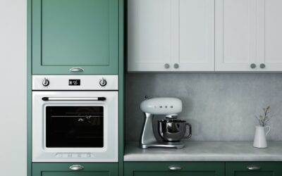
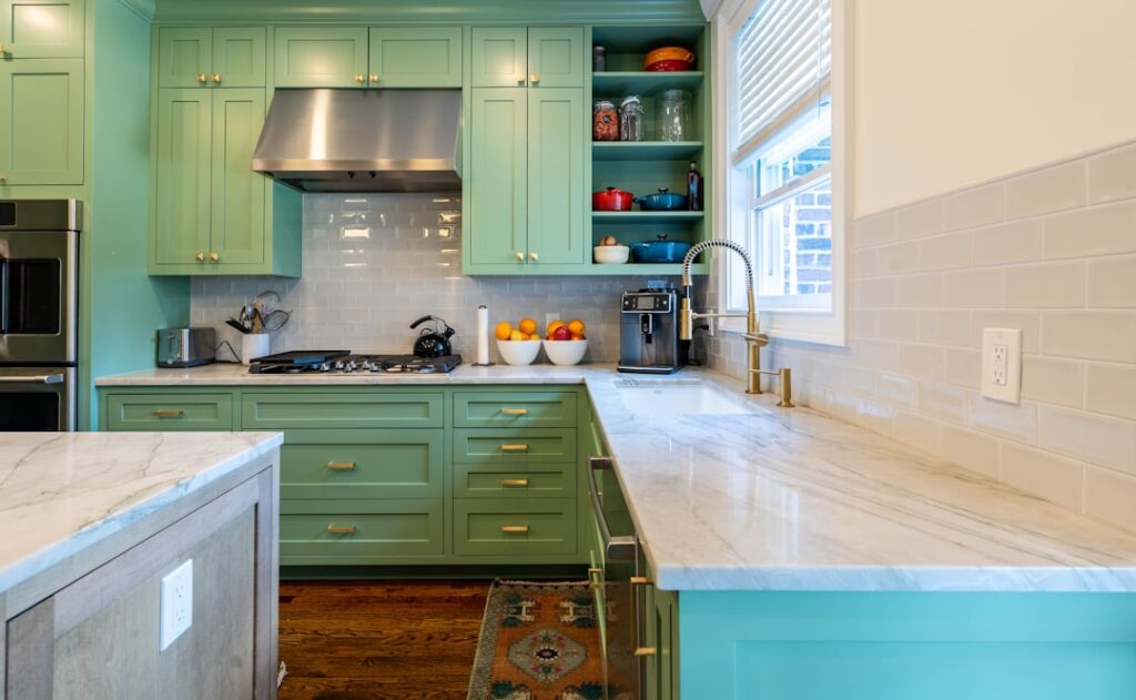
No color defines 2026 kitchens more than green. It has moved from a bold accent to a mainstream cabinet and wall color because it connects a kitchen to nature and pairs effortlessly with wood, brass, and marble.
Sage and soft muted greens lead for a calm, versatile look that suits almost any style. For those wanting more drama, deeper shades like olive, forest, and hunter green make a rich statement on lower cabinets or a full island. Benjamin Moore’s earthy greens and similar muted tones from other brands are showing up on islands, pantry doors, and full cabinet runs. Green also happens to hide the small scuffs of a working kitchen better than white, a practical bonus.
Moody and Dramatic Options
For homeowners ready to commit to atmosphere, deep and moody colors are having a moment. These work best in kitchens with good natural light or as a contrast element rather than blanketing a small, dark room.
- Deep navy and slate blue remain popular on islands and lower cabinets, offering richness without feeling as heavy as black.
- Charcoal and soft black create striking contrast against warm wood floors and brass fixtures.
- Warm terracotta and clay bring an earthy, Mediterranean warmth that feels fresh and cozy.
- Chocolate and espresso browns are re-emerging, echoing the broader return of brown tones in design.
A common 2026 approach is the two-tone kitchen: warm neutral or white upper cabinets paired with a moody green, blue, or brown on the lower cabinets and island. This grounds the room, adds depth, and lets you enjoy a bold color without overwhelming the space.
Choosing the Right Finish
Color is only half the decision—the sheen determines how the paint performs in a room full of grease, steam, and fingerprints. Kitchens demand durable, washable finishes.
For walls, a satin or eggshell finish balances a subtle glow with easy cleaning, standing up to splatters near the range. For cabinets, choose a satin or semi-gloss enamel; semi-gloss is the most scrubbable and resists moisture, which matters on surfaces you touch dozens of times a day. Avoid flat or matte finishes on cabinets and near cooking zones—they stain and cannot be wiped clean without burnishing. A quality cabinet enamel, whether an alkyd or a hybrid waterborne formula, gives the hard, furniture-like finish that makes a repaint look professional.
How to Test Colors Before Committing
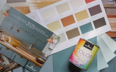
Paint colors shift dramatically with lighting, and kitchen lighting is a mix of daylight, warm bulbs, and under-cabinet LEDs. Never choose from a tiny chip. Buy sample pots and paint large swatches, or use peel-and-stick samples, directly on your cabinets and walls.
Look at the samples in the morning, at midday, and under your evening kitchen lights, since the same green can read sage in daylight and gray at night. Place samples next to your countertop, backsplash, and flooring to confirm the undertones harmonize. Live with them for at least two or three days before you buy gallons—this single habit prevents the most expensive paint mistakes.
Coordinating With Your Whole Kitchen
The best kitchen paint colors 2026 work as part of a palette, not in isolation. Start with the elements you cannot easily change—your countertop, flooring, and backsplash—and pick a paint color that complements their undertones. Warm-toned wood floors love greens and creams; cool marble pairs beautifully with soft greiges and navys.
Bring in metal finishes that reinforce the mood: brass and gold amplify warm greens and terracottas, while matte black sharpens moody blues and charcoals. Keep the palette to two or three main colors plus your metals so the kitchen feels cohesive rather than busy. When your paint, hardware, and hard surfaces speak the same language, even a simple color choice looks designed.
Colors to Retire in 2026
Just as important as what is trending is what is fading. Cool, flat gray—the defining kitchen color of the 2010s—now reads as dated and cold, and buyers increasingly react against it. If your kitchen is drenched in gray-white, warming it up is the fastest way to feel current. Stark, blue-based bright whites are also softening; the crisp all-white kitchen still sells, but a creamy white brings the warmth today’s homeowners want.
Cool-toned greige with a heavy gray bias is being replaced by warmer greige and true taupe. And the sterile, high-contrast black-and-white kitchen is giving way to softer, more layered palettes with wood and green. None of this means you must repaint a recent gray kitchen tomorrow, but if you are refreshing anyway, steering away from the cool grays and toward warm neutrals and greens keeps your kitchen from looking a decade behind the moment you finish.
Where to Add Color Beyond the Walls
Wall paint is only one canvas in a kitchen, and 2026’s best palettes distribute color across several surfaces. The kitchen island is the most popular place to introduce a bold shade—painting it a deep green, navy, or warm brown while keeping perimeter cabinets light grounds the whole room and creates a focal point without the commitment of full-room color. Interior cabinet backs and open shelving are another low-risk spot for an unexpected accent color that peeks through when doors open.
Do not overlook the often-forgotten fifth wall: the ceiling. A soft wash of color or a subtle warm tone overhead adds depth that a plain white ceiling misses. Pantry doors, a mudroom off the kitchen, and the inside of a glass-front cabinet all take color beautifully in small doses. Spreading your palette this way lets you enjoy the year’s richer, moodier shades in measured amounts, keeping the kitchen feeling layered and intentional rather than either bland or overwhelming.
Final Thoughts
Kitchen paint colors 2026 are all about warmth, nature, and personality—creamy neutrals as a timeless base, sage and deeper greens as the color of the year, and moody navy, brown, and terracotta accents for drama. Pair your color with a durable satin or semi-gloss finish, test generously in your own lighting, and coordinate with the surfaces and metals you already have. Whether you repaint the walls, refresh the cabinets, or commit to a two-tone island, choosing from this year’s warmer, earthier palette gives you a kitchen that feels current, inviting, and built to stay stylish for years.