The all-white kitchen that dominated the last decade is quietly giving way to something warmer and more layered — and the homeowners repainting now are the ones who noticed. Modern kitchen paint colors have moved past stark white and cool gray toward warm neutrals, moody greens and blues, and confident two-tone combinations that give a kitchen personality without chasing a trend that will look dated in three years. The kitchen is the hardest-working room in the house and the most expensive to redo, so the color choices here need to balance current style with staying power. This guide covers the shades and combinations that read as fresh today and will still look intentional a decade from now.
Part of our Kitchen Remodeling guide — explore the full guide →
- The Shift Away From All-White
- Warm Whites and Creamy Neutrals
- Moody Greens: The Defining Modern Color
- Deep Blues and Charcoals for Contrast
- Two-Tone Kitchens: The Modern Standard
- Choosing Colors That Won’t Date
- Matching Colors to Your Finishes and Light
- Warm Accent Colors on the Rise
- Using Backsplash and Trim to Complete the Palette
- Picking the Right Finish
The Shift Away From All-White
Pure white kitchens aren’t gone, but the mood has warmed considerably. Designers are trading bright, cool whites for softer, creamier versions that feel inviting rather than clinical. If you love a light kitchen, the move is toward warm whites and off-whites with a subtle undertone that catches morning light beautifully instead of reading flat and sterile.
The reason is livability. A kitchen is where people gather, and a slightly warmer palette makes the room feel welcoming. The pendulum swung so far toward crisp white that the reaction — warmth, contrast, and color — now feels genuinely modern by comparison.
Warm Whites and Creamy Neutrals
For walls and cabinets that stay light but current, reach for warm whites and soft neutrals rather than bright white:
- Benjamin Moore White Dove (OC-17): a soft warm white that’s become the default for modern cabinets — never stark, never dingy
- Sherwin-Williams Alabaster (SW 7008): a creamy warm white with a cozy edge, ideal for walls and cabinetry
- Benjamin Moore Swiss Coffee: a warm off-white with subtle depth
- Greige tones like Accessible Beige: for walls that ground white cabinets without cool gray’s chill
Pair warm white cabinets with a warm-toned wall and natural wood or brass hardware to complete the current look. This combination feels light and airy while sidestepping the cold sterility that dates a bright-white kitchen.
Moody Greens: The Defining Modern Color
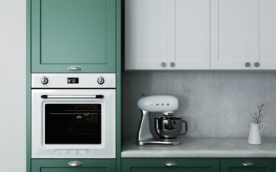
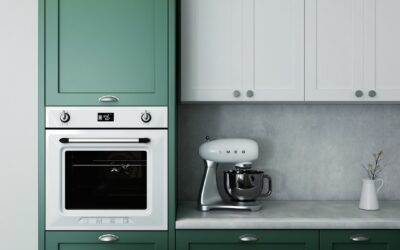
If one color defines the current kitchen, it’s green — specifically the muted, earthy greens that feel natural and grounded. Sage, olive, and deep forest greens have become the go-to for islands and lower cabinets because they bring color without shouting, and they pair effortlessly with wood, brass, and warm whites.
Benjamin Moore’s October Mist, a soft gray-green, and Sherwin-Williams Evergreen Fog, a versatile muted sage, are among the most-specified shades of the moment. For more drama, a deep green like Sherwin-Williams Pewter Green or Benjamin Moore Essex Green on lower cabinets or an island creates rich contrast against light upper cabinets. Green works because it reads as timeless and natural rather than trendy, which gives it real staying power.
Deep Blues and Charcoals for Contrast
Beyond green, deep blues and near-blacks give a modern kitchen sophistication and depth. A navy island against white perimeter cabinets is a look that has proven it can last, reading as classic rather than of-the-moment. Benjamin Moore Hale Navy and Sherwin-Williams Naval are the reliable deep blues.
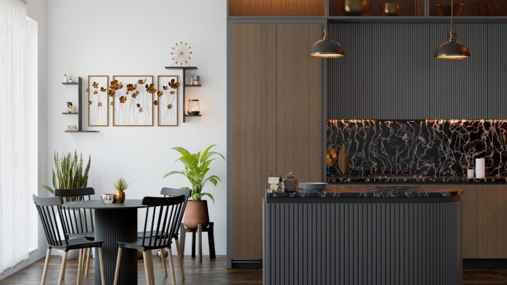
For a bolder, more dramatic kitchen, charcoal and soft black cabinets — think Benjamin Moore Kendall Charcoal or a deep off-black — create a striking, high-end feel, especially paired with warm brass or matte black hardware and light countertops. These darker colors work best on lower cabinets or an island, keeping upper cabinets and walls lighter so the room doesn’t feel closed in.
Two-Tone Kitchens: The Modern Standard
Perhaps the biggest shift in modern kitchens is the move away from a single cabinet color toward two-tone designs. Splitting the color — darker or bolder on the lower cabinets and island, lighter on the uppers — adds depth and visual interest while keeping the room feeling open. The lower half grounds the space, and the lighter upper half keeps it from feeling heavy.
Popular combinations that have staying power include:
- Warm white uppers with sage or forest green lowers — the current favorite
- White uppers with a navy island — a proven, classic contrast
- Cream cabinets with a charcoal or black island — dramatic and grounded
- Natural wood uppers with painted lowers — warmth plus color
Two-tone lets you introduce color confidently while hedging your bet — the bold color lives on the island or lowers, easy to repaint later if tastes change, while the timeless light color covers the bulk of the room.
Choosing Colors That Won’t Date
The goal with a kitchen is a color that feels current now but doesn’t scream a specific year. Muted, complex colors with grayed or earthy undertones age far better than bright, pure hues. A saturated primary color feels exciting for a year and dated soon after; a soft, muted version of the same color family stays graceful for a decade.
Lean on natural, grounded tones — warm whites, earthy greens, deep blues, soft charcoals — and let bolder trend colors live in easily changed elements like a backsplash, wall paint, or accessories rather than the cabinets you’d hate to repaint. If you want to experiment, paint an accent area or the walls in the trend color and keep the expensive cabinet paint timeless.
Matching Colors to Your Finishes and Light
Your countertops, backsplash, flooring, and hardware are the fixed elements the paint has to harmonize with, so choose the color with those in the room. A warm wood floor pairs beautifully with warm whites and greens; cool gray tile leans toward greige and blue. Consider the undertone of your countertop especially — a warm cream quartz fights a cool gray cabinet.
Kitchen light also shifts color dramatically. Kitchens often mix bright daylight from windows with warm or cool artificial light, and a color that looks perfect at noon can turn muddy under evening LEDs. Always sample two coats on poster board, prop it against your cabinets and counter, and check it across a full day and under your actual bulbs before committing.
Warm Accent Colors on the Rise
Beyond greens and blues, warmer accent colors are working their way back into modern kitchens as the reaction against cool grays continues. Terracotta, warm clay, and muted rust bring an earthy, welcoming energy that pairs beautifully with natural wood and brass. These tones show up on islands, in tile backsplashes, and in accessories, adding warmth without the heaviness of a dark color.
Soft, buttery yellows and warm creams are also re-emerging as a cheerful alternative to stark white, especially in kitchens that get plenty of natural light. And in a bolder move, some designers are using warm, spiced neutrals — think a deep putty or a mushroom taupe — on cabinetry for a sophisticated, unexpected look. The common thread is warmth and complexity: these colors have depth and a slightly grayed or earthy quality that keeps them from feeling loud, which is exactly what gives them staying power in a room you can’t easily repaint.
Using Backsplash and Trim to Complete the Palette
Wall and cabinet color is only part of a kitchen’s palette — the backsplash and trim tie everything together. A backsplash is the ideal place to introduce a trend color or pattern you love, since it’s far cheaper and easier to change than cabinets. Zellige tile, warm-toned subway tile, or a bold pattern can carry personality while the cabinets stay in timeless, grounded colors.
Trim and ceiling color deserve deliberate choices too. A warm white trim like White Dove keeps a warm-toned kitchen cohesive, while carrying that same white onto the ceiling brightens the room and keeps sightlines clean. In a two-tone kitchen, let the countertop and backsplash bridge the two cabinet colors so the whole composition reads as one intentional palette rather than a collection of separate decisions. Thinking about all these elements together, rather than choosing wall color in isolation, is what produces a kitchen that feels professionally designed.
Picking the Right Finish
In a kitchen, durability matters as much as color. For walls, a scrubbable eggshell or satin handles grease and splashes and wipes clean. For cabinets, a satin or semi-gloss enamel stands up to constant handling and cleaning while giving a smooth, furniture-like finish — flat paint on cabinets won’t survive kitchen use.
The most successful modern kitchen paint colors share a formula: warm, complex neutrals for the bulk of the room, an earthy green, deep blue, or charcoal for contrast on an island or lower cabinets, and durable finishes that hold up to daily life. Anchor the kitchen in timeless, grounded tones, reserve bolder color for elements you can easily change, sample everything under your real light, and you’ll land on a kitchen that looks fresh today and stays that way long after the trend cycle moves on.