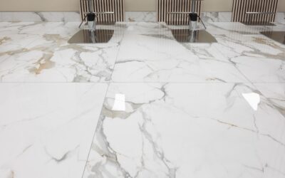
Few tile sizes have reshaped modern floors and walls the way the large-format rectangle has. Getting the 12×24 tile layout right is the difference between a floor that looks custom and one that looks like a first-time DIY job. These oversized planks read as clean and contemporary, but their length also exaggerates every mistake, from an uneven subfloor to a poorly chosen offset. Plan the pattern before you open a single box, and the installation goes far smoother.
Part of our Tile & Grout guide — explore the full guide →
This guide walks through the layout patterns that actually work with 12×24 tile, the offset debate that trips up most homeowners, and the practical steps that keep your grout lines straight and your corners sharp.
Why Layout Matters More With Large-Format Tile
A 12-inch square tile forgives a lot. A tile that runs a full 24 inches does not. Because each piece spans so much floor, any dip or hump in the substrate shows up as lippage, the term for one tile edge sitting higher than its neighbor. The industry standard calls for a subfloor flat to within 1/8 inch over 10 feet before you set large-format tile, and that is not a suggestion you can skip.
The other reason layout matters is visual. A rectangle has a strong directional pull. Run the long dimension across a narrow hallway and the space feels wider; run it lengthwise down a room and you stretch the perceived depth. Deciding this before you dry-lay anything saves you from tearing out rows later.
The Best Patterns for 12×24 Tile
Not every classic tile pattern suits a plank this size. A few stand out for both looks and installability.
Straight Stack (Grid)
Here every tile lines up edge to edge, forming a clean grid of stacked rectangles. It is the most modern and the most forgiving of a slightly out-of-square room, since there is no running joint to expose drift. Designers love it for bathrooms and minimalist kitchens. The tradeoff is that continuous grout lines demand precise spacing, so use tile spacers religiously.
One-Third Offset (Brick)
Offsetting each row by one-third of the tile length is the sweet spot for 12×24. The staggered joints hide minor size variation between tiles and read as timeless. Crucially, a one-third offset keeps lippage under control because you are never landing a joint at the exact center of the adjacent tile, which is where warp is most pronounced.
Herringbone
A 12×24 herringbone is dramatic and eats up more tile in cuts, roughly 15 to 20 percent waste versus 10 percent for straight patterns. It works beautifully in entryways and feature walls but takes patience and a solid layout grid snapped in chalk before you start.
The 50 Percent Offset Problem
The single most common mistake in any 12×24 tile layout is defaulting to a 50 percent brick offset, the same pattern people use for subway tile. With large-format rectangles, this is risky. Nearly every pressed tile has a slight bow across its length, so the highest point sits near the middle. When you offset by half, the corner of one tile meets the crown of the next, and lippage becomes almost unavoidable.
The Tile Council of North America now recommends keeping the offset at 33 percent or less for tiles with any side longer than 15 inches. Stick to a one-third stagger, or go with a straight stack, and you sidestep the problem entirely. If a client insists on a 50 percent look, a leveling clip system becomes mandatory rather than optional.
Planning Your Layout Step by Step
Careful dry planning prevents the dreaded thin sliver cut against a wall. Work through the room before mixing any mortar.
- Measure the room and find the center point of each wall, then snap perpendicular chalk lines to establish a true square starting cross.
- Dry-lay a full row of tiles in both directions from center, including spacers, to see where the cuts fall at each wall.
- If a wall leaves a cut narrower than half a tile, shift your starting line so both opposing edges get balanced, larger cut pieces instead of one full tile and one thin sliver.
- Account for the room’s most visible sightline, usually the doorway you enter through, and make sure full tiles greet you there.
- Confirm the pattern direction looks right from the primary vantage point before committing.
Spending an extra half hour on this dry layout routinely saves an entire afternoon of correction and a box of wasted tile.
Grout Lines and Spacers
Large-format tile looks best with tight, understated grout joints, typically 1/8 inch for a rectified edge tile or 3/16 inch for a standard pressed edge. Rectified tiles have machine-ground edges that allow those minimal joints, while non-rectified tiles need slightly wider lines to absorb size variance. Choose a grout color close to the tile for a seamless field, or contrast it deliberately if you want the pattern to pop. Match your spacer size to the tile edge type rather than guessing.
Tools That Make the Job Easier
A proper 12×24 tile layout benefits from a few specific tools. A tile leveling system with clips and wedges pulls adjacent tiles flush and cures the lippage issue at the source. A 1/2-inch by 1/2-inch notched trowel delivers the mortar coverage large tiles require, and back-buttering each piece pushes coverage past the 95 percent the standard demands for floors. A rail-style snap cutter handles straight cuts on porcelain up to 24 inches, though a wet saw gives cleaner results on dense tile and around obstacles.
Common Mistakes to Avoid
Beyond the offset trap, watch for a few recurring errors. Skipping the flatness check on the subfloor undoes even a perfect pattern. Starting from a wall instead of the room center almost guarantees uneven perimeter cuts. Rushing the mortar so it skins over before the tile is set leaves hollow spots that crack under load. And mixing tiles from different boxes without blending can create visible color banding, since shade lots vary. Open three or four boxes at once and pull from all of them as you work.
Handled with a little forethought, a 12×24 tile layout rewards you with a broad, elegant surface that reads as high-end. Nail the offset, prep the substrate flat, and plan your cuts from the center out, and the finished floor will look like it came from a professional crew.
Choosing a Direction for the Pattern
Direction is a design decision that shapes how a room reads, and with a strong rectangle it carries real weight. Running the 24-inch length parallel to the longest wall stretches and emphasizes the room’s depth, which suits hallways and galley kitchens. Running it across the short dimension makes a narrow room feel wider. In a bathroom, aligning the long axis with the line of sight from the door draws the eye through the space. There is no single correct answer, but choosing deliberately, rather than defaulting to whatever the first tile happens to land on, is what separates a considered floor from an accidental one. Dry-lay a few rows in each orientation and stand in the doorway before you commit.
Estimating Materials and Waste
Ordering the right quantity keeps the job moving and the shade lots consistent. Measure the room’s square footage and add waste based on the pattern: roughly 10 percent for a straight stack or one-third offset, and 15 to 20 percent for herringbone or diagonal layouts that generate more cuts. Buy it all at once so every box comes from the same production run, and confirm the lot number matches across boxes, since color can drift between runs. Keep a few spare tiles after the job for future repairs, because matching a discontinued tile years later is nearly impossible and a single cracked tile is far easier to swap when you already have the match on hand.
Prefer to explore on your own?
See how new flooring looks in your actual room in seconds — free, no signup.
Try the free Floor Studio →