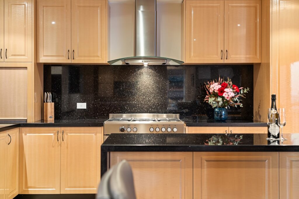
Pairing golden wood with a moody stone surface is one of the most requested kitchen combinations, and getting the wall right is what ties the whole scheme together. Choosing a backsplash with oak cabinets and dark countertops is a balancing act between warm and cool, light and heavy, that either makes the room feel curated or leaves it feeling disjointed. The good news is that a handful of reliable principles take the guesswork out of the decision.
Part of our Countertops guide — explore the full guide →
Oak brings honey, amber, and golden undertones, while dark counters in black, charcoal, or deep granite add weight and contrast. The backsplash is the mediator between them, and the tones you pick will either calm the warmth of the wood, amplify it, or clash outright. This guide walks through the color theory, the strongest tile choices, grout and layout decisions, and realistic budgets so you can build a kitchen that looks intentional.
Color Theory: Warm Oak Meets Dark Counters
Oak cabinetry, whether honey-toned traditional or the pale rift-cut oak popular in modern kitchens, reads as a warm color with yellow, orange, or golden undertones. Dark countertops such as absolute black granite, honed soapstone, charcoal quartz, or deep espresso surfaces sit at the opposite end of the value scale, adding depth and drama. When you place a warm mid-tone against a near-black surface, the eye craves a bridge, and that bridge is the backsplash.
The most successful backsplash either cools the room to counterbalance oak’s warmth or picks up a neutral that both the wood and the stone share. A too-yellow or overly beige tile amplifies the amber in the oak and can push the kitchen toward a dated, orange-heavy 1990s feel. Introducing a cleaner, slightly cooler neutral keeps the oak looking rich and current rather than yellowed, while still respecting the warmth that made you choose wood in the first place.
Creamy White and Light Neutral Backsplashes
A creamy off-white or soft ivory backsplash is the safest and most versatile choice. Pure bright white can look stark and clinical next to warm oak, so a white with a hint of warmth or a barely-there greige undertone bridges the gap beautifully. It brightens the wall, provides breathing room between the busy wood grain and the heavy counters, and reflects light in a kitchen that dark counters might otherwise make feel closed in.
Light beige, greige, and warm gray tiles work in the same way, offering a quiet backdrop that lets the oak and dark stone be the stars. Greige in particular is a workhorse because it carries both a warm and a cool note, so it flatters golden oak without turning yellow and still relates to a charcoal or black counter. If you want the wall to nearly disappear and keep all the attention on the cabinet-and-counter contrast, these muted neutrals are the way to do it.
Natural Stone and Warm Travertine Options
For a richer, more organic look, natural stone backsplashes bring texture that plays well with wood. Taupe travertine, tumbled marble, and honed limestone introduce subtle mineral veining and a matte, earthy surface that echoes the natural character of oak. These materials feel warm without being loud, and their layered neutral tones tend to contain flecks that tie back to both the amber cabinets and the dark counters at once.
A natural stone wall reads as timeless and slightly rustic, which suits Craftsman, farmhouse, and transitional kitchens where oak already leads. Because stone has movement and variation, keep the surrounding elements calm so the wall does not compete. One caution: natural stone is porous and needs sealing to resist grease and splatter behind a range, so factor periodic maintenance into your decision if you cook often and want the backsplash to stay clean.
Using Cool Tones to Balance Warm Oak
If your kitchen leans heavily golden, deliberately cool the palette to restore balance. A soft sage green, muted blue-gray, or cool dove tile counteracts the warmth of honey oak and keeps the space from feeling one-note. These cooler hues create a pleasant tension with the wood, and because they are low in saturation they still read as neutral enough to live with for years rather than as a bold statement you will tire of.
Cool tones are especially effective with modern white oak or rift-cut oak, which already has a paler, less orange character than traditional honey oak. Pair a rift-oak cabinet with a light gray-green backsplash and a charcoal quartz counter and the result is fresh and contemporary. The key is restraint: choose one cool neutral and let it whisper. Overly bright or glossy cool tiles can feel cold against the wood, so favor matte or satin finishes.
Honey Oak vs. Modern White Oak
The exact type of oak changes the ideal backsplash. Traditional honey and golden oak has strong yellow-orange undertones, so it benefits most from cooling neutrals, creamy whites, or greiges that temper the warmth. Avoid tan, gold, or yellow-beige tiles here, which stack warmth on warmth and read dated. A creamy subway tile with a soft gray grout is a classic, reliable pairing that keeps honey oak looking intentional.
Modern white oak and rift-sawn oak are paler, with cleaner, more muted grain and far less orange, so they are more forgiving. They pair happily with crisp whites, warm grays, and even cool sage or blue tones without looking clashy. With dark counters, a white-oak kitchen can carry a more contemporary backsplash such as a matte white hexagon or a fine-lined zellige, whereas honey oak generally looks best kept simpler and warmer-neutral.
Grout Color, Tile Shape, and Layout
Grout is a quiet decision that shapes the entire result. A grout that closely matches the tile creates a seamless, calm wall that recedes behind the oak-and-dark-counter contrast. A contrasting grout, such as a soft gray line between white subway tiles, adds definition and a subtle handcrafted rhythm. Avoid stark white grout that yellows quickly near a cooktop, and avoid very dark grout with light tile unless you want a bold graphic grid.
Tile shape and layout set the personality. Classic 3-by-6 subway laid in a running bond is the timeless default and the most budget-friendly. A herringbone layout adds movement and a tailored feel, while hexagon tile brings a modern, geometric edge that works especially well with rift oak. Deciding between a standard 4-inch backsplash and a full-height wall to the underside of the upper cabinets is largely about drama and budget: full-height showcases the tile and protects more wall, but uses considerably more material.
Budget and Installation Costs
Backsplash costs vary widely with material and labor, but most kitchens land between about $10 and $50 per square foot installed. Basic ceramic subway tile sits at the low end, roughly $10 to $20 per square foot including installation, making it the value choice for a clean creamy-white or greige wall. Porcelain, glass, and patterned tiles rise into the $20 to $35 range, while natural stone such as travertine or tumbled marble typically runs $30 to $50 or more once sealing and cutting are factored in.
A standard backsplash of 30 square feet in mid-range tile might total $600 to $1,200 installed, while a full-height feature wall in natural stone can climb well beyond that. Labor depends on tile size, pattern complexity, and regional rates; intricate herringbone or mosaic work costs more to set than simple stacked subway. Because the backsplash is a relatively small surface with outsized visual impact, it is often worth spending a little more on the tile and pairing it with straightforward installation to keep the oak-and-dark-counter kitchen looking polished.
Common Mistakes to Avoid
The most frequent misstep is matching the backsplash tone too closely to the oak, which erases contrast and leaves the wall looking muddy against the wood. The second is reaching for a busy, multicolor mosaic that fights both the grain of the cabinets and the depth of the dark counter; with two strong elements already in play, the backsplash should be the calm third party, not a competing focal point. When in doubt, quieter and cleaner almost always ages better.
Another trap is ignoring the finish sheen. A high-gloss tile can bounce hard light and feel cold beside warm oak, while a dead-flat matte can look dull under low kitchen lighting. A satin or lightly textured finish usually flatters both the wood and the stone. Finally, always test your top three tile samples taped to the wall for a few days, viewing them in morning and evening light next to a cabinet door and a counter offcut, before you order. Living with the samples in the real space prevents the expensive regret of a backsplash that looked perfect in the showroom but clashes at home.