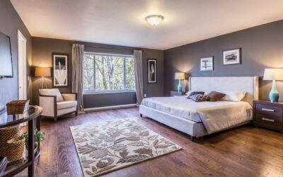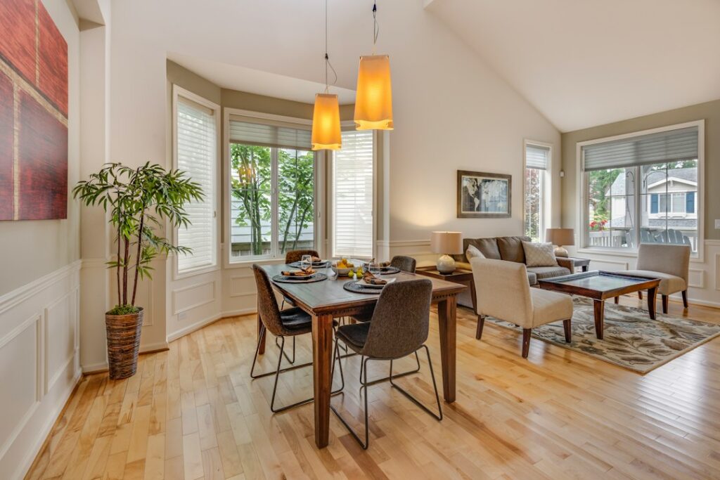
Behr Vintage Pewter is a warm, softly beige gray from the Behr Designer Collection, sold under the code DC-009. On the chip it reads as a gentle greige, lighter than the word “pewter” suggests, and in a sunny room it can drift toward a pale stone. People who expect a cool, metallic gray are often surprised, so the undertone is the first thing to understand before you buy a gallon.
The color sits in a comfortable middle zone: dark enough to show off white trim, light enough to keep a hallway or bedroom from feeling closed in. Behr publishes its RGB value as 203, 196, 183 (hex #CBC4B7), and that number explains most of its behavior. Red and green are slightly stronger than blue, which is why the color leans warm rather than steely.
- Behr Vintage Pewter at a Glance
- Undertones: Why It Looks Beige in Some Rooms
- Coordinating Colors for Trim, Cabinets and Accents
- Similar Colors and Common Mix-Ups
- How to Sample It Properly
- Where Behr Vintage Pewter Works Best
- Painting Tips and Coverage
- Troubleshooting Common Complaints
- Frequently Asked Questions
Three questions decide whether it suits your space: how much light the room gets, what fixed finishes (floors, counters, cabinets) it has to live with, and which white you plan to use on the trim. The sections that follow work through each one, with a spec table, a pairing table, and a sampling routine you can finish in a weekend.
Behr Vintage Pewter at a Glance
The specs for Behr Vintage Pewter come from Behr’s color listing and from independent color databases that convert Behr’s published RGB value. Where those sources disagree, the table says so rather than picking a number that sounds tidy.
| Spec | Value | What it means |
|---|---|---|
| Color code | DC-009 | Use this code at the paint counter to avoid mixing up similarly named colors |
| Collection | Behr Designer Collection | A curated palette of popular designer neutrals and accents |
| RGB / hex | 203, 196, 183 / #CBC4B7 | Warm gray with a slight beige cast; blue is the weakest channel |
| LRV | About 56 | Light to mid value; bright without reading white |
| Undertone | Warm, with a soft beige or taupe lean | Reads cozy, not icy; can look tan in strong warm light |
| Best sheens | Eggshell or satin for walls; semi-gloss for trim or cabinets | Flatter sheens hide wall flaws and soften the warmth |
| Interior or exterior | Both, depending on the paint line you choose | Ask for an exterior formula for siding or doors |
A word on that LRV figure. Light reflectance value runs from 0 (absolute black) to 100 (perfect white). Running Behr’s published RGB value through the standard luminance formula lands at roughly 56, which matches the figure most color sites repeat. Either way, the color behaves as a light to mid-tone neutral, not a deep gray.
Undertones: Why It Looks Beige in Some Rooms
Every gray has a hidden bias. In this one, the bias is warm. Hold the chip against a sheet of plain printer paper and you will see a soft khaki or mushroom cast. Hold it against a cool, blue-gray chip and it looks almost tan. That flexibility is the reason designers like it: it bridges the gap between older beige rooms and newer gray ones.
Light direction changes the read a lot:
- North-facing rooms: cooler, indirect light mutes the beige. The color looks closest to a true soft gray here, and sometimes slightly flat on overcast days.
- South-facing rooms: strong, warm daylight pulls out the taupe. Expect a light greige that can read as stone or putty by mid-afternoon.
- East and west rooms: the color swings. Morning light in an east room keeps it neutral, then it deepens and warms as the sun moves away.
- Artificial light: warm bulbs around 2700K push it toward beige; daylight bulbs around 4000K to 5000K make it cleaner and grayer.
Large fixed surfaces also reflect color onto the walls. Honey oak floors or cabinets bounce orange onto it, which makes the warmth stronger. Gray tile or cool white quartz pulls it back toward neutral. If your room has a lot of orange-toned wood, sample it next to the wood before you commit.
Coordinating Colors for Trim, Cabinets and Accents
Because the wall color is warm, the trim white should be warm or neutral too. A stark, blue-leaning white makes the walls look dingy or yellow by contrast. Soft antique-style whites suit it, and its warm undertone supports cream, mushroom, and deep bronze accents. The table groups pairings by role rather than by product name, so you can match them to whatever brand you buy.
| Role | Pairing direction | Why it works |
|---|---|---|
| Trim and doors | Soft warm white or creamy white (LRV in the 80s) | Crisp enough to define edges without making the walls look muddy |
| Ceiling | Same warm white as trim, or wall color at 25 to 50 percent strength | Keeps the room from feeling boxed in |
| Kitchen cabinets | Warm white, mushroom taupe, or a deep green-gray | Contrasts with walls while sharing the warm base |
| Island or lower cabinets | Charcoal with a brown base, or a muted navy | Adds depth without fighting the beige lean |
| Accent wall | Darker greige two or three steps down the same strip | Same undertone family, so the shift looks intentional |
| Front door (exterior) | Black, oil-rubbed bronze tone, or deep red | Warm siding color looks richer next to a dark door |
| Hardware and fixtures | Matte black, brushed brass, or bronze | Warm metals echo the undertone; chrome can look cold |
For an open floor plan, keep Behr Vintage Pewter as the main wall color and change intensity rather than hue. A lighter version of the same strip works for a dim hallway, while a deeper sibling grounds a dining area. That approach avoids the patchwork look you get from switching between unrelated grays.
Similar Colors and Common Mix-Ups
The name causes plenty of confusion. Another major paint maker sells a color also called Vintage Pewter, and it is a noticeably darker, different shade. Many people also confuse this Behr color with the widely used greige called Revere Pewter. They share a warm, beige-leaning gray character, but they are not the same formula, so bring the Behr code (DC-009) to the counter rather than the name alone.
Color-matching tools list a few cross-brand near matches with almost identical RGB values, including Benjamin Moore Ice Formations (973). Close matches are useful if you need a different paint line for a specific job, such as cabinet enamel, but a match on screen is never exact on the wall. Sample both side by side if you plan to blend brands in one room.
How to Sample It Properly
Small chips lie. A 2-inch square on a white card cannot show how a warm gray behaves across a whole wall. A simple routine gives you a reliable answer in a few days.
What you need
- Peel-and-stick paint samples or a sample pot
- Two or three large poster boards (if using a sample pot)
- A small foam roller and tray
- Painter’s tape
- A white sheet of paper for undertone comparison
Steps
- Apply two coats of sample paint to each board, or use a large peel-and-stick sheet. Leave a 2-inch white border so the color is not judged against the old wall.
- Place one sample on the brightest wall and one on the darkest wall in the room.
- Place another near your floor, counter, or cabinets so you can see the undertone against fixed finishes.
- Check the samples in the morning, mid-afternoon, and at night with your normal bulbs on.
- Compare against one or two alternates, such as a cooler gray and a lighter greige, to confirm you like the warm lean.
- Live with the samples for at least 48 hours before you buy full gallons.
Peel-and-stick swatches are the cleaner option for renters or for anyone testing several colors at once. They move easily from room to room, which is helpful when you want to test the same shade in a north bedroom and a south living room.
Where Behr Vintage Pewter Works Best
The color suits rooms where you want calm and warmth without the yellow cast of older beiges. Living rooms with mixed wood tones, bedrooms, home offices, and hallways all handle it well. In kitchens it pairs naturally with white or cream cabinets and warm stone-look counters. In bathrooms, use a satin finish for better moisture and scrub resistance, and pair it with white tile and warm metal fixtures.
On exteriors, it reads lighter than on the chip because full sun washes color out. Many homeowners like it on siding with white trim and a dark door. If you want the exterior to read clearly as gray rather than beige, test a sample on the shaded side of the house as well as the sunny side.
It is a weaker choice for rooms dominated by cool blue-gray tile or stainless steel with no warm wood to balance it. In those spaces the beige lean can look slightly dirty next to the cool finishes. A cleaner, cooler gray usually works better there.
Painting Tips and Coverage
A gallon of quality interior paint typically covers about 250 to 400 square feet per coat, depending on wall texture and the product. For a 12-by-14-foot bedroom with 8-foot ceilings, plan on about two gallons for two coats on the walls. If you are painting over a much darker or brighter color, use a gray-tinted or neutral primer first so the warm undertone comes through accurately.
- Use the same sheen throughout a room so the color reads evenly.
- Box your gallons (mix them together in a larger bucket) to avoid small batch-to-batch shifts.
- Cut in and roll one wall at a time to keep a wet edge and avoid lap marks.
- Let the first coat dry fully, usually 2 to 4 hours, before judging the final color.
Troubleshooting Common Complaints
“It looks too beige.” Your light is warm, or you have orange wood nearby. Try daylight-temperature bulbs, or step to a cooler gray with a blue or green base.
“It looks flat or gloomy.” North light and low ceilings can dull it. A lighter version of the same strip, or a slightly higher sheen, helps.
“The trim looks yellow.” The trim white may be too creamy. Choose a neutral white with less yellow so the edges stay crisp.
“The touch-ups show.” Touch-ups flash when the sheen or batch differs. Repaint the full wall section from corner to corner instead of spotting.
A professional painter or color consultant is worth the cost when you are painting a full open-concept floor or an exterior, or when you are coordinating paint with expensive fixed finishes. Interior painting labor generally runs a few dollars per square foot of wall, and a short in-home color consult usually costs far less than repainting a room you are not happy with.
Frequently Asked Questions
Is Behr Vintage Pewter warm or cool?
It is a warm gray. Its RGB value has slightly more red and green than blue, which gives it a soft beige or taupe lean, especially in south-facing rooms and under warm bulbs.
What is the LRV of Behr Vintage Pewter?
Calculated from Behr’s published RGB value, it lands at roughly 56, a light to mid-tone value, which matches the figure color databases list.
Is it the same as Revere Pewter?
No. Both are warm greiges with similar names, but they are different colors from different manufacturers. Order by the Behr code DC-009 to get the right one.
What white trim goes with Vintage Pewter?
A soft warm white or a neutral white with only a hint of cream works best. Very cool, blue-tinged whites can make the walls look dingy by comparison.
Does it work with honey oak cabinets?
It can, because the warm undertone harmonizes with oak. Expect the walls to look a little more beige next to orange wood, and sample it right beside the cabinets before you decide.
Can I use it on exterior siding?
Yes, in an exterior paint formula. Full sun lightens it, so it will read paler on the house than on the chip. Test on both a sunny and a shaded wall.