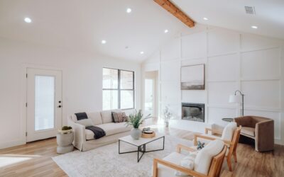
Plenty of homeowners pick a “gray” and end up with walls that feel cold, blue or flat. Edgecomb Gray paint color avoids that problem because it is not a true gray at all. Benjamin Moore Edgecomb Gray HC-173 is a light, warm greige from the brand’s Historical Colors collection, with an LRV of 63.09 on the manufacturer’s color page. It sits right between beige and gray, which is why it fits so many homes with warm wood floors and mixed finishes.
Part of our Paint & Walls guide — explore the full guide →
That LRV puts it in the light-to-mid range. It reflects plenty of light for living spaces but has enough depth to show up against white trim. In bright rooms it can look almost off-white; in dim rooms it reads as a soft taupe-gray.
The sections that follow cover the swatch specs, undertones, how light changes it, the rooms it suits, coordinating colors and how it compares with other popular greiges.
Edgecomb Gray Paint Color Specs
Use this table as a quick reference. Numbers are from the manufacturer’s own color pages; the undertone notes are a qualitative read that you should confirm with samples in your own light.
| Spec | Value | What it means |
|---|---|---|
| Brand and code | Benjamin Moore HC-173 | Order by code to get the exact formula |
| Collection | Historical Colors | A long-running palette inspired by traditional American homes |
| LRV | 63.09 | Light enough for main living areas, with visible color on the wall |
| Color family | Light warm greige | A blend of beige and gray |
| Undertone | Warm, with a soft green-gray edge in some light | Rarely looks blue or icy |
| Similar color | Elmira White HC-84 | The manufacturer’s suggested near match |
| Manufacturer pairings | Boothbay Gray HC-165, White Heron OC-57, Pashmina AF-100, Dove Wing OC-18 | Accent, trim and neutral partners |
Understanding the Undertones
Greiges are tricky because they mix warm and cool pigments, and room conditions decide which side shows. Edgecomb Gray leans warm. Its beige base gives it a soft, sandy quality, and a muted gray keeps it from looking yellow or tan. In some rooms, especially with cool light or green foliage outside, people notice a faint green-gray edge.
Here is how it tends to behave next to common finishes:
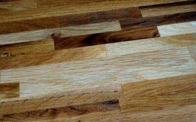
- Warm oak or hickory floors: the beige side comes forward and the room feels cozy and cohesive.
- Cool gray tile or marble: the gray side shows more, and the color can look slightly greener by contrast.
- Bright white trim: the color reads more clearly as a light greige.
- Warm white trim: a softer, low-contrast look where the walls almost read as a deep off-white.
Because it sits so close to neutral, Edgecomb Gray works with both warm and cool decor. That flexibility is the main reason it is a common whole-house neutral.
How Light Changes the Color
North-facing rooms
Cool northern light brings out the gray and any faint green cast. The color will look a bit deeper and cooler than the swatch. If you want it to stay warm in a north room, use warm bulbs and warm accents.
South-facing rooms
Strong southern light washes it out. In a bright south room, Edgecomb Gray can look like a warm off-white, so if you want visible color, consider a slightly deeper greige.
East and west rooms
East rooms look warm in the morning and cooler later; west rooms do the reverse. Look at samples at the times you actually use the room.
Artificial light
Warm 2700K bulbs make it look sandy and beige. Neutral 3000K to 3500K bulbs keep the balance. Cool 5000K daylight bulbs push it gray and can make it look flat.
Best Rooms for Edgecomb Gray
- Living rooms and open floor plans: light enough to flow through connected spaces without looking heavy.
- Bedrooms: calm and warm under evening lamp light.
- Kitchens: pairs well with white cabinets, warm wood islands and brass or black hardware.
- Hallways and stairwells: hides scuffs better than white and connects rooms painted in different colors.
- Exteriors: on siding it reads lighter outdoors, often as a soft warm white-gray. Pair with white trim and a dark door.
Rooms with very little natural light can make Edgecomb Gray paint color look muddy. In a windowless powder room or dark basement, test a lighter greige or warm white alongside it.
Coordinating Trim and Accent Colors
The manufacturer suggests Boothbay Gray HC-165, White Heron OC-57, Pashmina AF-100 and Dove Wing OC-18 as coordinating colors. Those give you a deeper blue-gray accent, two soft whites and a warm neutral.
| Role | Suggested color | LRV | Why it works |
|---|---|---|---|
| Trim and ceilings | White Heron OC-57 | 86.69 | Soft white that frames the walls without harsh contrast |
| Trim alternative | Dove Wing OC-18 | 77.52 | Soft white option for a gentler look |
| Accent wall or cabinets | Boothbay Gray HC-165 | 43.26 | Deeper gray-blue that adds contrast |
| Adjoining rooms | Pashmina AF-100 | 44.2 | Deeper warm neutral for dens or dining rooms |
For a modern look, pair Edgecomb Gray walls with black window frames or a charcoal island. For a coastal feel, add soft blues, natural linen and whitewashed wood. Warm metals such as brass and bronze suit it well; chrome works too but leans the room cooler.
How It Compares With Similar Greiges
The Edgecomb Gray paint color is often shortlisted with a few other well-known greiges from the same brand. LRVs here are from the manufacturer’s color pages.
| Color | LRV | How it compares |
|---|---|---|
| Classic Gray OC-23 | 73.67 | Much lighter; reads as an off-white with a soft gray cast |
| Balboa Mist OC-27 | 65.53 | Very close in depth; a bit cooler and more gray-leaning |
| Edgecomb Gray HC-173 | 63.09 | Light warm greige; a balanced middle choice |
| Revere Pewter HC-172 | 55.05 | Noticeably deeper and warmer; more visible color |
| Elmira White HC-84 | 64.67 | The manufacturer’s listed similar color |
If Edgecomb Gray looks too light in your samples, Revere Pewter is the classic step deeper. If it looks too beige, compare Balboa Mist. If you want something closer to white, Classic Gray is the lighter cousin.
Sampling and Painting Tips
- Use large samples. Peel-and-stick paint samples let you move the color around the room without painting test patches.
- Test on several walls. Place one near a window, one on the darkest wall and one next to the floor or cabinets.
- Compare with neighbors. Put a white sheet of paper and a competing greige next to it to see the undertone clearly.
- Check over two or three days. Morning, midday, evening, lights on and off.
- Pick the right sheen. Matte or eggshell for living areas and bedrooms; eggshell or satin for kitchens and baths; satin or semi-gloss for trim and doors.
- Prime when needed. Prime over dark colors, stains, glossy surfaces and patched drywall; plan on two finish coats for even color.
Premium interior paint generally runs about $40 to $90 per gallon depending on the product line, and a gallon typically covers 350 to 400 sq ft per coat. A typical 12 x 14 ft bedroom with 8 ft ceilings usually takes about two gallons for two coats on the walls.
Troubleshooting Common Issues
It looks too beige. Warm light and warm floors pull the beige forward. Switch to neutral bulbs, add cooler accents, or compare a slightly cooler greige.
It looks green. Cool light, green foliage outside, or cool gray tile can pull a green edge. Test next to those finishes and consider a warmer neighbor if it bothers you.
It looks washed out. Very bright rooms can make it look almost white. A deeper greige will hold its color better.
Touch-ups flash. Sheen differences show on mid-tone colors. Touch up with the same can and the same applicator, feathering the edges.
When to Call a Pro
Painting walls is a manageable DIY job, but hire a professional painter for high stairwells, vaulted ceilings, cabinet refinishing and multi-story exteriors. If your home was built before 1978, test the existing paint for lead before sanding or scraping and follow lead-safe practices. A color consultant is worth considering for open plans where one neutral must work under very different light.
Frequently Asked Questions
What is the LRV of Edgecomb Gray?
Benjamin Moore lists Edgecomb Gray HC-173 at an LRV of 63.09, a light-to-mid value that keeps rooms bright while still showing visible color.
Is Edgecomb Gray warm or cool?
It leans warm. It is a greige with a beige base and a muted gray, and in cool light it can show a soft green-gray edge.
Does Edgecomb Gray look beige?
It can in warm light or next to warm wood floors. In balanced light it reads as a light greige, and next to bright white trim it looks more gray.
What white trim goes with Edgecomb Gray?
White Heron OC-57 is one of the manufacturer’s suggested pairings. Dove Wing OC-18, another suggested pairing, gives a softer, low-contrast look.
Is Edgecomb Gray lighter than Revere Pewter?
Yes. Edgecomb Gray has an LRV of 63.09 and Revere Pewter has 55.05, so Edgecomb Gray is lighter and slightly less warm.
Can Edgecomb Gray be used outside?
Yes. Outdoors it reads lighter, often as a soft warm white-gray, and it pairs well with white trim and dark doors or shutters.