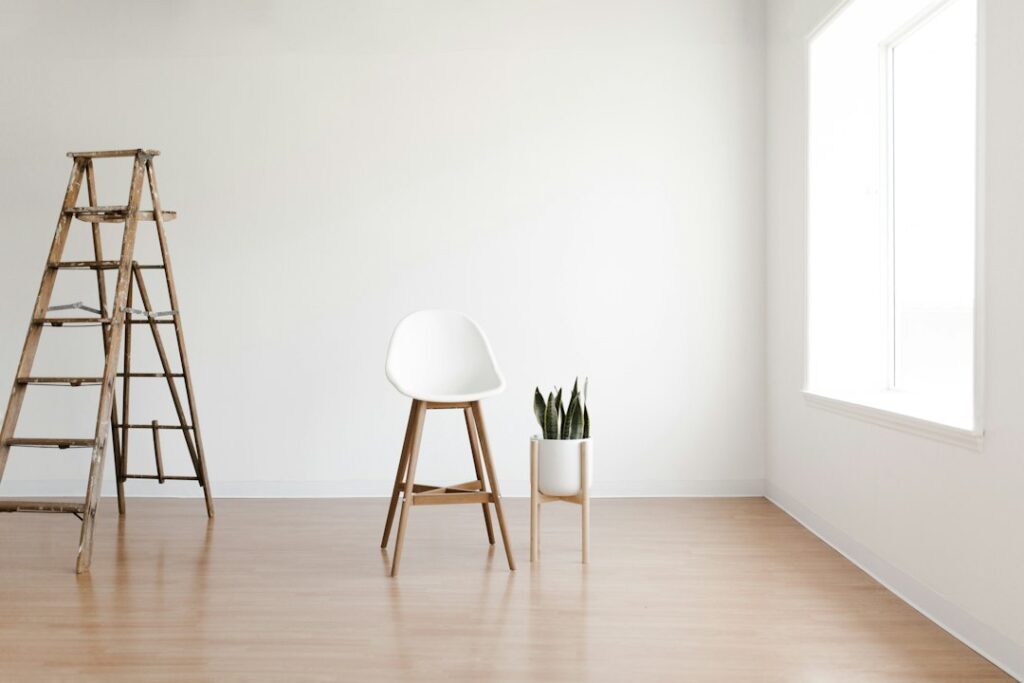
Behr Dolphin Fin is a soft, light gray with a quiet warm streak, the kind of neutral that looks calm on a wall without feeling cold. Its color code is 790C-3, and third-party color databases put its light reflectance value (LRV) at about 59. That places it firmly in the light-to-mid range: light enough to keep a room bright, deep enough to show clearly against white trim.
The undertone is where people get confused. Some describe it as a warm gray or a greige, others notice a faint cool hint in certain light. Both observations are fair. The color is low in saturation, so it reads as a balanced gray most of the time, leaning slightly warm (a touch of beige) in warm light and a little cooler in north light. That flexibility is why it shows up in so many open-plan homes.
- Behr Dolphin Fin Specs at a Glance
- Undertones and How Light Changes Them
- Coordinating Trims and Accent Colors
- Near-Color Comparisons
- Rooms Where It Works Best
- How to Test the Color Properly
- Finish and Application Tips
- Troubleshooting Common Complaints
- General Cost and When to Hire a Painter
- Frequently Asked Questions
If you want a gray that will not turn blue or purple, and you have a mix of warm and cool finishes in the house, behr dolphin fin is worth sampling. If you want a crisp, cool gray or a bright, airy white, look elsewhere.
Behr Dolphin Fin Specs at a Glance
The swatch and spec table brings together the published numbers. Behr’s own color page and the physical chip are the final authority; screen hex values in particular vary slightly by source and never match paint exactly.
| Spec | Value | What it means |
|---|---|---|
| Color code | 790C-3 | Quote this at the paint counter to get the right formula |
| Color family | Light gray / soft greige | A neutral gray with a little warmth |
| LRV | About 59 (third-party data; confirm on the chip) | Light to mid-tone; keeps rooms bright without looking white |
| Hex (screen approximation) | About #CCCAC1 | For digital mockups only |
| Undertone | Slightly warm (beige-straw), very muted | Rarely turns blue, green or purple in normal light |
| Rooms it suits | Living rooms, kitchens, bedrooms, offices, hallways | A versatile whole-house neutral |
| Trim pairing | Soft or neutral whites | Frames the gray without making it look dingy |
An LRV around 59 is a useful benchmark. Colors in the high 50s and low 60s tend to be the sweet spot for whole-house neutrals: they hide scuffs better than whites, give enough contrast for trim, and still let natural light do its job.
Undertones and How Light Changes Them
Every gray carries an undertone, and the wrong one can make a room feel off. Dolphin Fin’s is a subtle straw or beige warmth sitting under a mostly neutral gray. Because the saturation is so low, that warmth acts as a softener rather than a visible tint.
North-facing rooms get cool, indirect light all day. In that light, Dolphin Fin loses some of its warmth and looks like a true light gray, sometimes with a faint cool cast. This is the setting where people report seeing a hint of blue. If you love the color in the store but want it to stay warm in a north room, warm bulbs help a lot.
South-facing rooms bathe the walls in warm light, and the color responds by reading as a soft greige. East and west rooms shift through the day: cooler and grayer in the shaded hours, warmer and softer when the sun hits.
Bulb color temperature makes a big difference at night. Warm white bulbs (2700K to 3000K) keep the color cozy and greige. Daylight bulbs (5000K) push it toward a cleaner, cooler gray. Neither is wrong; they just produce different moods, so check samples under the bulbs you actually use.
Coordinating Trims and Accent Colors
Trim choice decides whether this gray looks fresh or flat. A white with a little softness usually works best, because a very stark, blue-tinted white can make a warm gray look dull by comparison.
- Soft warm whites such as Behr Swiss Coffee give a gentle, low-contrast look that suits traditional and farmhouse rooms.
- Neutral whites such as Behr Polar Bear or Behr Ultra Pure White add more crispness for a modern feel. Test them first to make sure the wall does not look muddy beside them.
- Same-strip tints: a lighter step of the same family, or the wall color mixed at reduced strength, works well on ceilings to keep the room cohesive.
For accents, Dolphin Fin pairs well with deep navy, charcoal, black, and muted greens such as sage and olive. Warm woods, leather, and brass add contrast to the cool side of the gray. For a calm bedroom, soft blue-gray textiles and white linens keep the palette quiet. For a bolder look, a charcoal or black interior door or kitchen island gives the gray a strong anchor.
Near-Color Comparisons
When shortlisting behr dolphin fin, most people also look at a few well-known light grays. Comparing them helps you choose based on undertone rather than name.
Dolphin Fin vs Sherwin-Williams Repose Gray
Repose Gray (published LRV 58) is one of the most common comparison points, and the two are close in depth. Repose Gray is often described as a balanced gray that can show a faint cool or violet hint in some rooms, while Dolphin Fin leans a little warmer. If your home has warm wood floors or beige stone, Dolphin Fin may sit more comfortably; with cool gray tile or marble, either can work.
Dolphin Fin vs Sherwin-Williams Agreeable Gray
Agreeable Gray (published LRV 60) is a warmer greige with more beige in it. Next to it, Dolphin Fin looks grayer and slightly cooler. Choose Agreeable Gray for a warmer, more beige-leaning room and Dolphin Fin for a cleaner gray that still avoids coldness.
Dolphin Fin vs lighter Behr grays
If you sample Dolphin Fin and it feels too deep, look at lighter grays on the same or neighboring Behr strips, or have the store mix it at a reduced strength. Silver Drop (790C-2), one step lighter on the same Behr strip, is the natural paler version at an LRV of about 70. Chic Gray (PPU26-10) is often mentioned too, but it sits at about the same depth as Dolphin Fin, so it is a sideways move rather than a lighter one.
A simple method for comparing: lay all your chips on a sheet of white printer paper. The one that looks most beige is the warmest; the one that looks bluest is the coolest.
Rooms Where It Works Best
Living rooms and open plans. Its balanced undertone makes it a reliable whole-house neutral, handling mixed light from several directions better than strongly warm or cool grays.
Kitchens. It works beside white, navy, or wood cabinets and pairs well with both stainless and brass. With creamy, yellowed cabinets, test carefully, since the gray can make cream look dated.
Bedrooms and offices. The softness reads calm and restful. In a dim room, it can feel slightly heavy; a lighter gray may suit a small, dark space better.
Bathrooms. Good with white tile and chrome or nickel fixtures. Use a finish rated for humid rooms.
Exteriors. Outdoor light washes colors out, so a color around LRV 59 will look lighter on siding than on the chip. Pair with white trim and a dark door for a classic look, and view a large sample in full sun and shade.
How to Test the Color Properly
Peel-and-stick paint sample swatches are the easiest way to test without painting the wall, and they are large enough to judge the undertone. Sample cans painted onto white poster board are a good alternative.
- Use samples at least 12 by 12 inches.
- Place one on a wall that gets direct light and one in a shaded corner.
- Keep samples away from the existing wall color, or back them with white paper.
- Check them in the morning, afternoon, and evening with your lights on.
- Hold them against fixed finishes: floors, countertops, tile, and large furniture.
- Wait a couple of days before buying gallons.
Finish and Application Tips
Matte or flat finishes make grays look softer and slightly deeper and hide wall imperfections. Eggshell is a good, washable middle ground for living spaces and hallways. Satin works in kitchens, bathrooms, and kids’ rooms where you clean often. Save semi-gloss for trim, doors, and cabinets.
When painting over a darker or strongly colored wall, use a primer, ideally tinted gray, to reach full coverage in two coats. Roll in overlapping W patterns, keep a wet edge, and cut in one wall at a time so the brushed edges blend with the rolled field.
Troubleshooting Common Complaints
It looks blue. Usually north light or daylight bulbs. Switch to warmer bulbs, or choose a gray with more beige in it.
It looks too beige. Warm bulbs or strong southern light can push it toward greige. Cooler bulbs or a slightly cooler gray will bring it back.
It looks darker than expected. Paint on four walls reflects onto itself and reads deeper than a chip. Try a reduced-strength mix or a lighter step on the strip.
It looks dull with my trim. The trim white may be too cool and bright. Try a softer white.
General Cost and When to Hire a Painter
An average bedroom needs about 2 gallons for two coats on the walls. Mid-range interior paint generally costs a few dozen dollars per gallon, with premium lines higher. Hiring a painter for a single room usually runs in the low to mid hundreds of dollars for walls, more with ceilings, trim, and drywall repairs.
Bring in a pro for tall stairwells, vaulted ceilings, two-story exteriors, or homes built before 1978, where old paint may contain lead and should be tested before sanding or scraping.
Frequently Asked Questions
What is the LRV of Behr Dolphin Fin?
Third-party color databases list it at about 59. Confirm the current figure on Behr’s color page or the paint chip, since published numbers vary slightly.
Is Dolphin Fin a warm or cool gray?
It is a mostly neutral gray that leans slightly warm. In north light or under daylight bulbs it can look cooler, sometimes with a faint blue hint.
What white trim goes with Dolphin Fin?
Soft or neutral whites work best. Very stark, cool whites can make the gray look dull, so test trim colors side by side with the wall sample.
Is Dolphin Fin similar to Repose Gray?
The two are close in depth, but Dolphin Fin generally reads a bit warmer, while Repose Gray is more balanced and can show a slightly cooler cast.
Can I use Dolphin Fin on exterior siding?
Yes. Expect it to look lighter outdoors than on the chip, and view a large sample in sun and shade before committing.