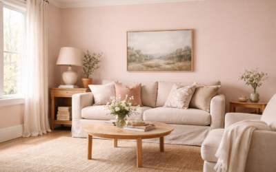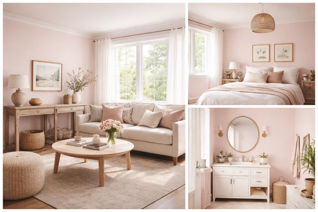
Pink paint scares a lot of homeowners, usually because they picture a nursery or a candy-colored bedroom. Benjamin Moore First Light is far quieter than that: a soft, airy pink that the company positions as a refreshing alternative to white or beige. Its color code is 2102-70, its light reflectance value (LRV) is 75.86 according to Benjamin Moore’s color page, and it was named Benjamin Moore’s Color of the Year for 2020.
On a wall, it reads as a pale blush with enough warmth to flatter skin tones and wood. It works best in bedrooms, bathrooms, dining rooms, offices and entryways, and it looks most like a sophisticated neutral when paired with crisp white trim and soft grays. The main risk is very warm, sunny light, where its pink can strengthen.
- Benjamin Moore First Light Specs and Sheen Picks
- What an LRV of 75.86 Means for Your Room
- How First Light Changes With Lighting
- Best Rooms for First Light
- Coordinating Trim and Accent Colors
- First Light vs Nearby Blush Shades
- How to Test First Light
- Painting Tips and Common Issues
- Using First Light With Flooring and Finishes
- Cost and Coverage
- Frequently Asked Questions
Benjamin Moore First Light Specs and Sheen Picks
The color data comes from Benjamin Moore’s own color page. Published values can be revised, so confirm details on the current page or a physical sample before you buy.
| Spec | Value | What it means |
|---|---|---|
| Color name | First Light | Benjamin Moore’s 2020 Color of the Year |
| Color code | 2102-70 | The lightest shade on its color strip |
| LRV | 75.86 | Light; brighter than most pastels, softer than a white |
| Color family | Red family (reads as pale pink) | A warm hue, not a cool lilac pink |
| Undertone | Soft pink with warmth | Flatters skin tones and wood, can strengthen in warm light |
| Sheen for walls | Matte or eggshell | Soft, even glow; hides minor wall flaws |
| Sheen for baths and kitchens | Satin | More scrubbable in humid, high-use rooms |
| Coordinating colors listed | White Heron, Chantilly Lace, Amherst Gray, Normandy | Benjamin Moore’s suggested pairings |
Sheen availability depends on the product line you choose, so check which finishes are offered in that line before ordering.
What an LRV of 75.86 Means for Your Room
LRV measures how much light a color reflects on a scale from 0 (black) to 100 (pure white). At 75.86, First Light is a light color that keeps rooms bright, but it is clearly a color and not an off-white. Compared with Benjamin Moore’s brightest whites, which sit close to 90, it reflects noticeably less light, so in a small or dim room it will feel cozier and more enveloping.
That moderate brightness is part of its appeal. It gives the wall a gentle glow instead of a stark, reflective surface, which is why designers often use it as a softer replacement for a beige or a warm white.
How First Light Changes With Lighting
North-facing rooms
Cool northern light tones the pink down. In these rooms, First Light tends to read as a muted, slightly dusty blush, close to a warm neutral. Many people find this the most sophisticated version of the color.
South-facing rooms
Warm, direct sun brings the pink forward. In a bright south-facing room, the walls can look distinctly rosy at midday. If you want a whisper of pink rather than a clear pink, test carefully here.
East and west light
East-facing rooms will look warmer and pinker in the morning and calmer later in the day; west-facing rooms reverse that pattern, glowing in late afternoon sun.
Artificial light
Warm bulbs around 2700K make the pink stronger and cozier. Neutral bulbs around 3000K to 3500K keep it soft and balanced. Very cool bulbs can flatten it toward a pale gray-pink.
Best Rooms for First Light
- Bedrooms: The soft warmth suits restful spaces, for adults as well as kids. Pair with white bedding, linen and natural wood.
- Bathrooms and powder rooms: Pale pink flatters skin in a mirror, and it looks fresh with white tile, brass or nickel fixtures, and marble-look surfaces.
- Dining rooms: Warm, welcoming and flattering under evening light.
- Home offices: A calm alternative to white that still feels bright on video calls.
- Entryways and hallways: Adds personality without overwhelming a small space.
- Nurseries: A gentle option that grows with the child better than a bright bubblegum pink.
Living rooms with lots of warm afternoon sun and orange-toned wood floors are the trickiest setting, since both push the pink harder. Test with your actual flooring in view.
Coordinating Trim and Accent Colors
Benjamin Moore lists four coordinating colors on the First Light page, and they show the range of ways the color can be styled.
- White Heron (OC-57): A soft white for trim and ceilings that keeps the look gentle.
- Chantilly Lace (OC-65): A very bright white (LRV 90.04 on Benjamin Moore’s page) for crisp, high-contrast trim that makes the pink read cleaner.
- Amherst Gray (HC-167): A deeper gray for an accent wall, doors or cabinetry. Gray is a classic way to make pink feel grown-up.
- Normandy (2129-40): A blue that creates a fresh, balanced contrast for accents, furniture or an adjoining room.
Brass and gold hardware, warm wood, olive greens and soft charcoal all sit comfortably next to First Light as well.
First Light vs Nearby Blush Shades
Benjamin Moore lists several similar colors on the First Light page: Tropical Sand (2101-70), Strawberry ‘n Cream (2103-70), Victorian Lace (2100-70) and Silky Smooth (1373). The three 2100-series colors are the lightest shades on neighboring strips, so they share a similar lightness but shift in hue.
| Color | Code | Where it sits | Choose it if |
|---|---|---|---|
| First Light | 2102-70 | Soft, warm pink | You want a balanced blush that reads as a neutral |
| Victorian Lace | 2100-70 | Neighboring strip, lightest shade | Test it if First Light leans too pink in your light |
| Tropical Sand | 2101-70 | Neighboring strip, lightest shade | You want a nearby pale tint with a different hue shift |
| Strawberry ‘n Cream | 2103-70 | Neighboring strip, lightest shade | You want a nearby pale tint on the other side of First Light |
The best way to choose between near colors is to put samples side by side on the same wall. Small differences that are invisible on a chip become obvious across a whole room.
How to Test First Light
Peel-and-stick paint sample sheets are the easiest way to test a subtle color like this without painting swatches on the wall.
- Place samples on at least two walls, one that gets direct light and one that stays in shadow.
- Look at them at morning, midday, evening and under your lamps at night.
- Hold a sample against your flooring, trim and largest pieces of furniture.
- Compare against your current wall color and a warm white so you can judge how pink it really reads.
- Live with the samples for at least two or three days before deciding.
Painting Tips and Common Issues
- Too pink once painted: switch to neutral bulbs and add gray, white or blue accents. If it is still too strong, try a nearby shade with a different hue shift.
- Patchy coverage over a darker color: prime with a white or tinted primer, then apply two coats.
- Visible touch-ups: use the same sheen and batch, and feather edges with a lightly loaded roller.
- Color looks different from the chip: large areas always look stronger than a chip; this is normal and why full-size samples matter.
Using First Light With Flooring and Finishes
Floors cover a large share of what you see in a room, so they shape how any wall color reads. First Light looks especially good with light and mid-tone oak, white oak, ash and maple floors, where the gentle pink warms the wood without competing with it. Gray-washed or cool gray vinyl plank keeps the color soft and modern. Very orange or red-toned floors, such as some older finished oak or cherry, can push the walls pinker, so test samples with the floor in view.
For tile, white, cream and pale gray surfaces all work, and terrazzo or marble-look tile with gray veining picks up the color’s soft warmth. In kitchens, white or light gray quartz counters, natural wood open shelving and brass or matte black hardware all suit First Light. If your cabinets are already a cool white, Chantilly Lace on the trim keeps everything consistent.
Cost and Coverage
The color itself does not change the price; the paint line and sheen do. Premium interior paints typically cost roughly $50 to $100 per gallon, and one gallon covers around 350 to 400 square feet per coat. A typical 12 by 12 foot bedroom with 8 foot ceilings usually takes about two gallons for two coats on the walls.
Frequently Asked Questions
What color is Benjamin Moore First Light?
It is a soft, airy pink, code 2102-70, that Benjamin Moore presents as an alternative to white or beige. It was the company’s 2020 Color of the Year.
What is the LRV of First Light?
Benjamin Moore lists First Light with an LRV of 75.86, which places it in the light range while still reading as a distinct color.
Does First Light look too pink?
In cool or north light it reads as a muted blush. In strong warm sun or under warm bulbs it looks pinker, so test samples in your own room.
What trim color goes with First Light?
Benjamin Moore suggests White Heron and Chantilly Lace. White Heron keeps the look soft, while Chantilly Lace gives crisper contrast.
What rooms suit First Light best?
Bedrooms, bathrooms, dining rooms, offices and entryways suit it well. Rooms with intense warm sun and orange wood floors need careful testing.