Plenty of blues look calm on a chip and then turn either electric or nearly black once they cover four walls. Benjamin Moore Philipsburg Blue (HC-159) avoids both problems because it carries a heavy dose of gray. The maker describes it as a grayish blue that conjures still waters at dusk, and its light reflectance value (LRV) of 19.06 puts it firmly in the medium-dark range.
In practice, Philipsburg Blue reads as a muted, slightly smoky mid blue. It is deeper than the pale blue-grays people use on whole-house walls, yet noticeably lighter and softer than a true navy. That middle position makes it a favorite for accent walls, studies, dining rooms, kitchen islands, cabinetry and front doors, and it also appears on exterior siding and shutters.
- Benjamin Moore Philipsburg Blue Specs at a Glance
- Undertones: How Philipsburg Blue Shifts in Different Light
- Rooms Where Philipsburg Blue Works Best
- Coordinating Colors and Trim Pairings
- Philipsburg Blue vs Van Deusen Blue vs Hale Navy
- Tools and Materials for Painting with Philipsburg Blue
- Step-by-Step: Getting an Even Finish with a Deep Blue
- Troubleshooting Common Issues
- Cost Considerations and When to Call a Pro
- Frequently Asked Questions
The sections that follow cover the confirmed specs, how the undertone behaves in different light, the rooms it suits, the coordinating colors Benjamin Moore lists, and how it compares with two of the brand’s best-known blues, Van Deusen Blue and Hale Navy.
Benjamin Moore Philipsburg Blue Specs at a Glance
The figures in this table come from the manufacturer’s color page. Paint sellers sometimes round the LRV to 19.
| Spec | Value | What it means |
|---|---|---|
| Color number | HC-159 | The code to give at the paint counter |
| Collection | Historical Colors | A collection inspired by traditional North American architecture |
| LRV | 19.06 | Medium-dark; reflects roughly a fifth of the light that hits it |
| Maker’s description | A grayish blue | Gray content softens the blue so it never looks bright |
| Undertone | Gray, with a subtle cool lean | Can look slightly slate or smoky in north light |
| Similar color listed | Normandy (2129-40) | The maker’s own suggested near match |
| Best sheens | Matte or eggshell walls; satin or semi-gloss trim and cabinets | Deeper colors show lap marks and touch-ups more in higher sheens on walls |
An LRV under 20 means the color absorbs most of the light that hits it. On a large wall that translates into a cozy, enveloping feel rather than a bright one, so lighting plays a bigger role than it would with a pale blue.
Undertones: How Philipsburg Blue Shifts in Different Light
Gray is the dominant undertone. That gray is why the color reads as sophisticated and quiet instead of nautical or juvenile. Depending on exposure, you will notice a few shifts:
- North-facing rooms: Cool, indirect light emphasizes the gray and can make Philipsburg Blue look closer to a slate or stormy blue. Warm white bulbs help balance it.
- South-facing rooms: Strong warm light brings the blue forward, and the color looks clearer and a touch brighter, still well short of a saturated blue.
- East and west rooms: Expect the color to change through the day: richer in the morning or evening sun, grayer in the off hours.
- Artificial light: Bulbs around 2700K to 3000K keep it warm and inviting; very cool daylight bulbs push it toward gray.
Because the blue is muted, it rarely turns green or purple the way some mid blues do. Still, test a large sample on at least two walls before committing.
Rooms Where Philipsburg Blue Works Best
Dining rooms and studies
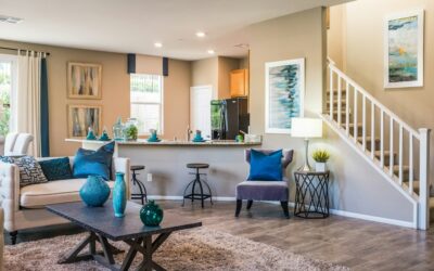
The depth of the color suits rooms used mostly in the evening. With white trim and warm lighting, it creates a classic, tailored look that pairs well with wood furniture and brass fixtures.
Bedrooms
Painted on all four walls or just behind the bed, it gives a restful, cocooning effect. In small bedrooms with limited light, consider using it as an accent wall only.
Kitchen islands and cabinets
A muted blue island surrounded by white or warm-white perimeter cabinets is a durable look. Use a satin or semi-gloss cabinet enamel for wipeability.
Bathrooms and powder rooms
Small powder rooms are a good place to go bold. Pair it with white tile, marble-look surfaces and polished nickel or brass.
Front doors and exteriors
On a front door it reads as a dignified, traditional blue. On siding it works best on homes with crisp white trim and plenty of sun, since in shade it can look quite gray.
Coordinating Colors and Trim Pairings
Benjamin Moore lists four coordinating colors for Philipsburg Blue on its color page. These give a quick starting point for a whole-room or whole-house palette:
| Coordinating color | Code | How to use it |
|---|---|---|
| Putnam Ivory | HC-39 | A warm, creamy color for adjoining rooms or cabinetry |
| Mountain Peak White | OC-121 | A white option for trim, ceilings and doors |
| Baby Fawn | OC-15 | A soft warm neutral for hallways and connecting spaces |
| Brentwood | 1223 | A secondary accent for furniture, doors or built-ins |
For trim, a clean white keeps the look crisp, while a creamy off-white softens the contrast and suits older homes. Natural wood, warm leather, brass and aged bronze all complement the gray-blue. Avoid pairing it with stark cool grays on adjoining walls, which can make the whole palette feel cold.
Philipsburg Blue vs Van Deusen Blue vs Hale Navy
These three Historical Colors are often shortlisted together, and the LRV gap between them tells most of the story.
| Color | Code | LRV | How it reads |
|---|---|---|---|
| Philipsburg Blue | HC-159 | 19.06 | Medium-dark grayish blue, softest of the three |
| Van Deusen Blue | HC-156 | 11.97 | Deeper, richer foundational blue |
| Hale Navy | HC-154 | 8.36 | Classic deep navy |
Choose Philipsburg Blue if you want color that still lets a room feel open, especially in spaces with moderate light. Choose Van Deusen Blue when you want more saturation and depth, for example on cabinets or a feature wall where the blue should clearly read as blue. Choose Hale Navy for a dramatic, near-traditional navy on doors, islands or exterior shutters. Many homeowners use Philipsburg on walls and one of the darker two on cabinetry or a door in the same space for a layered effect.
Tools and Materials for Painting with Philipsburg Blue
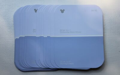
- Peel-and-stick samples or two sample pots for testing
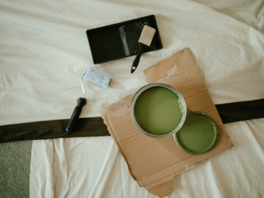
- A quality roller and tray kit with a 3/8-inch nap cover for smooth walls
- A 2 to 2.5 inch angled sash brush for cutting in
- Painter’s tape, drop cloths and a sanding sponge
- Primer tinted toward gray if covering a light or very different color
- Paint in your chosen sheen: plan on two coats
Step-by-Step: Getting an Even Finish with a Deep Blue
- Test first. Paint large swatches or apply samples on two walls and look at them morning, afternoon and night for two or three days.
- Prep the surface. Fill holes, sand patches smooth, wipe off dust and grease, and remove outlet covers.
- Prime when needed. A gray-tinted primer helps a medium-dark blue cover in two coats over white or bold colors.
- Cut in one wall at a time. Cut in and roll the same wall while the edges are still wet to avoid picture-framing.
- Roll in sections. Work top to bottom in 3-foot sections with a fully loaded roller, finishing each section with light, consistent strokes.
- Apply the second coat. Wait the recoat time on the can, then repeat. Deeper colors almost always need two full coats.
- Keep leftover paint. Label a small container for touch-ups, since darker colors show patched spots more readily.
Troubleshooting Common Issues
- Looks too gray: The room is likely north-facing or lit with cool bulbs. Warmer bulbs help, or consider a slightly more saturated blue.
- Looks too dark: Try it on one accent wall or a lower wainscot instead of the full room.
- Streaks or flashing: Usually from rolling over partly dry paint or using a high sheen on walls. Keep a wet edge and choose matte or eggshell.
- Uneven coverage: Add a tinted primer coat or a third finish coat rather than pressing harder with the roller.
Cost Considerations and When to Call a Pro
Material costs for a typical 12 x 12 foot bedroom with two coats generally fall in the $80 to $200 range depending on the paint line. Hiring a painter for that room commonly costs a few hundred dollars up to around $1,000, with cabinet painting running considerably higher because of the prep and spraying involved. Deep colors reward experience: a professional painter is worth considering for kitchen cabinets, tall stairwells, or rooms with lots of trim where crisp lines matter. Paint formulas and color pages are updated from time to time, so check the current Benjamin Moore color page or fan deck before you buy.
Frequently Asked Questions
What is the LRV of Benjamin Moore Philipsburg Blue?
The manufacturer lists an LRV of 19.06, which places it in the medium-dark range. It reflects roughly a fifth of the light that strikes it.
Is Philipsburg Blue a gray or a blue?
It is a blue with a strong gray undertone. Benjamin Moore calls it a grayish blue, and in low light it can look quite gray.
Is Philipsburg Blue darker than Van Deusen Blue?
No. Philipsburg Blue has an LRV of 19.06, while Van Deusen Blue is 11.97, so Van Deusen Blue is noticeably deeper.
What white goes with Philipsburg Blue?
Benjamin Moore lists Mountain Peak White (OC-121) among its coordinating colors. Crisp whites give strong contrast, while creamy whites soften the look for traditional homes.
Can Philipsburg Blue be used on kitchen cabinets?
Yes. It works well on islands and lower cabinets, especially paired with white uppers. Use a durable cabinet enamel in satin or semi-gloss.