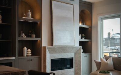
Say “pink walls” and half the room pictures a toddler’s nursery. But the best blush paint colors are nothing like that — they’re subtle, sophisticated, dusty rose and warm beige-pink tones that behave more like a flattering neutral than a bold color. Interior designers reach for blush because it warms a space, glows under both daylight and lamplight, and pairs with an unexpectedly wide range of accents. Done right, a blush room reads as calm and elegant. Done wrong, it tips into cotton-candy territory. Here’s how to choose a shade that lands firmly on the grown-up side.
Part of our Paint & Walls guide — explore the full guide →
- What Makes a Blush Color Work
- The Best Blush Paint Shades to Try
- Best Rooms for Blush Walls
- What to Pair With Blush
- How Light Changes Blush
- Choosing the Right Finish
- Avoiding the Nursery Trap
- Warm Blush vs. Cool Blush
- Using Blush as an Accent Instead of a Whole Room
- Blush in Different Design Styles
- The Bottom Line
What Makes a Blush Color Work
The difference between an elegant blush and a juvenile pink comes down to undertone and saturation. Sophisticated blushes are muted and desaturated — they contain gray, beige, or a touch of brown that grounds the pink. The moment a shade gets too clean, bright, or saturated, it reads as a child’s pink.
Look for blushes described as “dusty,” “rosy beige,” “greige-pink,” or “warm putty with a pink cast.” These carry enough complexity to feel adult. A useful test: if the color looks like the inside of a seashell, weathered terracotta, or a faded antique rose, you’re in safe territory. If it looks like bubblegum or a highlighter, keep looking.
The Best Blush Paint Shades to Try
These well-loved blushes consistently read sophisticated across different lighting:
- Farrow & Ball Setting Plaster: the gold standard — a warm, dusty pink-beige that glows without going sweet
- Benjamin Moore First Light (2102-70): a soft, airy blush with subtle warmth, named a color of the year
- Sherwin-Williams Intimate White (SW 6322): a barely-there blush that behaves like a warm off-white
- Benjamin Moore Proposal (1191): a deeper, rosier take for more presence
- Behr Feather Pink: a gentle, greige-leaning blush that’s forgiving in most rooms
- Farrow & Ball Pink Ground: a warm, understated pink that flatters period homes
Best Rooms for Blush Walls
Blush rewards you most in rooms where warmth and softness matter. Bedrooms are the natural home — a dusty blush creates a restful, enveloping feel that’s especially flattering in morning light. Living rooms and dining rooms take blush beautifully too, particularly in homes that get cool north light, since the warm pink counteracts the blue cast.
Powder rooms are a great low-risk place to experiment; the small footprint lets you go a shade deeper and more saturated for drama. Home offices and reading nooks benefit from blush’s calming quality, and even a kitchen with white or wood cabinets can carry a blush wall for unexpected charm. The one place to be cautious is a room with harsh fluorescent lighting, which can flatten blush into an unappealing gray-pink.
What to Pair With Blush
Blush’s versatility comes from how many partners it accepts. The pairing you choose sets the entire mood:
- Blush + warm white + natural wood: soft, Scandinavian, and serene
- Blush + charcoal or black: modern and grown-up, with the dark tone anchoring the pink
- Blush + navy or deep green: rich and sophisticated, a designer favorite
- Blush + brass and gold accents: warm, luxe, and glamorous
- Blush + terracotta and rust: earthy and layered, leaning bohemian
Adding a dark or saturated partner color is the single easiest way to keep blush from feeling too sweet. A blush bedroom with a charcoal headboard and brass lighting reads unmistakably adult.
How Light Changes Blush
No color shifts with light quite like blush. In warm afternoon sun it deepens and glows rosy. Under cool morning light or an overcast sky it can pull grayer and more muted. In north-facing rooms, blush stays soft and cool; in south-facing rooms, it warms up and can even read peachy. Artificial light matters just as much — warm 2700K bulbs make blush glow, while cool 4000K-plus bulbs can drain the warmth and turn it chalky.
Because of this sensitivity, testing is essential. Paint large samples on multiple walls and observe them across a full day and again at night under your actual bulbs. A blush that looks dreamy at sunset can look washed-out at noon, so make sure you love it in the light the room lives in most.
Choosing the Right Finish
Sheen shapes how blush feels. A flat or matte finish gives blush a soft, chalky, plaster-like quality that enhances its sophistication — ideal for bedrooms and living rooms. Eggshell is the practical middle ground for everyday spaces, offering a slight glow and easier cleaning. Save satin and semi-gloss for trim and doors, where a crisp white or a soft greige lets the blush walls take center stage. Because blush is a color of subtlety, avoid high-gloss on the walls; too much shine can make the pink look artificial and cheap.
Avoiding the Nursery Trap
If you’re worried about blush reading too young, a few moves keep it firmly grown-up. Choose the most muted, grayed version you can find rather than a clean pink. Ground the room with darker and richer elements — a moody accent wall, black window frames, walnut furniture, or deep-toned textiles. Layer in metals like brass or matte black hardware. And keep the palette sophisticated overall; blush with white and pastels can drift childish, while blush with earth tones and jewel tones stays elegant. The color itself isn’t the risk — it’s the company it keeps.
Warm Blush vs. Cool Blush
Not all blushes behave the same, and the split comes down to undertone. A warm blush carries peach, coral, or golden undertones and feels cozy, inviting, and sunny — it flatters skin tones beautifully and works wonders in a north-facing room that needs warming up. A cool blush leans toward mauve, lilac, or a grayed rose and reads more sophisticated and calm, pairing naturally with cool grays and blues.
Choosing between them depends on your room’s light and your existing furnishings. If your space runs cool and blue, a warm blush balances it; if your room already feels warm and you want serenity, a cool blush keeps things restful. Hold a warm and a cool blush sample side by side and the difference jumps out — one glows, the other soothes. Matching the undertone to your goal is the difference between a blush that feels intentional and one that feels slightly off.
Using Blush as an Accent Instead of a Whole Room
You don’t have to commit every wall to pink to enjoy blush. It works beautifully in smaller doses: a single accent wall behind a bed, the inside of a bookcase or built-in for a subtle pop, a ceiling washed in soft blush for a flattering overhead glow, or millwork and trim painted a dusty rose against neutral walls. Blush on the back of open shelving or inside a china cabinet adds a quiet warmth that surprises. For the commitment-shy, painting just a powder room or a closet interior in blush is a low-risk way to test how the color feels in your home before going bigger. These accent applications deliver blush’s warmth and charm while keeping the overall scheme grounded in neutrals.
Blush in Different Design Styles
- Scandinavian: pale blush with white, light wood, and minimal decor for an airy, serene look
- Modern glam: a richer blush with brass, velvet, and marble for understated luxury
- Traditional: a muted rose like Pink Ground with classic millwork and antique furniture
- Bohemian: blush layered with terracotta, rust, and plants for an earthy, collected feel
- Contemporary: a grayed blush with black accents and clean lines for a grown-up edge
The takeaway is that blush isn’t tied to one aesthetic — the shade and the styling decide whether it reads soft and romantic or crisp and modern.
The Bottom Line
Blush paint colors have shed their girly reputation to become one of the most flattering, versatile neutrals-with-warmth you can put on a wall. The secret is choosing a muted, dusty shade like Setting Plaster or First Light, pairing it with grounding partners such as charcoal, navy, or natural wood, and testing large samples in your room’s real light. Match the finish to the mood — matte for softness, eggshell for everyday — and layer in warm metals to seal the sophisticated look. Get those pieces right and blush delivers a space that feels warm, calm, and undeniably grown-up.