Light blue is one of the most requested paint colors in American homes because it reads as calm, clean, and timeless, but pairing it poorly produces a nursery look in a dining room or a clinical feel in a bedroom. Figuring out what color goes with light blue comes down to understanding undertone, contrast, and context. This guide covers the strongest pairings with specific paint codes and decor examples drawn from real-world design work.
- Understanding Light Blue Undertones
- Warm Whites That Elevate Light Blue
- Soft Neutrals for a Sophisticated Look
- Warm Wood Tones That Ground Light Blue
- Navy and Deep Blue Accents
- Blush, Pink, and Coral Complements
- Green Combinations for a Natural Feel
- Metallics That Enhance Light Blue
- Colors to Avoid with Light Blue
- Sample Testing Before Committing
Understanding Light Blue Undertones
Not all light blues are created equal. Some lean toward green (like Benjamin Moore Palladian Blue HC-144), some toward gray (Sherwin-Williams Misty SW 6232), and some toward violet (Farrow & Ball Borrowed Light 235). The undertone determines which companion colors harmonize and which clash.
To identify your blue’s undertone, compare the paint chip side-by-side with pure white paper. A blue that appears slightly green next to white is a seafoam or coastal tone. A blue that looks slightly gray is a cool modern tone. A blue with a hint of purple is a romantic or traditional tone. Pair companion colors with the same undertone for cohesive results.
Warm Whites That Elevate Light Blue
Cold white trim turns light blue icy. Warm whites with slight cream or yellow undertones bring out the best in almost any light blue. Benjamin Moore Swiss Coffee OC-45 and Sherwin-Williams Alabaster SW 7008 both work beautifully as trim and ceiling partners.
For a more dramatic contrast, try Benjamin Moore White Dove OC-17, which reads as clean but not stark. Pair with medium-tone light blues like Quiet Moments 1563 for a coastal cottage effect. Avoid pure whites like Benjamin Moore Chantilly Lace or Sherwin-Williams High Reflective White unless the blue itself is warm-toned.
Soft Neutrals for a Sophisticated Look
Greige (gray-beige) hues make light blue feel grown-up and intentional. Accessible Beige SW 7036, Edgecomb Gray HC-173, and Revere Pewter HC-172 all pair with cool or neutral light blues without competing.
For upholstered furniture and rugs, natural linen in oatmeal, sand, or pale taupe supports light blue walls without creating the nautical feel that white furniture can produce. A dining room with Palladian Blue walls and Edgecomb Gray wainscoting looks restrained and elegant rather than juvenile.
Warm Wood Tones That Ground Light Blue
Light blue can feel cold without warm wood elements. White oak, walnut, and reclaimed pine flooring or furniture warms the space considerably. A light blue bedroom with white oak hardwood floors and a walnut bed frame reads as modern farmhouse rather than baby boy nursery.
For smaller touches, add woven rattan, natural jute, or leather-wrapped accents. A dining chair with a caned back or a sofa with oiled leather arms introduces warmth that pure fabric upholstery cannot. Avoid orange-toned woods like cherry, which fight with cool blues. Stick to honey, walnut, or white oak ranges.
Navy and Deep Blue Accents
Layering blues creates a monochromatic scheme that looks designed rather than accidental. Pair light blue walls with navy furniture, navy throw pillows, or a navy area rug. The contrast between the tones reads as rich and intentional.
Hale Navy HC-154, Naval SW 6244, and Railroad by Magnolia all work as deep blue anchors. Use navy sparingly on focal points like a single accent chair, a bookshelf interior, or a statement door rather than spreading it across multiple large elements. One or two navy pieces per room is the right balance.
Blush, Pink, and Coral Complements
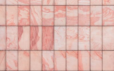
Pink and blue have outgrown their nursery association when the pink leans dusty, terracotta, or salmon rather than bubblegum. Farrow & Ball Pink Ground 202 and Benjamin Moore First Light 2102-70 pair with light blue in a sophisticated way that reads as modern French country.
Keep the pink as an accent, not a dominant color. A blush velvet chair, a terracotta planter, or a coral throw blanket against light blue walls creates visual warmth without overwhelming the palette. This combination works especially well in bedrooms, powder rooms, and sunrooms.
Green Combinations for a Natural Feel
Sage, olive, and eucalyptus greens pair beautifully with light blue that has green undertones. Think of a sea and sage coastal palette. Benjamin Moore Sage Wisdom 2139-30, Farrow & Ball Vert de Terre 234, and Sherwin-Williams Evergreen Fog SW 9130 all hit the right notes.
Use the green on cabinetry, built-ins, or a single accent wall within a light blue room. Kitchen islands painted sage green with light blue walls and warm wood counters create a timeless color story. Add brass or aged bronze hardware to tie the tones together.
Metallics That Enhance Light Blue
Brass and gold fixtures warm up light blue rooms better than chrome or nickel, which reinforce the cool temperature of the wall color. Unlacquered brass cabinet hardware, aged brass light fixtures, and warm gold picture frames provide the temperature contrast that prevents a room from feeling chilly.
For a more modern look, blackened bronze or oil-rubbed bronze offers similar warming benefits. Silver and polished chrome work only when a room has multiple warm elements elsewhere (leather furniture, wood floors, cream textiles) to balance the cool tones. Mixing metals within a single space is fine as long as one metal dominates and the other appears in small supporting roles.
Colors to Avoid with Light Blue
Saturated primary colors clash hard with light blue. Fire engine red, school bus yellow, and royal purple overwhelm the soft tone and create visual chaos. If you want red, choose dusty brick or faded terracotta. For yellow, pick mustard or dusty gold. Purples should lean eggplant or plum rather than true violet.
Also avoid cool grays with blue undertones. Pairing a blue-gray like Stonington Gray HC-170 with light blue walls creates a washed-out effect where neither color reads clearly. Lean warm on your grays: Revere Pewter, Agreeable Gray, or Edgecomb Gray all have warmer undertones that support rather than compete with light blue.
Sample Testing Before Committing
Always buy pint-sized samples of your top three paint choices and paint 2 by 2-foot swatches on at least two walls in the room. Light blue looks dramatically different on a north-facing wall (cooler, grayer) versus a south-facing wall (warmer, brighter). Observe the swatches at morning, noon, and evening light before committing.
For fabric and decor pairings, bring home 4 by 4-inch swatches from furniture retailers or fabric stores. Lay them on the painted swatches at different times of day. A blush pink that reads as warm and dusty at noon can look salmon orange under incandescent bulbs at night. This 30-minute exercise prevents thousand-dollar mistakes on upholstered pieces that cannot be returned.