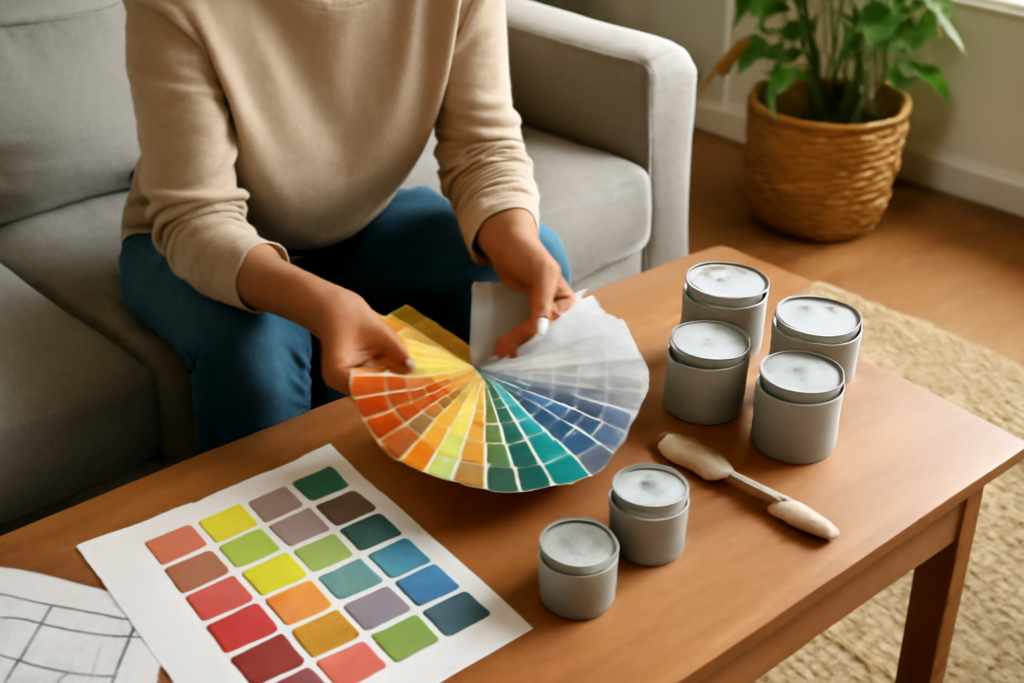
Paint is the cheapest, highest-impact upgrade in any home—and also the one most likely to go wrong, because the swatch on the wall rarely matches the swatch in your head. Choosing paint colors that actually work in your space is a skill built on a few reliable principles rather than luck or a designer’s magic touch. Once you understand how anchors, undertones, and lighting interact, the endless wall of fan decks stops being intimidating. This guide gives you a practical, room-by-room approach so you end up with colors you love and never dread the “should have tested it” regret.
Part of our Paint & Walls guide — explore the full guide →
- Anchor to Something You Already Have
- Master the Undertone
- Account for Light in Every Room
- Always Test Large Samples
- Balance the Whole Palette
- Match Color to the Room's Purpose
- Keep Connected Spaces Flowing
- Getting White and Neutral Choices Right
- Practical Painting Considerations
- Putting It All Into Practice
Anchor to Something You Already Have
The single best starting point is not the paint aisle—it is your own room. Look at the largest and most permanent things in the space: your flooring, countertops, tile, cabinets, and big furniture. These are your anchors, the elements you are not repainting, and your wall color must live in harmony with them.
Pull a color you love from an existing item—a favorite rug, a throw pillow, a piece of art, or the veining in your countertop. Building the palette around that anchor guarantees cohesion and gives you a starting direction. If your floor is warm honey oak, you are already leaning toward warmer paint; if your tile is cool slate, cooler tones will feel more natural. Let the room tell you where to begin.
Master the Undertone
Undertones are the hidden reason colors succeed or clash. Every shade, even neutrals, carries a subtle secondary hue beneath the obvious color—a gray can lean blue, green, or purple, and a white can read yellow, pink, or blue. When a color looks “off” and you cannot explain why, the undertone is usually the culprit.
Reveal an undertone by placing a swatch next to a pure white sheet of paper or beside other shades in the same family. Isolated, a greige looks neutral; against its cousins, its true purple or green bias appears. Then hold that swatch against your anchors. If your countertop has a warm beige undertone and your paint pick has a cool gray one, they will fight no matter how nice each looks alone. Matching undertones between paint and fixed elements is the professional’s secret to a pulled-together room.
Account for Light in Every Room
The same gallon of paint can look like two colors in two rooms because light changes everything. Before you commit, understand what light your space receives throughout the day.
- North-facing rooms get soft, cool light that mutes and grays colors—warm shades counterbalance this.
- South-facing rooms flood with warm light that intensifies whatever you choose, so bold colors read richer.
- East-facing rooms glow warm in the morning and turn cooler by afternoon.
- West-facing rooms start cool and warm up dramatically in evening light.
Bulbs matter as much as sunlight. Warm LEDs push colors yellow, daylight bulbs push them blue. Evaluate any candidate under the actual lighting you live with at night, because a color chosen under store fluorescents can disappoint at home.
Always Test Large Samples
A tiny paint chip is the fastest route to a mistake. Colors behave differently at scale and against your own furnishings and light. Invest a few dollars in sample pots or peel-and-stick swatches and test properly before buying gallons.
- Paint sizable patches—two feet square or larger—on more than one wall, since light strikes each wall differently.
- Place a sample beside your trim, flooring, and anchor pieces to check the interaction.
- Observe the samples in morning, midday, and evening light.
- Live with them for two or three days before deciding.
Painting samples onto white poster board you can move around, rather than directly over the existing wall color, keeps the old color from distorting your read. This one habit prevents nearly every costly repaint.
Balance the Whole Palette
A room needs more than a single wall color; it needs a balanced scheme. Interior designers use the 60-30-10 rule to keep palettes harmonious. Roughly 60 percent of the room is a dominant color—usually the walls—30 percent is a secondary color in upholstery or cabinetry, and 10 percent is an accent in accessories and art.
Thinking this way as you choose paint keeps you from over-committing to a bold shade. Reserve your most saturated color for the smaller 10 or 30 percent and let a calmer, versatile tone carry the walls. The result feels intentional and layered rather than flat or overwhelming.
Match Color to the Room’s Purpose
Color shapes mood, so let each room’s function steer the palette. The right emotional tone makes a space work harder for you.
- Bedrooms reward calm, restful colors—soft blues, sage greens, and warm neutrals promote relaxation.
- Living and dining rooms can carry warmer, more sociable tones that feel welcoming.
- Kitchens handle both crisp neutrals and warm accents; durability of finish matters as much as color.
- Home offices benefit from grounding, focus-friendly shades like deep green or muted blue.
- Bathrooms feel fresh in soft, spa-like colors, and small ones open up with light tones.
Keep Connected Spaces Flowing
In open floor plans and homes where rooms are visible from one another, colors must transition gracefully. Rather than a jarring change at every doorway, choose a cohesive palette that flows through the home. A popular method is selecting one versatile whole-home neutral for main walls and hallways, then adding room-specific accent colors that all share a common undertone so nothing clashes.
Consistent trim color throughout the house is a powerful unifier. Keeping the same crisp white or soft off-white on all your trim ties different wall colors together and makes even a varied palette feel deliberate and calm. Before finalizing, stand in each doorway and check how adjacent rooms read together.
Getting White and Neutral Choices Right
Whites and neutrals cover more wall space in the average home than any bold color, and choosing them well is trickier than it looks because their undertones are so subtle. No white is truly neutral—each leans warm (toward cream and yellow) or cool (toward blue and gray). Warm whites feel cozy and pair naturally with wood floors and traditional furnishings, while cool whites read crisp and contemporary but can feel sterile or turn slightly blue in dim light. Pick your direction before you shortlist.
The same subtlety governs grays and greiges. A blue-based gray feels cold, a green-based one can look muddy, and a warm greige with a beige foundation feels inviting and current. Whenever you evaluate a neutral, compare at least three options side by side. A single swatch hides its bias; only against warmer and cooler neighbors does its true undertone emerge, and the shade that seemed perfect alone often reveals an undertone you did not want once it has company.
Practical Painting Considerations
Color choice interacts with the practical side of painting, so factor these in before you commit. Darker and more saturated colors show imperfections, roller marks, and touch-ups more readily than lighter shades, and they often require an extra coat for even coverage—budget more paint and time for a deep accent color. Very dark colors on a sunny wall can also fade over years of direct light, so ask about fade-resistant formulas for those spots.
Sheen affects both look and durability. Flat and matte finishes hide wall flaws and suit low-traffic bedrooms and ceilings, but they are hard to clean. Eggshell and satin balance a subtle glow with washability, making them the workhorses for living areas and hallways. Semi-gloss and gloss stand up to scrubbing and moisture, ideal for trim, doors, kitchens, and bathrooms. Choosing the right sheen for how a room is used is as important as the color itself—a beautiful shade in the wrong finish either shows every scuff or looks plasticky, so match the two decisions together.
Putting It All Into Practice
Choosing paint colors becomes straightforward when you follow the sequence: anchor to what you already own, identify and match undertones, respect your room’s light, and test big samples over several days. Layer in the 60-30-10 balance, tune the color to each room’s mood, and keep connected spaces flowing with a shared neutral and consistent trim. Approach it as a method rather than a gamble, and you will move from overwhelmed in the paint aisle to confident on the ladder—with colors that flatter your home and still feel right long after the last coat dries.