Frost grout color is one of the most reached-for neutrals in tile work: a soft, cool off-white that reads cleaner than beige but warmer than a stark bright white. It is the grout people choose when they want the tile to be the star and the joints to quietly disappear. On a white subway backsplash or a gray-veined marble floor, frost blends rather than competes, which is exactly why designers lean on it.
Part of our Tile & Grout guide — explore the full guide →
The name “frost” appears across several major grout manufacturers, and the exact shade varies slightly from brand to brand. What stays consistent is the intent: a light, neutral, slightly cool tone that flatters cool and white tiles. Understanding how it behaves helps you decide whether it is right for your project.
What Frost Looks Like
Picture the white of fresh snow in shade rather than full sun. Frost carries a faint gray or cool undertone that keeps it from looking yellow or creamy. Next to a true bright white grout, frost looks softer and a touch deeper. Next to a warm almond or bone, it looks crisper and cleaner.
That cool undertone is the whole point. Pure white grout can look clinical and shows every speck of dirt, while warm whites can clash with cool-toned tile. Frost threads the needle, giving you a light joint that still feels relaxed and forgiving in everyday light.
Where Frost Grout Works Best
This color is a natural match for cool palettes. It pairs especially well with:
- White tile of nearly any finish, where frost gives a seamless, low-contrast look.
- Gray tile and porcelain, where the cool undertone ties the joints to the field.
- Marble and marble-look porcelain, where frost echoes the cool veining without drawing attention.
- Blue, sage, and soft pastel tile, where a warm grout would fight the tile’s tone.
Frost is the go-to for the classic look of a white subway backsplash with barely-there joints. It is also a smart pick for large-format gray floor tile, where you want the grout to recede so the floor reads as a continuous surface rather than a grid.
When to Choose a Different Color
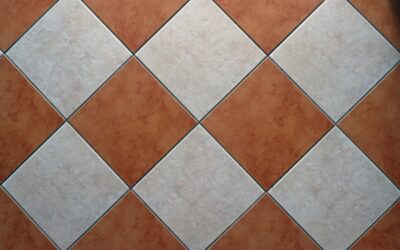
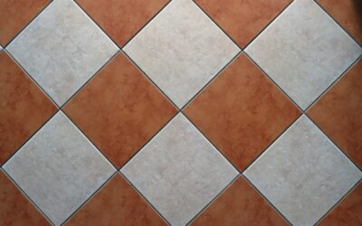
Frost is not universal. On warm-toned tile, like creamy travertine, terracotta, or beige porcelain, frost can look cold and slightly off, and a warm ivory or almond grout will sit more naturally. If you want the grout lines to stand out as a design feature, a contrasting darker color does that job better than a blend-in neutral.
There is also a practical caution: light grout shows dirt, especially on floors and in high-traffic kitchens. In a mudroom, an entry, or a busy family bathroom floor, a slightly darker greige or gray hides everyday grime far better than any light shade, frost included. Save frost for walls, backsplashes, and lower-traffic floors where its clean look pays off.
Sanded Versus Unsanded
Color is only half the decision. The grout type you choose depends on joint width:
- Unsanded grout for narrow joints, typically 1/8 inch or less, common on polished tile and subway backsplashes. It is smoother and will not scratch delicate surfaces.
- Sanded grout for wider joints, generally 1/8 inch and up, which resists cracking and shrinkage in larger gaps.
- Epoxy grout for maximum stain resistance, available in frost-equivalent shades from several brands, ideal where staining is a concern.
For a light color like frost, epoxy or a high-performance cement grout with built-in stain protection is worth the upgrade. Light joints reward any extra defense against discoloration.
Keeping Frost Grout Clean
A light grout lives or dies by maintenance. The good news is that staying on top of it is simple.
- Seal cement-based frost grout after it fully cures, usually after the manufacturer’s recommended wait of several days, and reseal periodically. Epoxy grout does not need sealing.
- Wipe spills promptly, especially coffee, wine, and cooking oils that can stain light joints.
- Clean with a pH-neutral tile cleaner. Avoid acidic cleaners on grout near marble, since acid etches both the stone and some grout surfaces.
- For occasional deeper cleaning, a soft brush with a gentle grout cleaner lifts grime without grinding it deeper.
Resealing once a year in wet or high-use areas is a small habit that keeps frost looking like it did on day one.
Getting an Accurate Color Match
Grout color on a brand’s chart is printed ink, not cured grout, so never commit based on the card alone. Cured color also shifts with how much water you use in mixing and how the joint dries, and the same frost can look lighter or darker depending on the tile beside it.
Make a test board. Spread the grout into a few sample joints on spare tile, let it cure for a couple of days, and view it in your room’s actual lighting at different times of day. This 20-minute step prevents the most common regret in tile work, which is a grout that looked perfect on the chart and wrong on the wall.
Safety and Application Notes
Grout is a cement or epoxy product, so handle it with basic care. Wear gloves and eye protection when mixing and applying, since cement is alkaline and drying, and epoxy components can irritate skin. Work in a ventilated space and follow the manufacturer’s mixing ratios and cure times exactly, as those numbers drive both the final color and the durability.
For large installations, intricate stone, or wet areas like shower floors, a tile professional gets the consistency, joints, and sealing right the first time. Whether you DIY a backsplash or hire out a full floor, choosing a frost grout color and testing it on a sample board first gives you a clean, cohesive result that lets your tile do the talking.
Frost in Real Rooms
A few practical pairings show how versatile this neutral is. In a bright white kitchen, frost on a glossy subway backsplash keeps the wall feeling continuous while still hinting at the brick pattern up close. In a spa-style bathroom, frost over a marble-look porcelain floor lets the veining flow without a grid of harsh lines breaking it up. And in a laundry or powder room with soft gray penny tile, frost reinforces the cool, calm palette instead of muddying it with warmth.
The thread running through all of these is restraint. Frost is the color you choose when you want the eye to land on the tile, the layout, and the light, not on the grout. Used in the right setting and maintained with a little discipline, it delivers that quiet, finished look that makes a tile job feel professionally designed.