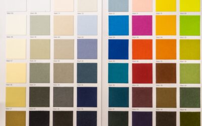
Grey became the defining neutral of the last decade for a reason: it reads clean and modern without the coldness of stark white or the heaviness of beige. But choosing among the hundreds of grey paint colors on a fan deck trips up more homeowners than any other hue, because grey is never truly neutral. Every grey leans warm or cool through a hidden undertone, and that undertone is what turns a beautiful chip on the wall into a lavender, green, or blue surprise once it covers a whole room.
Part of our Paint & Walls guide — explore the full guide →
Get the undertone and the light right and grey delivers a sophisticated, timeless backdrop. Get them wrong and you repaint. This guide covers how to read undertones, why light reflectance value matters, and which proven shades designers reach for again and again.
Why Grey Is Never Just Grey
Pure grey is an equal mix of black and white, but paint chemists almost never sell it that way. To make grey feel livable, they tint it with blue, green, purple, or a touch of brown. That base tint is the undertone, and it only reveals itself at full scale, next to your flooring, trim, and furnishings.
Cool greys carry blue, green, or violet undertones and feel crisp and contemporary. Warm greys, often called greige, blend grey with beige and lean tan or taupe for a cozier result. Before you commit, hold a chip against a sheet of pure white printer paper and the underlying color jumps out immediately.
Understanding LRV Before You Buy
Light Reflectance Value, printed on the back of most paint chips, measures how much light a color bounces back on a scale of 0 (black) to 100 (pure white). It is the single most useful number for predicting how a grey behaves in your space.
- LRV 60 to 75: Light, airy greys that read almost off-white in bright rooms. Ideal for small or north-facing spaces.
- LRV 45 to 59: True mid-tone greys that stay balanced without going dark.
- LRV 25 to 44: Deep, dramatic greys for accent walls, islands, and moody bedrooms.
A north-facing room drains warmth and light, pushing greys cooler and darker, so favor a higher LRV and a warmer undertone there. South-facing rooms flood with warm light and can carry a cooler, lower-LRV grey beautifully.
The Most Reliable Grey Paint Colors
These shades have earned their reputation across thousands of real projects because their undertones behave predictably in most lighting.
Warm Greiges
Sherwin-Williams Agreeable Gray (SW 7029), LRV 60, is arguably the most popular neutral in America. It balances grey and beige so evenly it flatters nearly any room. Benjamin Moore Revere Pewter (HC-172), LRV 55, leans slightly greener and warmer, pairing well with wood tones and traditional trim.
True Mid-Tone Greys
Sherwin-Williams Repose Gray (SW 7015), LRV 58, offers a soft, barely-warm grey that resists going blue. Benjamin Moore Stonington Gray (HC-170), LRV 59, is a cooler classic with a subtle blue undertone that shines in bright, well-lit rooms.
Deep Dramatic Greys
Sherwin-Williams Peppercorn (SW 7674), LRV 10, and Benjamin Moore Kendall Charcoal (HC-166), LRV 14, deliver rich, near-black depth for cabinetry, front doors, and feature walls.
Matching Grey to Your Flooring
Grey walls live or die by how they relate to the floor beneath them. Cool-toned floors, like grey-washed oak or porcelain tile with blue undertones, pair naturally with cool greys and can look muddy against greige. Warm hardwoods in oak, hickory, or walnut demand a warm greige, or the contrast reads harsh.
A safe rule: keep your walls and floors in the same temperature family. If your luxury vinyl plank has a golden or reddish cast, reach for Agreeable Gray or Revere Pewter. If it is a cool grey or ashy tone, Repose Gray or Stonington Gray will sit comfortably above it.
Choosing Grey Room by Room
Different rooms ask different things of a grey.
- Living rooms: Mid-tone greiges like Agreeable Gray keep large, open spaces warm and inviting.
- Bedrooms: Softer, cooler greys such as Repose Gray promote calm; deeper charcoals create a cocooning feel on an accent wall.
- Kitchens: Light greys keep the space bright, while a charcoal island grounds white cabinetry.
- Bathrooms: Cool greys read clean and spa-like alongside white tile and chrome fixtures.
- Exteriors: Greys with a slight blue or green undertone hold up beautifully and hide dirt between washes.
Always Test Before You Commit
No amount of online research replaces a real-world sample. Paint chips lie because they are printed, not painted, and store lighting distorts every color. Follow this proven testing routine:
- Buy sample pots of your top two or three greys, around $6 to $9 each.
- Paint two-foot squares on at least two different walls, since light hits each wall differently.
- Better yet, paint on a large poster board you can move around the room and hold against the floor and trim.
- Observe the samples in morning, midday, and evening light, and under your artificial lighting at night.
- Watch for undertones emerging, a grey that looked neutral at noon may flash purple under warm LED bulbs.
Warm Greige vs. True Grey: Reading the Difference
The single most useful distinction to master is greige versus true grey, because it explains why two chips that both read “grey” can feel worlds apart on the wall. Greige blends grey with beige, borrowing warmth from tan and brown undertones, and it dominates open-concept homes because it flatters wood floors, cream furnishings, and warm lighting. True grey leans cool, drawing on blue, green, or violet, and it reads crisper and more contemporary.
Neither is better; they simply suit different homes. If your house is full of oak trim, honey-toned floors, and traditional furniture, greige will feel harmonious while a cool grey may look stark and out of place. In a modern home with white oak, black hardware, and clean lines, a true cool grey looks intentional and sophisticated where greige might read muddy. Identify which camp your fixed elements fall into before you ever open a fan deck.
Grey Paint Mistakes to Avoid
Most grey disappointments trace back to a handful of predictable errors. Learn them and you’ll dodge the repaint:
- Ignoring the undertone: A grey that flashes purple, blue, or green almost always got chosen from a chip without a full-scale test.
- Fighting the light: Putting a cool grey in a north-facing room amplifies the coldness; that room needs a warmer, higher-LRV grey.
- Mismatching trim white: Pairing a warm greige with a stark blue-white trim creates a subtle clash that makes both look off.
- Going too dark in a small room: A low-LRV grey can shrink and darken a compact space; save the drama for accent walls or well-lit rooms.
- Forgetting the fifth wall: A grey that looks great on walls can turn dingy on the ceiling; keep ceilings white unless you’re deliberately going moody.
The recurring theme is context. Grey never behaves in isolation, so evaluate every candidate against your specific light, floors, and trim rather than trusting how it looks in a showroom or on a screen.
Pairing Grey With Trim and Accents
Crisp white trim is the default partner for grey, but the white matters. A warm grey wants a warm white like Benjamin Moore White Dove, while a cool grey pairs with a cleaner white such as Sherwin-Williams Extra White. Matching temperatures keeps the whole scheme cohesive rather than clashing.
For accents, warm greys welcome brass, wood, and cream, while cool greys sing with black hardware, chrome, and crisp blues. When you honor the undertone throughout the room, the best grey paint colors stop feeling like a gamble and start delivering the polished, enduring look that made grey a designer staple in the first place.