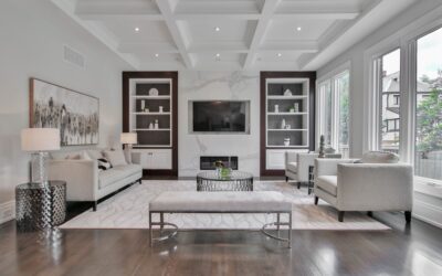
Half the homeowners who paint a room grey end up with walls that look icy blue or sickly green by 4 PM, because grey paint is the trickiest color family on any fan deck. The best Behr grey paint colors hold their hue across natural and artificial light, work with warm and cool decor, and avoid the common pitfall of going purple under LED bulbs. After repainting clients’ rooms after failed grey selections more times than I can count, here are the Behr greys that consistently deliver across light conditions.
Part of our Paint & Walls guide — explore the full guide →
- Understanding Grey Undertones
- Best Light Greys for Living Spaces
- Mid-Tone Greys for Statement Walls
- Dark Greys and Charcoals
- Greige and Warm Grey Crossovers
- Exterior Grey Picks
- Trim and Ceiling Pairings
- Lighting Considerations
- Sheen Choices by Room
- Sample Before You Commit
- The Bottom Line
- How Behr Greys Compare to Other Brands
Understanding Grey Undertones
Every grey has an undertone, a secondary color that emerges as light changes. Cool greys lean blue, green, or violet. Warm greys lean beige, taupe, or yellow. The undertone is invisible on a paint chip in the store but obvious on the wall at scale. Always sample a 12 by 12 inch swatch on at least two walls and observe it across morning, midday, and evening light before committing.
Best Light Greys for Living Spaces
Light greys read as fresh neutrals when chosen well, but turn icy or dingy when chosen poorly.
- Silver Drop, soft warm grey that reads near-white in bright rooms
- Sterling, balanced light grey that holds across light conditions
- Light French Gray, cool but warm enough to avoid blue shift
- Wheat Bread, grey-beige greige for warmer trim packages
- Granite Boulder, slightly darker option for more visible color
Silver Drop and Sterling are my two most-recommended Behr light greys for living rooms because they hold up under both north-facing daylight and warm LED at night.
Mid-Tone Greys for Statement Walls
Mid-tone greys work on accent walls, dining rooms, and primary bedrooms where you want presence without going dark.
- Dolphin Fin, classic mid-grey with neutral undertone
- Studio Taupe, warmer grey-taupe blend
- Cathedral Gray, slightly cooler with green undertone in bright light
- Anonymous, flexible mid-grey that pairs with both warm and cool decor
- Elephant Skin, deeper mid-grey with sophisticated read
Dark Greys and Charcoals
Dark grey reads as quietly bold and pairs beautifully with white trim, brass hardware, and rich wood floors. Behr’s deeper greys hold up well in interior applications and on cabinetry projects.
- Cracked Pepper, the cult favorite Behr 2025 Color of the Year
- Carbon Copy, near-black grey for dramatic accent walls
- Iron Mountain, charcoal with subtle warmth for libraries
- Ash Gray, lighter charcoal that prevents the cave effect
- Distant Star, deep grey with slight blue lean for moody bedrooms
Cracked Pepper is the standout. It works on island cabinetry, full bedroom walls, and exterior trim packages without ever reading blue or green.
Greige and Warm Grey Crossovers
Greige, a hybrid of grey and beige, is more forgiving than pure grey because the warm undertone covers the cool shifts that pure greys suffer.
- Toasty Gray, popular warm-leaning crossover
- Perfect Taupe, slightly browner than typical grey
- Classic Silver, neutral greige that pairs with most wood tones
- Mineral, deeper greige with brown undertone
For homes with oak floors, honey-toned cabinetry, or warm leather furniture, greige reads more cohesive than cool grey.
Exterior Grey Picks
Exterior greys see harsher light shifts than interiors, so undertone errors get amplified. Behr greys that perform well on siding and trim include Sterling and Silver Drop for lighter facades, Dolphin Fin and Anonymous for mid-tone homes, and Cracked Pepper or Carbon Copy on the dark side. Use Behr Exterior Marquee for fade resistance, since the standard Premium Plus exterior shows undertone shifts faster as it weathers.
Trim and Ceiling Pairings
Pure white trim like Behr Ultra Pure White or Polar Bear gives the cleanest contrast against grey walls. For a softer look, an off-white like Swiss Coffee or Smoky White prevents the harsh grey-white edge that pure white creates. On ceilings, drop the wall color by 30 to 50 percent in tint strength for an enveloping but not heavy result.
Lighting Considerations
The same Behr grey paint colors look entirely different under different bulbs. Daylight LED at 5000K cools all greys and accentuates blue undertones. Warm white at 2700K shifts greys toward beige. Most homes use 3000K bulbs, which is the closest match to natural afternoon light. Test your samples under your actual bulbs, not in the paint store, since paint store lighting is often a different color temperature than your home.
Sheen Choices by Room
- Matte and flat for ceilings and low-traffic adult bedrooms
- Eggshell for living rooms and dining rooms
- Satin for kitchens, hallways, and kid bedrooms
- Semi-gloss for trim, doors, and bathrooms
- High gloss only on furniture pieces and small accent doors
Matte hides drywall imperfections best but shows scuff marks. Higher sheens clean easier but spotlight every wall flaw. Behr Marquee Matte is the rare matte finish that cleans well, worth the upcharge over Premium Plus.
Sample Before You Commit
Buy 8-ounce samples for any grey under serious consideration, around 5 dollars each. Roll a 12 by 12 inch patch on multiple walls in the room, since the same paint reads differently depending on which wall it sits on. Watch the swatches across at least three light conditions, and ideally tape a poster board sample so you can move it around the room. Spending 20 dollars on samples is far cheaper than repainting a 400 square foot room because the grey turned blue at sunset.
The Bottom Line
The best grey for your space depends on the room’s natural light, your existing decor warmth, and the trim you plan to pair. For most homes, Sterling, Silver Drop, Dolphin Fin, and Cracked Pepper deliver consistent results across the widest range of conditions, which is why pros default to that short list for client projects.
How Behr Greys Compare to Other Brands
Behr greys typically run cooler than Benjamin Moore equivalents and warmer than Sherwin-Williams comparable colors. If you cross-shop, Sterling reads close to Benjamin Moore’s Classic Gray and Sherwin-Williams Repose Gray, though each has slight undertone differences. Cracked Pepper sits between Benjamin Moore Wrought Iron and Sherwin-Williams Iron Ore. Always test the actual paint on your walls rather than relying on color matching software, which often misses the subtle undertone shifts that make or break a grey selection. Quality differences between brands matter less than getting the undertone right for your specific lighting.