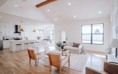
Choosing cabinet colors is one of the most consequential decisions in a kitchen remodel, and it is where many homeowners freeze up. Scrolling through kitchen cabinets color combination pictures reveals just how many directions you can go, from timeless two-tone navy and white to moody greens and warm woods. This guide organizes the most popular and enduring combinations, explains where to use each color, and gives practical advice on making a scheme work in your own space so you can commit with confidence.
Part of our Kitchen Remodeling guide — explore the full guide →
- Why Cabinet Color Sets the Whole Tone
- Two-Tone Kitchens: The Modern Favorite
- Navy and White: The Timeless Classic
- Green Cabinets: Warm and Grounded
- Gray and Greige: The Versatile Neutral
- Bold and Dramatic Combinations
- Coordinating Counters, Backsplash, and Hardware
- White and Cream: The Enduring Standard
- Matching Cabinet Colors to Your Home’s Style
- Choosing the Right Combination for Your Home
Why Cabinet Color Sets the Whole Tone
Cabinets cover more visual surface than any other element in a kitchen, so their color defines the room’s entire mood. A crisp all-white kitchen reads bright and clean, while deep charcoal or forest green feels intimate and sophisticated. Because cabinets are expensive and semi-permanent, the color you choose will live with you for a decade or more.
That permanence is exactly why studying combinations before you commit pays off. The right pairing balances the cabinet color with your countertops, backsplash, flooring, and wall paint, creating a cohesive look rather than a collection of competing finishes. Get the cabinet color right and the rest of the palette tends to fall into place.
Two-Tone Kitchens: The Modern Favorite
The single biggest trend in cabinet design is the two-tone kitchen, where upper and lower cabinets, or the perimeter and island, wear different colors. It adds depth and visual interest that a single color cannot, and it lets you use a bolder shade in moderation.
The most popular formula keeps lighter uppers with darker lowers, which grounds the room and keeps it from feeling top-heavy. Common combinations include the following.
- White uppers with navy lowers: Crisp, classic, and endlessly photographed.
- White uppers with sage or forest green lowers: Fresh and organic.
- Light gray uppers with charcoal lowers: Subtle, tonal, and contemporary.
- Wood uppers with painted lowers: Warm and current, blending natural texture with color.
A two-tone island is the easiest way to test the waters. Paint just the island a bold color while keeping perimeter cabinets neutral, and you get a striking focal point without committing the whole kitchen to a strong hue.
Navy and White: The Timeless Classic
If any combination has proven itself recession-proof and trend-proof, it is navy and white. Deep navy cabinets paired with white counters and bright walls deliver a nautical-inspired, deeply satisfying contrast that photographs beautifully and dates slowly.
Navy works especially well on a kitchen island or on lower cabinets, anchoring the space while white uppers keep it light. Pair it with brass or gold hardware for a warm, elegant pop, or with polished chrome for a cooler, more modern feel. A white marble or quartz counter with subtle gray veining completes the look. This is the combination to choose if you want something bold now that will still feel right in fifteen years.
Green Cabinets: Warm and Grounded
Green has surged as homeowners crave a connection to nature, and it spans an enormous range from pale sage to deep hunter green. Sage green cabinets feel soft and calming, pairing gorgeously with white counters, natural wood open shelving, and warm brass fixtures.
Deeper forest and olive greens create drama and work well as an accent on a lower run or island against neutral perimeter cabinets. Green pairs naturally with wood tones, so a walnut or oak island or butcher-block counter reinforces the organic feel. For walls, warm whites and creamy off-whites let the green stay the star without competing.
Gray and Greige: The Versatile Neutral
Gray dominated kitchens for a decade because it is remarkably flexible, reading warm or cool depending on the undertone and the finishes around it. It bridges traditional and modern styles effortlessly.
Cooler grays pair with white counters and stainless steel for a crisp, contemporary look, while warmer greige, a gray-beige blend, softens the room and works beautifully with wood floors and brass hardware. Gray also makes an ideal partner in two-tone schemes, whether as the lighter uppers over a darker charcoal base or as the calm neutral perimeter around a bolder island. If you want a safe, resale-friendly choice that still feels current, greige is hard to beat.
Bold and Dramatic Combinations
For homeowners who want their kitchen to make a statement, several dramatic combinations deliver. These require more confidence but reward it with genuinely memorable spaces.
- Black cabinets with wood accents: Sleek and modern, softened by natural wood shelving or a butcher-block counter.
- Deep charcoal with white marble: Luxurious contrast that feels like a boutique hotel.
- Terracotta or rust with cream: Warm, earthy, and on-trend for a Mediterranean feel.
- Deep burgundy or plum with brass: Rich and unexpected for a formal dining-adjacent kitchen.
The key with bold colors is restraint elsewhere. Keep counters, walls, and flooring neutral so the cabinet color carries the drama without the room feeling chaotic.
Coordinating Counters, Backsplash, and Hardware
Cabinet color never lives in isolation, and the surrounding finishes make or break the combination. A useful rule is to choose one element as the star and let the others support it. If cabinets are bold, keep counters quiet, and vice versa.
White and light quartz counters flatter nearly every cabinet color, which is why they remain so popular. For backsplashes, a simple white subway tile is a safe supporting player, while a patterned tile becomes the focal point if cabinets are neutral. Hardware finish ties it together: brass and gold warm up cool cabinet colors, matte black adds contemporary edge, and polished nickel keeps things classic. Coordinating these layers deliberately is what separates a designer-looking kitchen from a collection of nice individual choices.
White and Cream: The Enduring Standard
No discussion of cabinet color is complete without the perennial favorite: white and its warmer cousin, cream. An all-white kitchen remains the most requested look in America because it is bright, timeless, and makes even a small kitchen feel larger and cleaner.
Pure white cabinets pair with almost anything, from marble counters and subway tile to bold, colorful backsplashes and dark hardware. The tradeoff is that stark white can feel cold or clinical, which is why many homeowners now choose a soft white or creamy off-white that adds warmth without sacrificing brightness. Cream and antique white also pair beautifully with wood floors and brass fixtures for a more traditional, inviting feel. If you want a look that will never date and offers the most flexibility for changing your counters and accents later, white and cream remain the safest bet in the kitchen.
Matching Cabinet Colors to Your Home’s Style
The right combination also depends on your home’s overall architecture and design language. A color scheme that dazzles in a modern loft may feel out of place in a farmhouse, so align the cabinets with the house.
- Modern and contemporary: High-contrast schemes like black-and-white, or sleek handleless gloss cabinets in gray or navy.
- Farmhouse and cottage: Soft whites, sage green, and warm wood tones with visible grain.
- Traditional: Cream, navy, and classic two-tone pairings with raised-panel doors.
- Transitional: Greige, muted blues, and light-over-dark two-tone schemes that bridge old and new.
- Industrial: Charcoal, black, and deep gray with metal and reclaimed wood accents.
Choosing a combination that fits your home’s character makes the kitchen feel intentional and integrated rather than like a trend dropped in from a magazine. When the cabinets speak the same design language as the rest of the house, the whole space feels cohesive.
Choosing the Right Combination for Your Home
Start by considering your kitchen’s light and size. Small or dark kitchens benefit from lighter cabinet colors that reflect light, while large, well-lit kitchens can carry deeper, moodier hues without feeling closed in. Next, factor in the fixed elements you are keeping, your flooring, appliances, and adjacent rooms, so the palette flows through your home.
Finally, always test with large paint samples or door samples in your actual kitchen light before committing, since colors shift dramatically between a showroom and your space. Browsing kitchen cabinets color combination pictures is the perfect starting point for inspiration, but the winning combination is the one that suits your light, your finishes, and the mood you want to live with every day.